
|
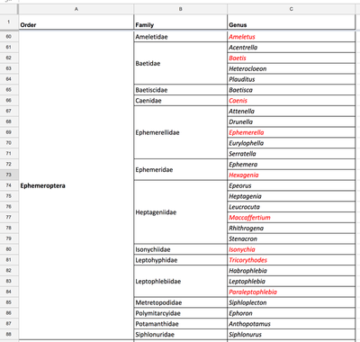
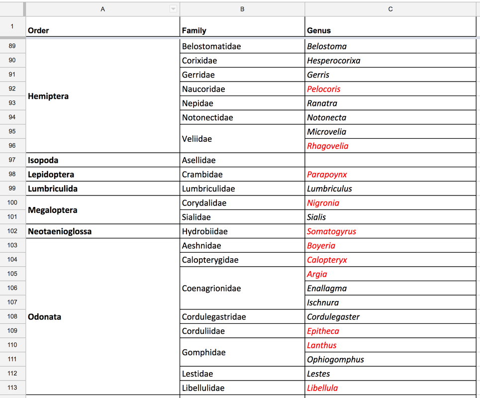
Hello! My name is Joyce Chen. I recently joined the Learning to See project, and one of my tasks has been to design exercise to explore what the macroinvertebrates.org homepage might look like using a Zoomable User Interface (ZUI) approach. The idea was to create a large-scale Gigapan that would incorporate all of the different orders in the collection. The homepage would mimic a larger draw or musuem collection of insects. This also let's us see overall scope and scale of the collection based on the 150 taxa we plan to represent. We recognize many usability issues with this approach, but think it provides some interesting points for team discussion. To get more familiar with the project and the collection size, I started by simply organizing the different genera and families within each order. My goal was to better understand the distribution of information, particularly the different order and family sizes. By re-formatting the spreadsheet as shown, I was able to get a much better sense of the sizes of different groups. In addition, I took a quick count of the total number of orders, families, and genera. After these initial steps, I moved on to the layout of the potential homepage gigapan. For my first version, I focused on 15 orders. I presented these in a 4x4 grid, with each order appearing as a square. Within each square, I included gigapans of 4 families within the order (fewer if less than 4 families/pictures available). I grouped the grid so that the Insecta orders were adjacent to each other and took up the central portion of the screen. On the perimeter of the Insecta group, I placed the smaller classes (Arachnida, Bivalvia, etc.). A small view of the Gigapan is shown below, and the full resolution image can be found at: http://www.gigapan.com/gigapans/3207a47d1c28943264442d96a541c138. 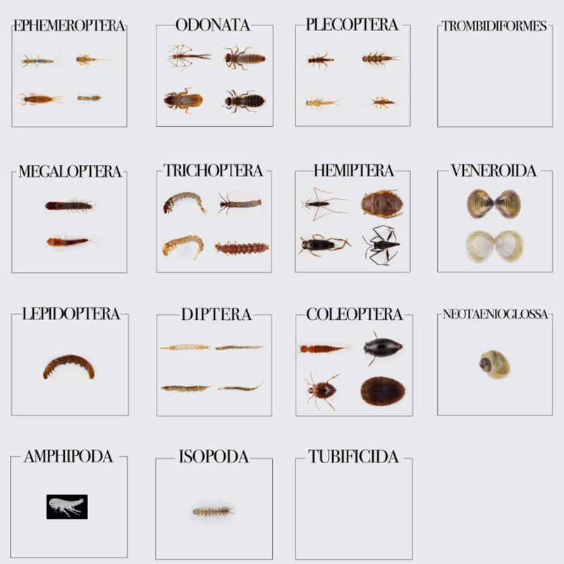 Additionally, I created another mockup which represented all of the different families for each order. Since some orders were much larger than others, this did not create a perfectly even 4x4 grid system. However, I tried to maintain an overall order that would allow users to easily navigate. This mockup can be found at http://www.gigapan.com/gigapans/6d78f8a2794618fd8fd01f41ca84897a. Within the Coleoptera order, there were many genera that had separate information for adult and larval forms. After consulting some existing field guides and discussing with Maddie and Dr. Morse, I decided to split the order into 2 groups for future versions of this design. This was done in order to improve clarity for volunteers on the website, since the adult and larval forms have very different characters. I also revised these initial attempts by incorporating all of the orders in the collection. Since some of the orders only have one or two specimen, I grouped different orders together by classes and phyla. I still aimed to focus attention on the class Insecta (and especially the phylum Arthropoda), so I put the other three phyla on the right-most edge of the Gigapan. The 4x4 grid is linked here: http://www.gigapan.com/gigapans/dff36941681925114d70ce6a871f2077 The organized rectangle layout can be viewed below, or at full resolution on the Gigapan website: http://www.gigapan.com/gigapans/5bcd13ccde5ffe7dc3efac7da5bee6ea 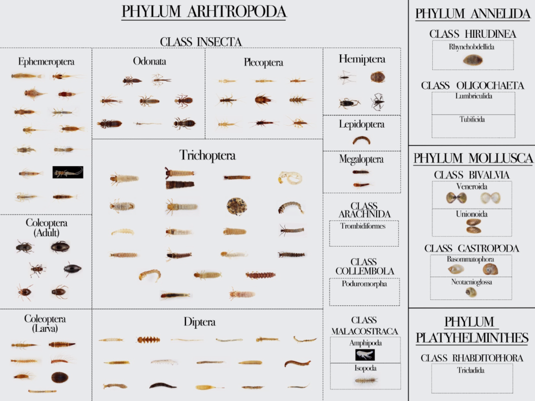
Taiji Nelson
8/7/2017 10:30:58
SO COOL. You've done a really great job of balancing the natural beauty of the specimens with the underlying scientific concepts of lumping and splitting. This is the perfect example of the power of design to organize and communicate. Looking forward to seeing how this continues to improve! Comments are closed.
|
Project TeamAn interdisciplinary team Categories
All
Archives
June 2023
|
 RSS Feed
