
|
In redesigning macroinvertebrates.org, we are focusing on three levels of the current system: the macro, or the architecture of the site, where pages go in relation to each other, and what the general structure and flow of the website is like - whether the site will be structured more like a key or a guide, for example. At the meso-level, our concern is with the interactions on the page – what the layout and structure of each page will be like, what content and how it will be available. At the micro level, we are concerned with the microinteractions, the various cues and feedback mechanisms that the user will encounter interacting with the site. 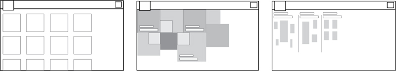 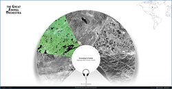 I’ve been assembling a list of precedents looking at macro and meso level strategies in dealing with content. The Great Animal Orchestra is a great example of a website that seeks to train people to listen and identify various biomes and animal sounds. It encourages the user to put on their headphones, and leads them through a selection of various regions, using circular spatial metaphors to slowly train users to isolate specific sounds. A multiple choice game that asks you questions about what you’ve just heard is an interesting way to evaluate if users are learning. 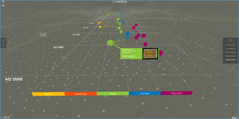 The British Museum’s website has an interesting way of isolating and highlighting various paths the user can take to view information. While the current site follows a chronological format, the user can isolate specific areas to view chronologies of. The website also uses overlays to give away information in a neat, concise manner.  Codeology is interesting because of the way that the grid structure is laid out, where hovering the mouse over a specific square causes it to animate and rotate. Possibly could be used as a precedent for interactions for the website where hovering over an insect square enlarges and magnifies it. 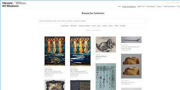 The Harvard Art Museum website uses a more standard grid interface, but interestingly allow for panning and zooming into the high resolution images on the site.  The Google font gallery uses a detailed sidebar with the ability to use sliders to change variables and update things in realtime. In addition to this, the various modules in the grid also allow for changing around variables and being able to see how the type changes and looks - this is really important as an example of how to manipulate and compare different images without necessarily diving in a level deeper.
Comments are closed.
|
Project TeamAn interdisciplinary team Categories
All
Archives
June 2023
|
 RSS Feed
