
|
By Alice Fang 🐞📱This past semester, I refined the design of the field guide that Estelle and I worked on over the summer. With the main structure of each page layout figured out over the summer, this fall, I worked on global navigation, refined the design system of components and typography, and finalized some of the interactions. These design decisions informed the design and look of both the ID Key and Quiz. Previous Version 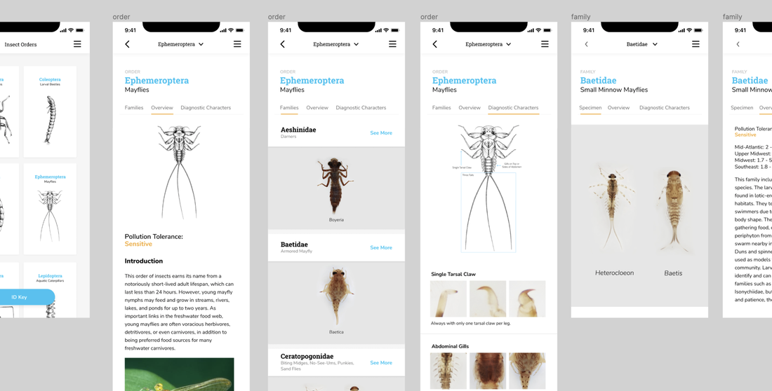 Prototype from summer, used in first round of user testing The prototype we had over the summer followed the scientific-name as its organizing convention. With blue type in Roboto Slab, the scientific name stood out on each page, but conflicted in hierarchy with other type. What does the opening page look like when a user first opens the field guide function of the app? And how do these elements translate to the other two functions, ID Key and Quiz? Global Navigation, Menu List, Flipping Images 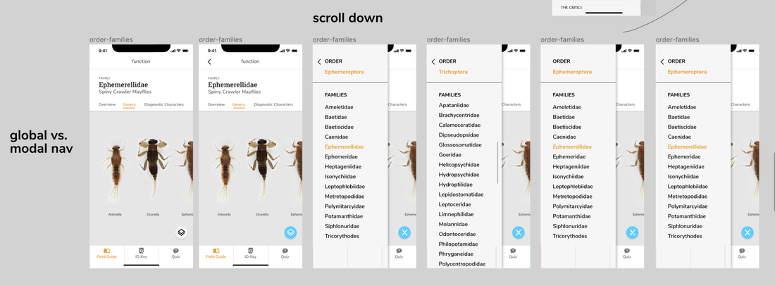 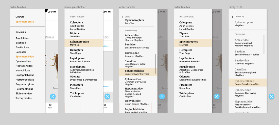 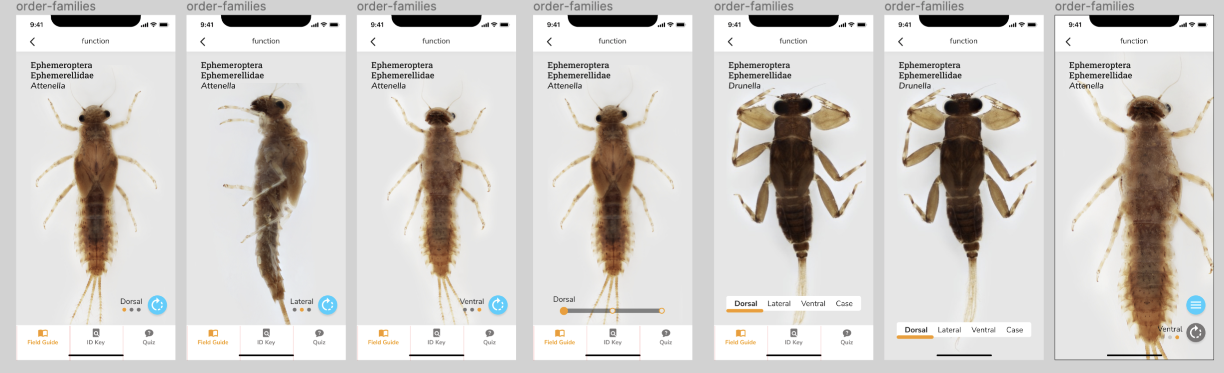 We wanted color to be used more intentionally and consistently. Blue became actionable, orange represented 'state.' Following this convention, I changed the typographic system, exploring type size, weight, and style. Thinking more holistically about the app, how does a user switch from the field guide to the ID Key? How does navigation work? Where does the back button go to? We used the bottom bar for global navigation, to switch between the main functions. Each function is its own independent section of the app, with tap to switch, not swipe. I also explored more modal navigation methods; over the summer, we had designed a drop-down menu. However, during user tests, we received mixed feedback about people's mental models about the taxonomic structure. How else could we show Order > Family navigation, across all three sub menus: overview, diagnostic characters, and families? The blue action button on the lower right floats on top of any content on any sub menu page. Selecting it on an Order page brings an overlay with other Insect Orders; on a Family page, it brings an overlay with the current Order, and a list of the families within the current Order. This way, users can get a better understanding of the nested structure of Order > Family > Genus. I also explored different ways to flip / switch images at the Zoomable page level. How can someone recognize that a. an insect has multiple views, even if they don't know what 'ventral' and 'dorsal' mean; b. that there is an icon that actively flips the image? User Testing Round 2 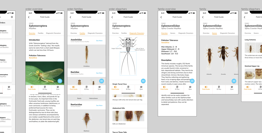 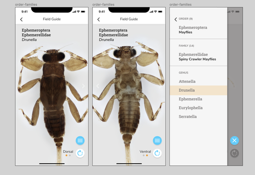 We conducted a second round of user testing with teachers, novice learners, and trainers. We asked them to speak aloud through a prototype of the app, and used a similar research protocol as the first round of testing. Main Insights:
Iterations Informed by Testing 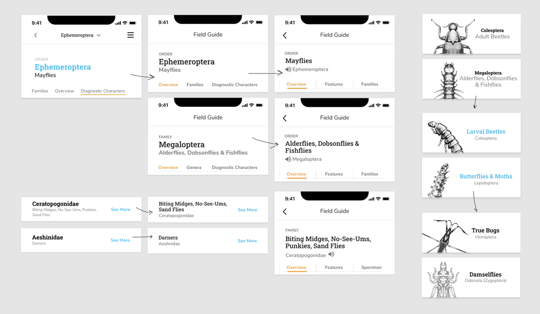 I flipped the type system; the name with highest contrast is now the common name, with the scientific name quieter underneath. Common names were in Roboto Slab, and scientific names in Nunito Sans; this also allowed the Order Family genus naming convention to be used (Roboto Slab doesn't have an italic). Previously, we went with scientific names because of length; it was easier for edge cases to fit within the design. To switch to common names, I redesigned the headers, bars, and menu components for the reversed typography. 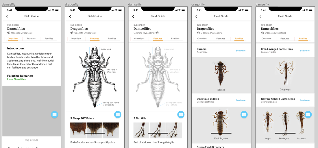 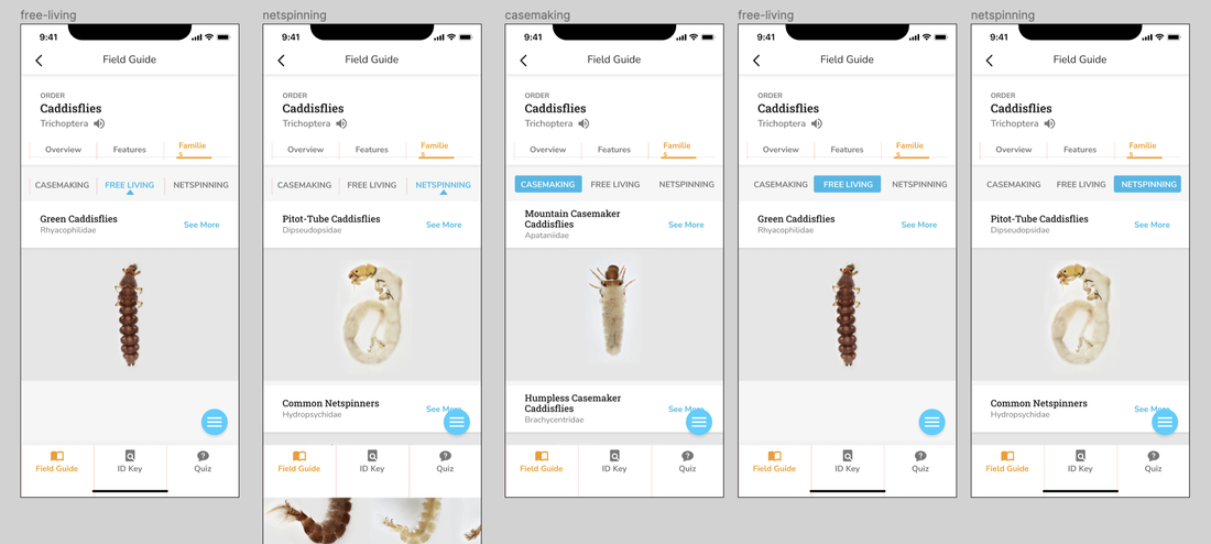 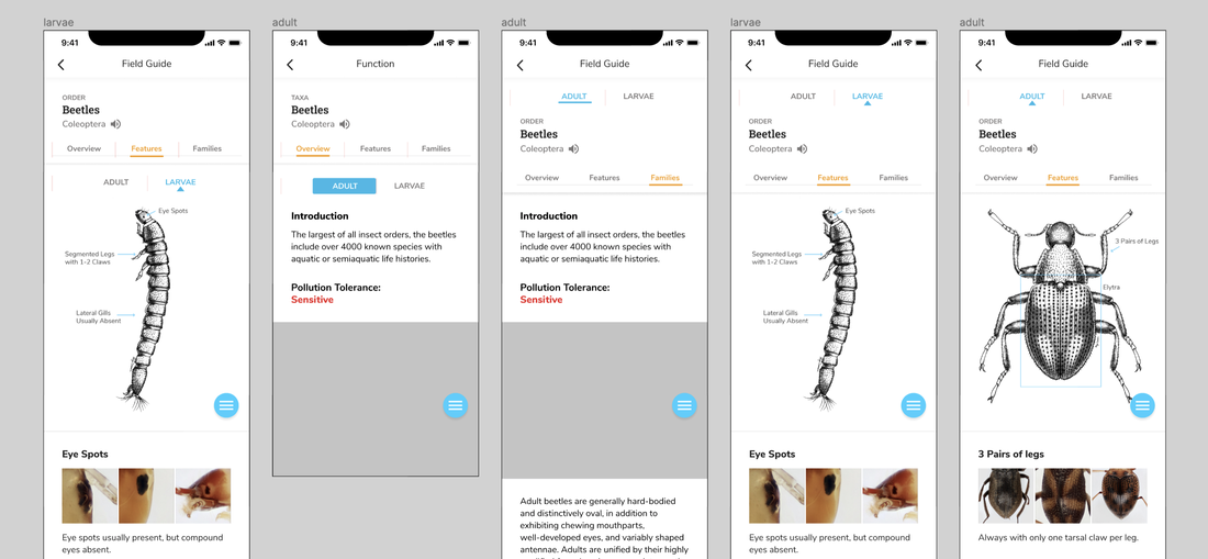 I also had to consider how components would fit in Orders outside of Mayflies. There are several important subcategories for identifying macroinvertebrates. Therefore, I had to separate Damselflies from Dragonflies, and toggle between the three categories of Caddisflies (case-making, free living, net-spinning). If there was a toggle for Caddisflies, then why are Adult and Larval Beetles separated into two different 'Order' pages? For the logic of the app structure, I grouped them back together; this meant we needed some toggle or filter system for Beetles as well now. Building the Design System 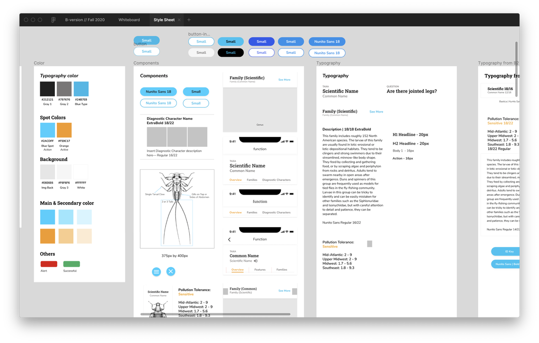 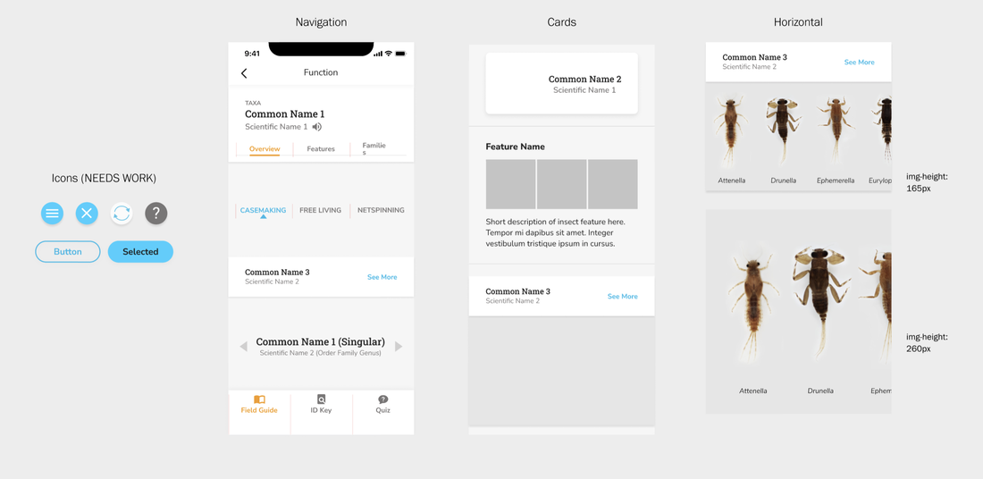 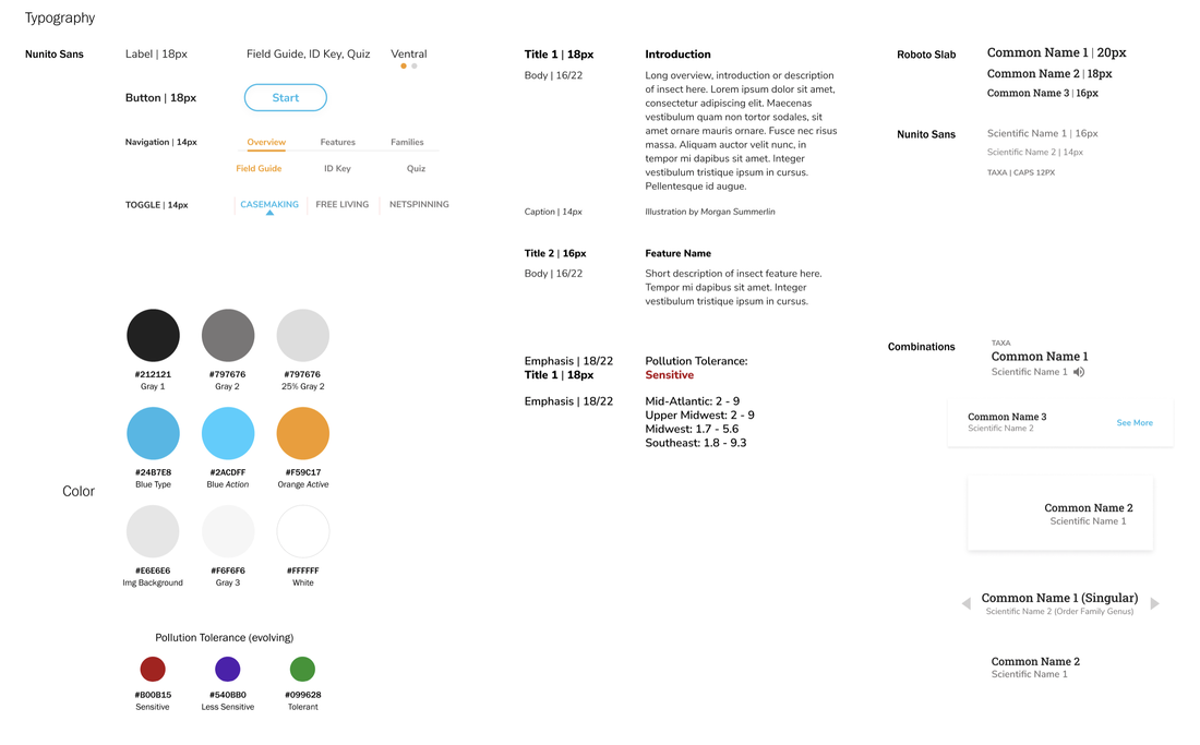 Throughout the semester, I've been creating and updating a style sheet, so that all of the components were the same across all of the many frames and pages. When redesigning components, I also consolidated and organized all of the visual elements and typography. (This... is a more tedious process than I previously imagined.) Field Guide Wireflow—All the Interactions 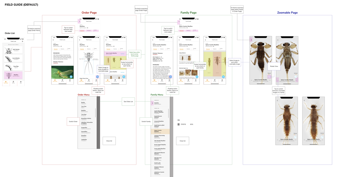 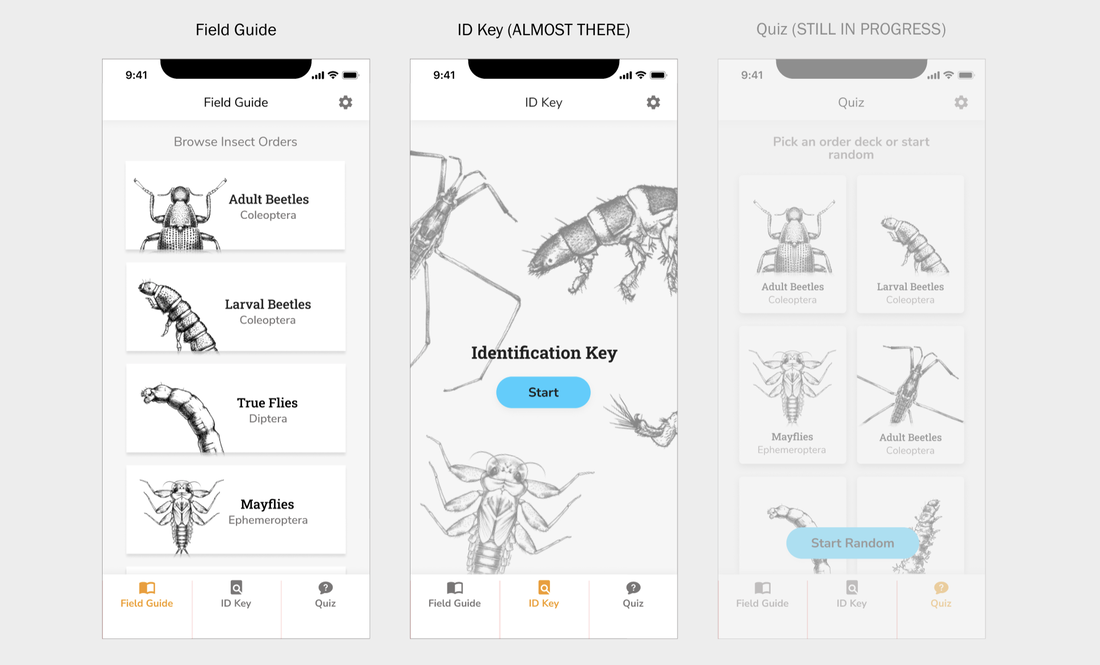 I also organized a wireflow for the team to understand the interactions of the Field Guide, so we're all on the same page. The three main functions of the app, Field Guide, ID Key, and Quiz, are also laid out for reference. A bit (and tedious) part of this project has also been organizing all of the resources, references, and assets for the developer and the rest of the team.
Comments are closed.
|
Project TeamAn interdisciplinary team Categories
All
Archives
June 2023
|
 RSS Feed
