
|
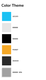
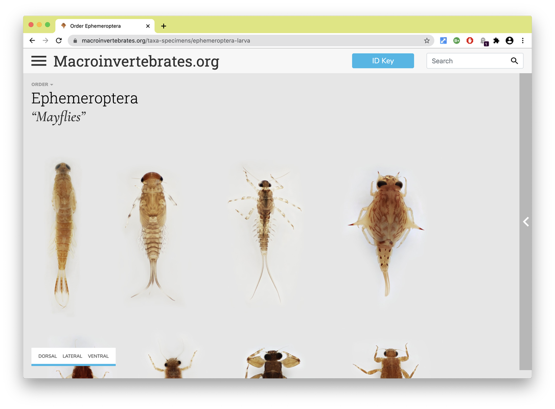
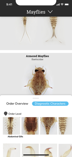
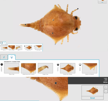
Personas are a common design research consolidation technique to make sense of user research data. Here findings from observations, interview transcripts, and organizational document analysis were synthesized and a set of representative user types were created to allow the design team an abstracted view of a range of user types, their needs, motivations and use cases to continually consider in decision-making as the design evolved . Below are a fictionalized set of personas we created based on our data to characterize typical users of Macroinvertebrates.org. Personas developed by CMU design student Adrian Galvin. By Estelle Jiang and Alice Fang 🐞📱Moving to a higher fidelity prototype by following the design system. After showing our low-fidelity prototype to the entire team and developers, we decided to move forward by applying a more detailed design and developing the visual + design system. We also figured out how to showcase the relationship between orders, family and genius on the mobile application, and the UI components for each type of 'page'. It was one of the biggest challenges we met previously. For the color theme, we followed the guidelines the project used on the website and applied the blue color to highlight actionable parts. To keep the app clean and concise, we used white for the major user interface design. As for the typography, the body font is Nunito Sans and the title font is Roboto Slab. Due to limitations with the database information, and in an effort to bring about the features of the specimen in photography, we also worked with the gigapan background color, creating a floating, borderless 'under a microscope' look [see image on the right].
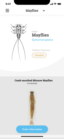
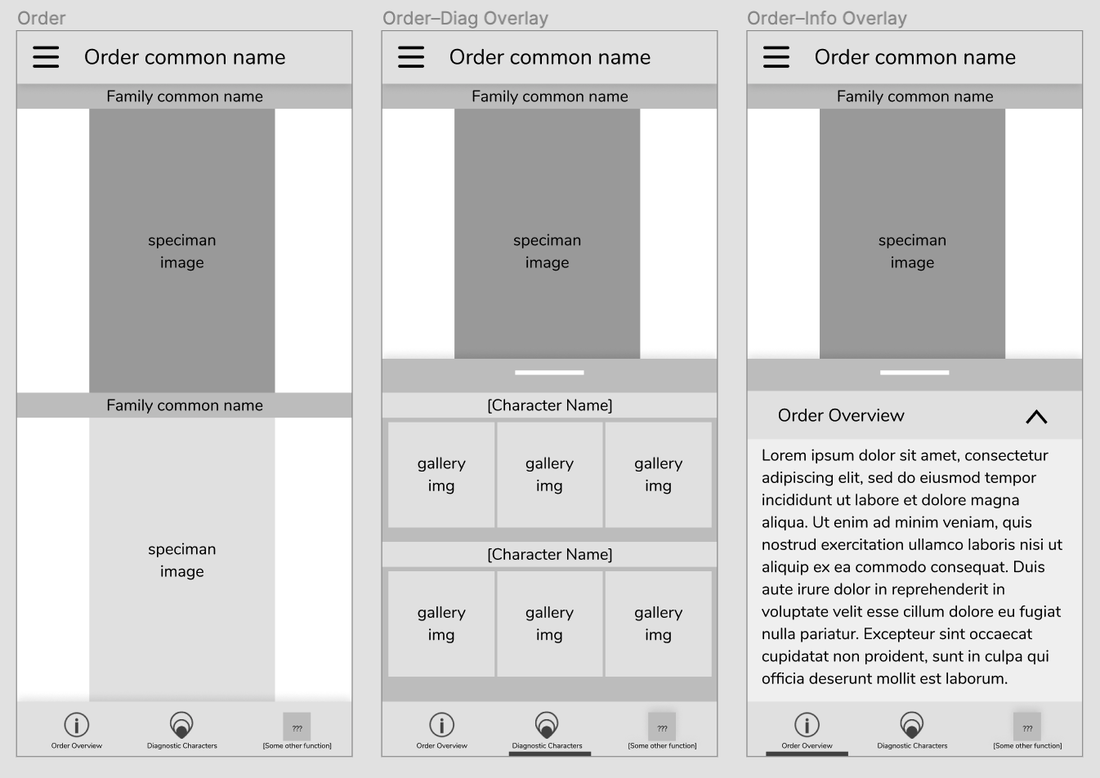
Changes we made for the high fidelity prototype after discussion: 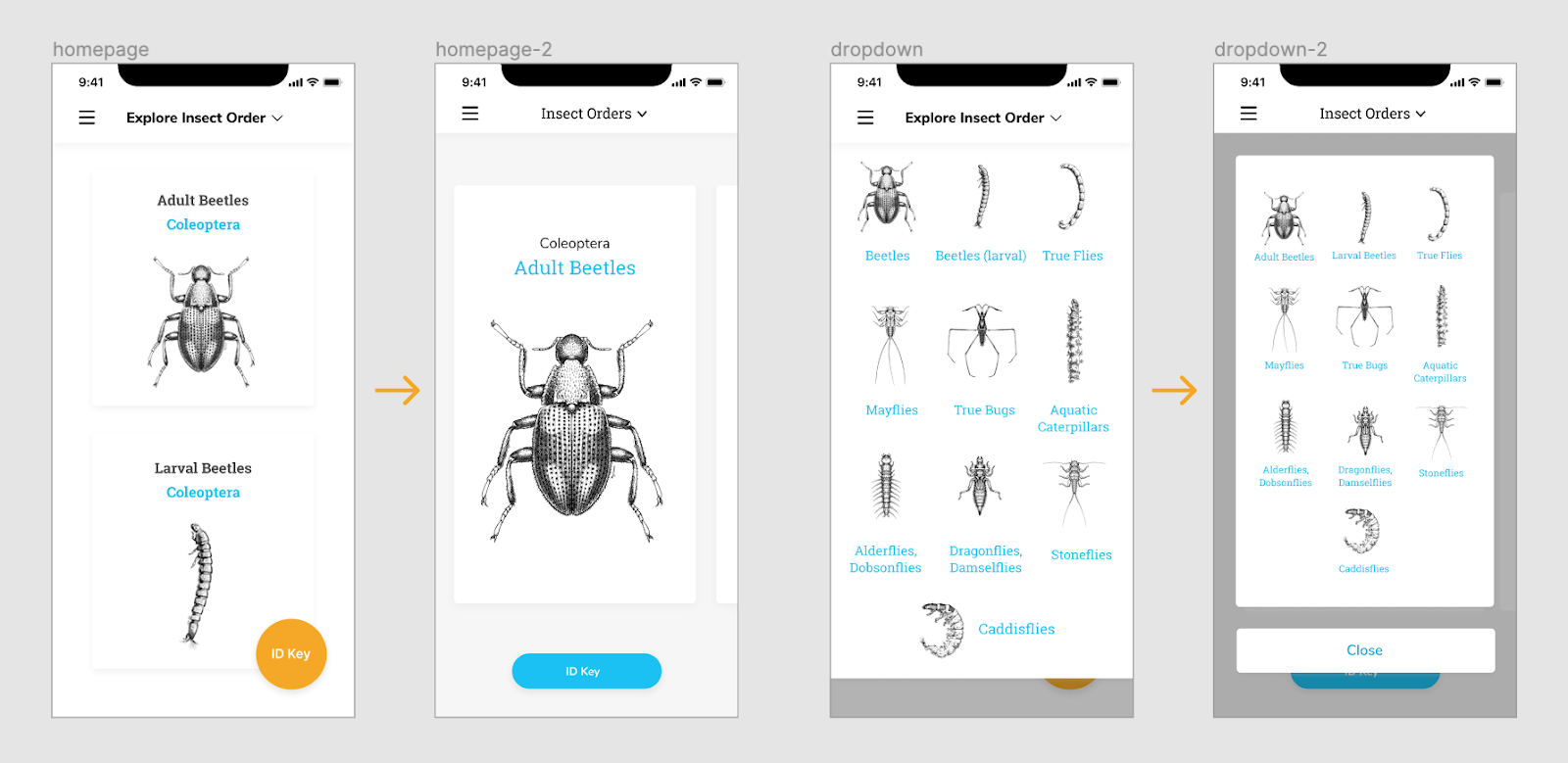 Homepage - We thought the card view can be bigger to attract people’s attention and intrigue their interest. Since we only have 10 orders, we did not have too many concerns about accessibility at the very beginning. The ID key button is also replaced on the home page. The dropdown menu was also changed to help user easily navigate and get back to main page. 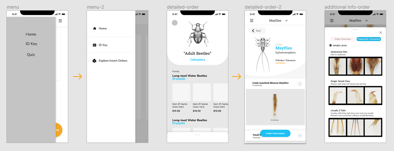 We also added icons to explain the functionalities and applied color for the side menu to make it stand out more. As we mentioned on the previous post, we were struggling between a button to expand, and swiping up. Since we were worried about the experience of swiping up which is too hidden on the bottom of the screen. we iterated and created a button on the bottom for accessibility instead. Planning and preparing first round usability testing To conduct our first round of testing, we started with writing the testing protocol, thinking about the purpose of the testing and the goals we want to achieve. The purpose of our testing was to test the logic of the user flows, and to identify potential navigation and usability issues. We wanted to understand if the application is engaging to users, and is useful in identifying macroinvertebrates and learning their characteristics. We assigned a few small tasks for users to finish during the testing: Pre-task: Users will be given 30 seconds to get familiar with the application before doing task. First task: Users are asked to browse the different orders though different ways. This way, we can then tell whether the design makes sense, and take note of how users navigate through the different levels of information. Second task: This task was focused on the detailed Order & Family page designs, users are asked to find out more detailed order and family information, as well as specific diagnostic characters for a specific family. By asking the users how difficult the task is, we can evaluate the slider design idea we had, and how accessible / noticeable the actionable button is. We also asked additional questions at the end of testing to check whether they can have a clear understanding about our application throughout the testing process, including:
Synthesize the findings to guide our next iterations. Overall, we conducted five user interviews, with macroinvertebrate experts, people familiar with the site, and a novice user; I also got feedback from my friend who knew nothing about the concept or field in order to get additional novice learner’s insights. Rather than use the normal user research method - affinity diagramming to synthesize the testing findings, Alice made the excel sheet to list out the key points the interviewee made for each task. It helped us highlight the common suggestions and feedback. 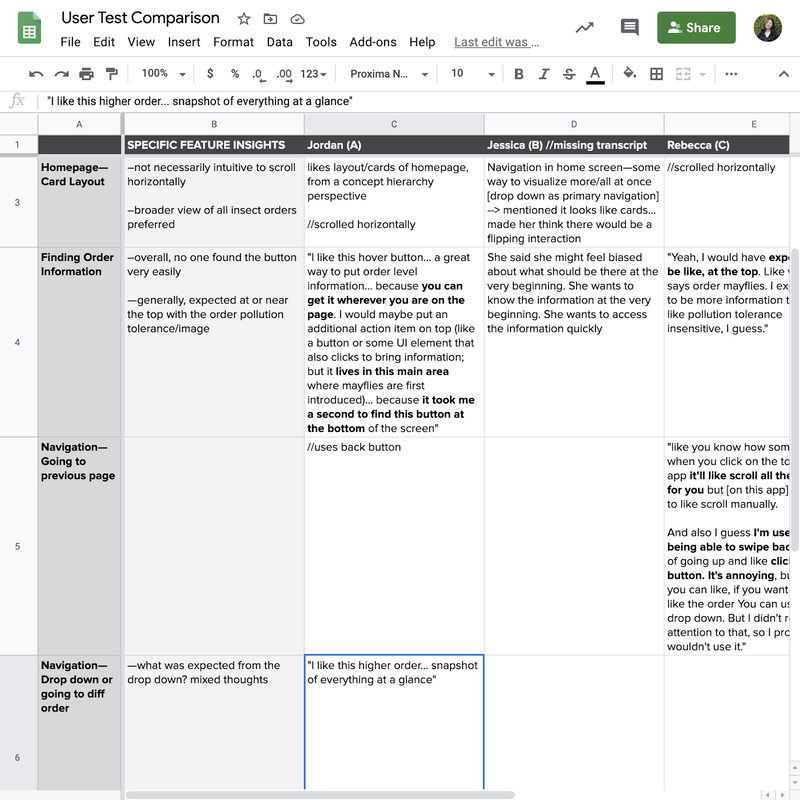 Here are the findings that guided our next iterations:
Iterations we made. Since the first version of high fidelity prototypes are hard for novice learners to learn and understand the additional information, I quickly brainstormed two other versions to display the information and hierarchy between orders and families. 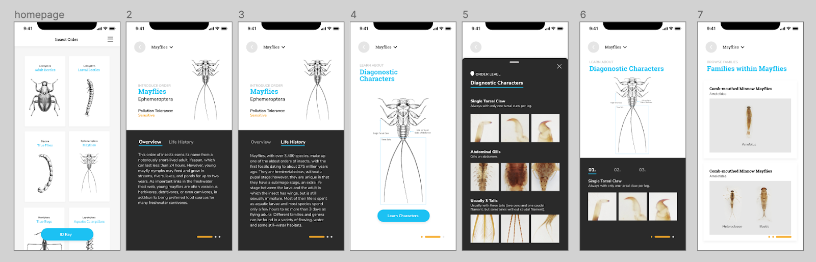 The first version allows users to swipe and learn along the way. The experience is more immersive and easy to follow if the users have no idea about the insect and the order. However, it doesn’t give enough freedom and choices for users to explore themselves, and quickly becomes repetitive for more experienced users. 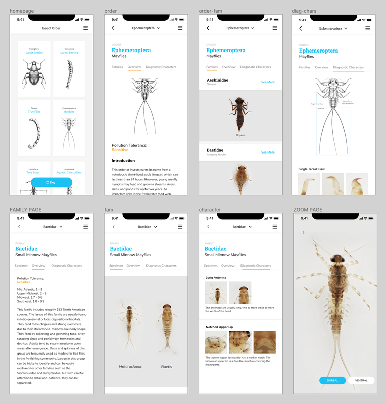 The second version can cater the needs of both experienced users and novice learners since it allows them to quickly switch between various levels of information. The structure of the insects are also easy to tell and discover. The homepage was also iterated from showing only one order to display multiple orders at once.
The developers moved forward with this version, and worked to develop a beta version. It was interesting and difficult figuring out how to work in parallel; they were focused on setting up the database and structure, while we were iterating through the designs, but we couldn't progress too far or change too many things after they began developing the pages. By Alice Fang 🐞📱Re-framing with a new team! Chelsea and I were joined by Estelle (Yi Cheng) Jiang and Dakota (Zi Qi) Dong in late May. Moving forward, Chelsea and Dakota will be working on development, while Estelle and I will be working on the design and user-testing of the app. There was an adjustment period as we introduced the project to the new members and got everyone acquainted while figuring out how to work collaboratively in a remote wfh environment. Through this process, we've been utilizing google docs and spreadsheets, as well as Figma, but coordinating between design and development has been tricky. Accommodating and synching the design and development timelines was difficult, and it was a bit touch-and-go. Spreadsheets and Organizing Data Previously, I struggled with establishing a structure to the app that allowed for navigation in and out of orders/families. To make the taxonomy clear (as we are non-scientists and non-bug experts), and to organize the information for design purposes, I created a spreadsheet with the following: 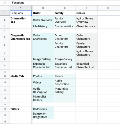 1. Inventory of functions that exist on the website In order to figure out the minimum viable product that can be developed by students within a summer, and to compare what needs to change from Order to Family, I listed all of the functions for Order/Family/Genus. 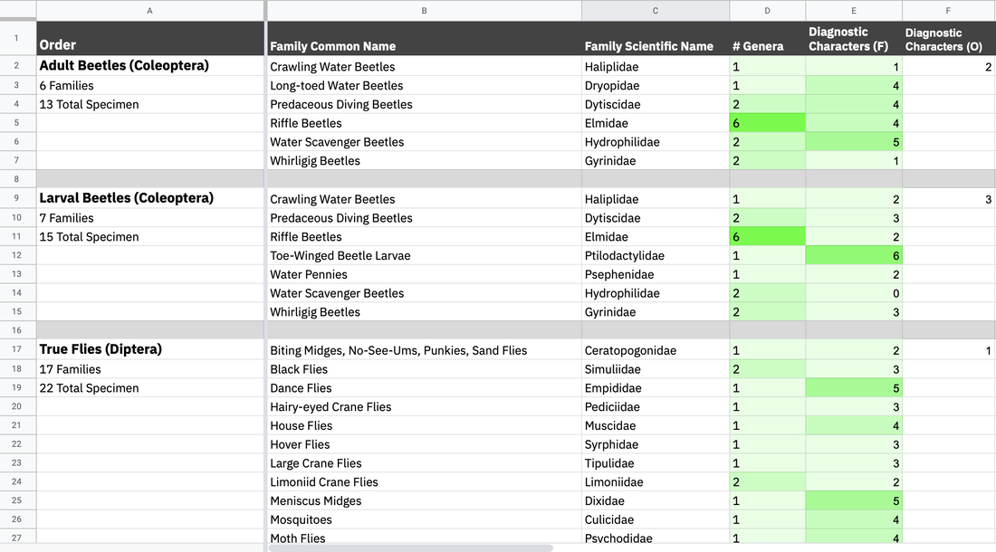 2. List of insect orders, the families in each order, and the number of specimen (genera) in each family, and the number of diagnostic characters for each family and order While many of the families have similar numbers of specimen, there were a lot of outlier cases we needed to keep an eye on, and account for while designing. The length of names, both common and scientific, impacts the typographic system, and the number of diagnostic characters affects how we visually set up that information. Some of the cases are as follows:
*Dev team has to set up the database (I don’t know the exact details). We ran into a challenge late in the summer [early August] where the Gigapan database had to be moved, and there was no way to extract some of the family traits and text information, requiring manual copy and pasting Collecting References and Resources for Ideation Round II Getting the design team on the same page. I showed Estelle the previous mockups and ideas that I had for the mobile app, but in order to refresh and sort of create a mutual visual language, we took the time to research and look at other apps. We compared and discussed field guide apps, quiz apps, and other text-based apps like news/media.  Estelle's feedback + insights 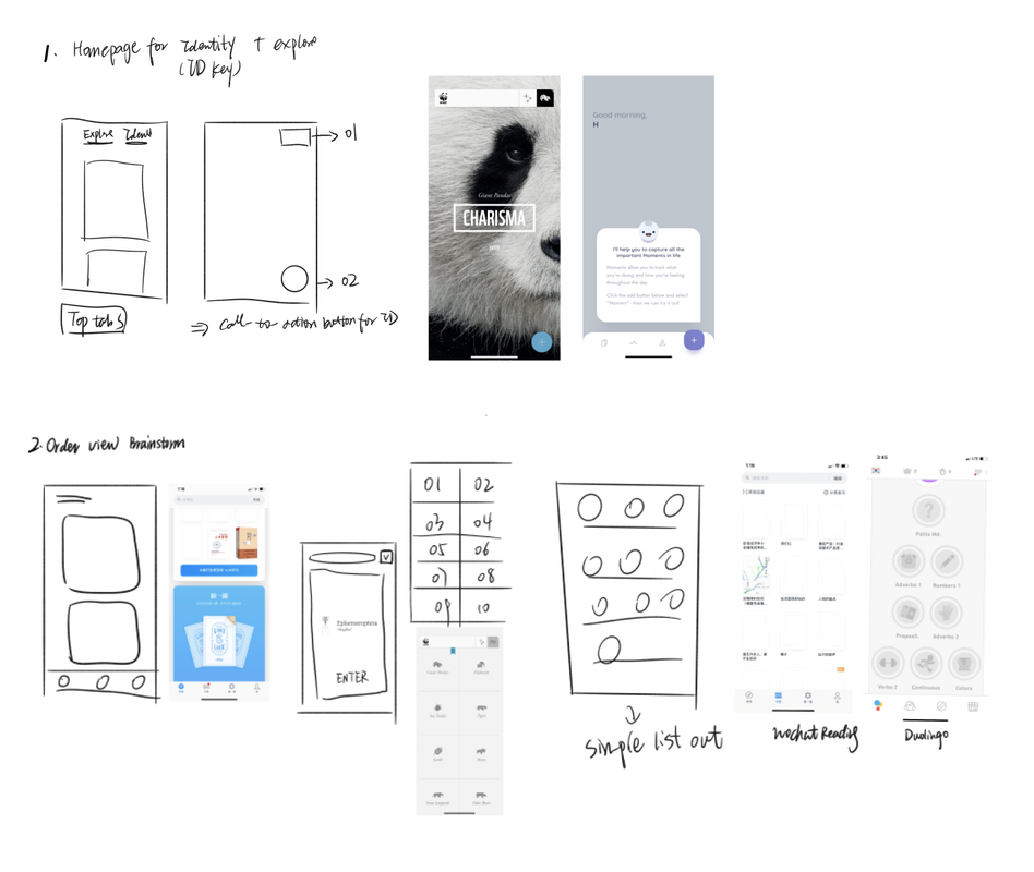 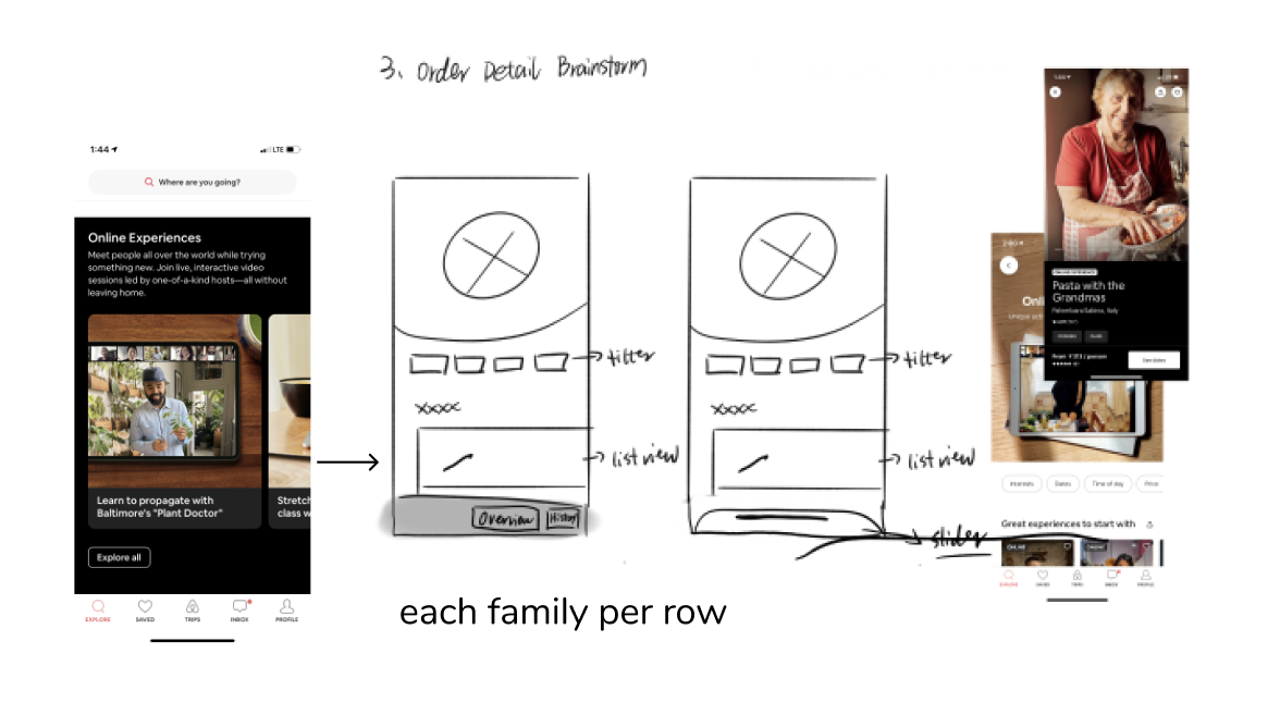 *Referencing Headspace, AirBnB, Medium, WWF Together Alice’s Points:
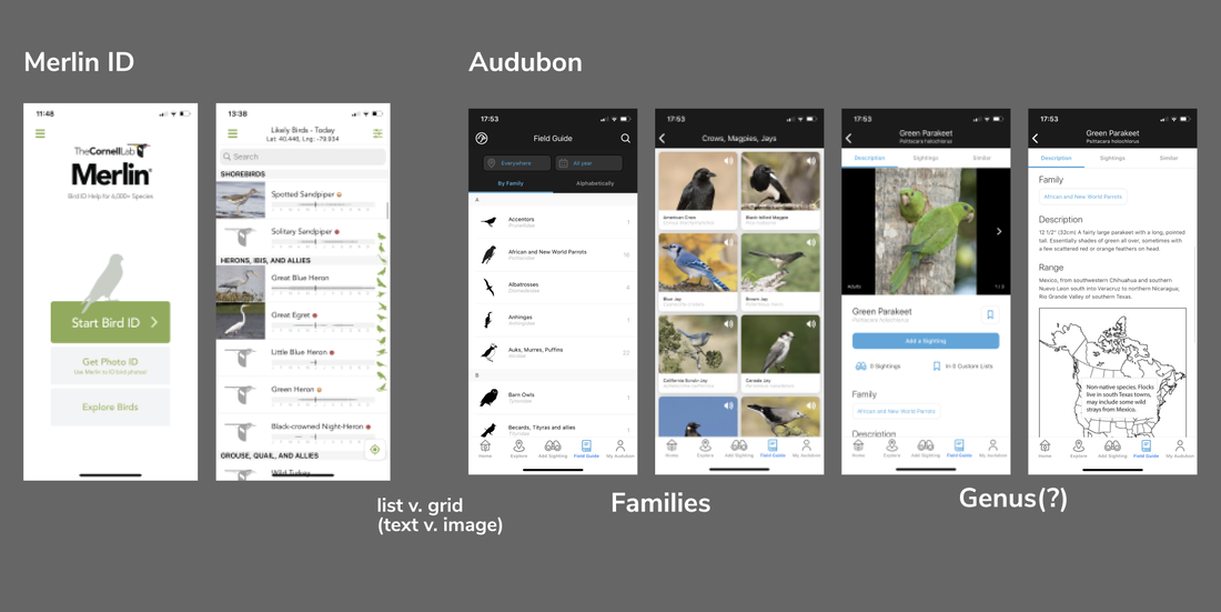 *Referencing Twitter, Google Maps, Medium Merlin ID, Audubon Lo-fi Version 2 New Ideas and Changes Estelle quickly mocked some basic page structures, and documented user stories. This allowed us to see possible entry points and user profiles for the app. What are possible ways people would use the app? What would they be looking for? And how do we prioritize that development at the same time? 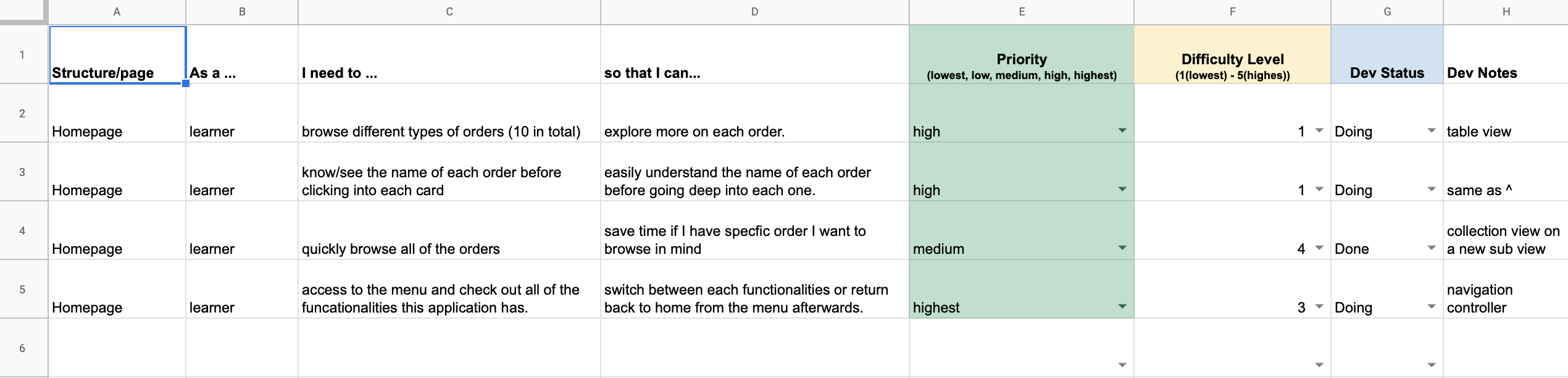 User Stories 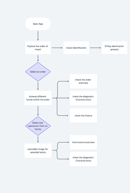 She also created this flow diagram of entry in the app and access points to different functions; however, it didn't include navigation and returning to previous pages, or other major functions we hope to implement in the future, like a quiz. 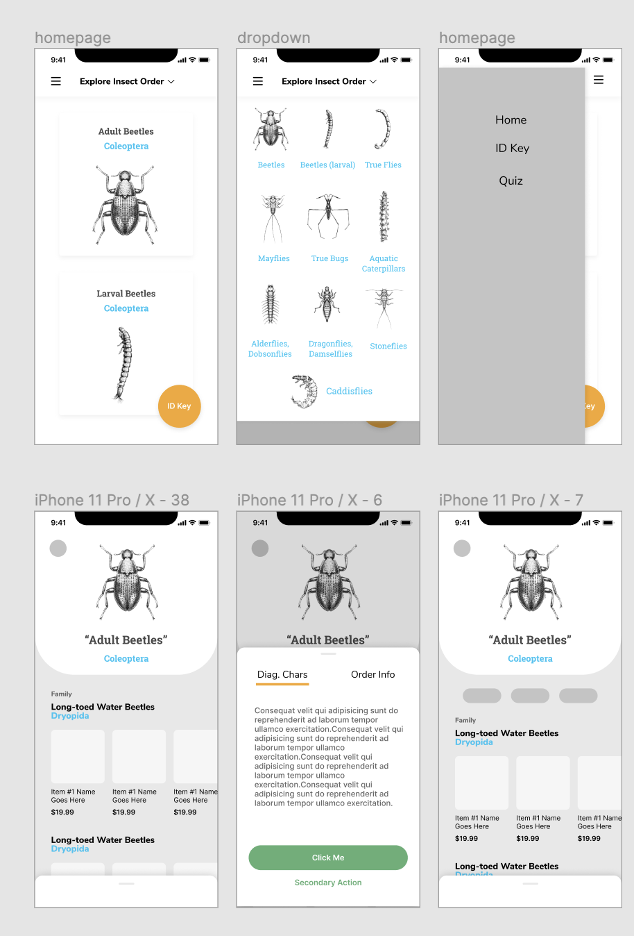 Home Page and Order Page Templates that Estelle created
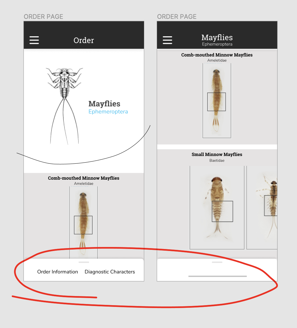 Scroll-up Popup for additional information, as well as an 'introduction' to the Order Page
*Comparing what a bottom pop-up that scrolls up, and a button on the bottom, would look like. Between a button to expand, and swiping up, we originally decided on a swiping up action, but were worried about the screen experience that it would be too hidden on the bottom of the screen. As we moved into user testing, we created a button on the bottom for accessibility instead. It stood out more, and for someone holding a phone, was located in a position that was easy to access. 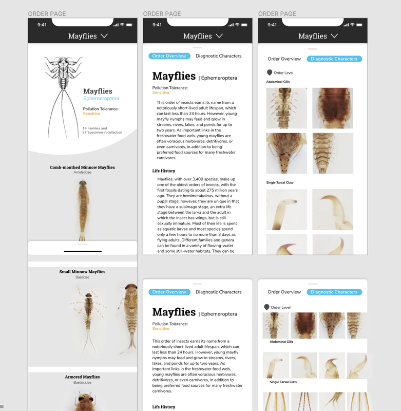 Through this process, we also started to get into the look and feel of the application. As the focus and beauty of the collection is the high definition images and close-up thumbnails, I really wanted typography to play a role in the visual style while staying close to what the desktop site looks like.
by Alice Fang 🐞📱 A little after spring break, Chelsea and I started on conceptualizing and developing a mobile app version of Macroinvertebrates.org, which we will continue to work on into the summer. The original question we started with was what should the app do? (and what can we do to create a minimum viable product as a 2 person group?) The primary functions of the site that could be reflected in a mobile app were:
Primary Goals for mobile: learning orders! and providing access when you don't have internet connectivity (creating a lighter weight, downloadable version) A mobile version of the ID Key was already prototyped by Jaclyn last year, so the majority of the focus will be working on integrating Order and Family level information. Based on how far concept/prototyping goes, we may also integrate a practice quiz as well. 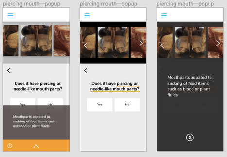 Different ways of showing 'additional information' The first issue we ran into while refining the ID Key was the number of cases that the original design couldn’t accommodate for. For example, in the ID Key on the site, there were a few questions that examined/compared two different physiological traits ("wings OR wing pads", instead of just "wings"). How could the gallery of characteristics show images of both, and how should the help button appear to show both text explanations as well? This was the first (and definitely not the last) time where I struggled designing for mobile, instead of desktop or 'website on mobile.' I don't have much experience in designing a purely mobile app product, so I'm excited for the challenge and learning experience. Areas that need resolving as we move forward!:
Looking at Mobile Interactions 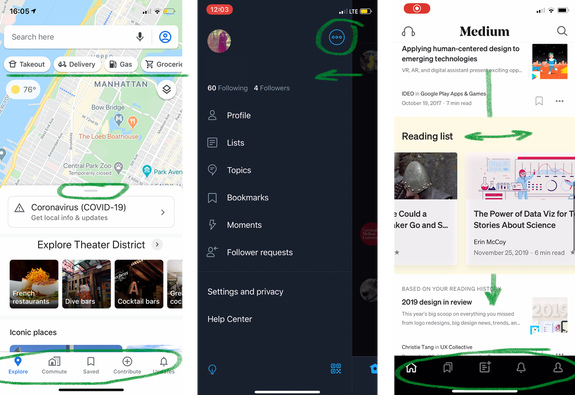 Google Maps|Twitter|Medium I took note of some common features of mobile apps to help structure our app as well. These are some references that could help with structure/organization.
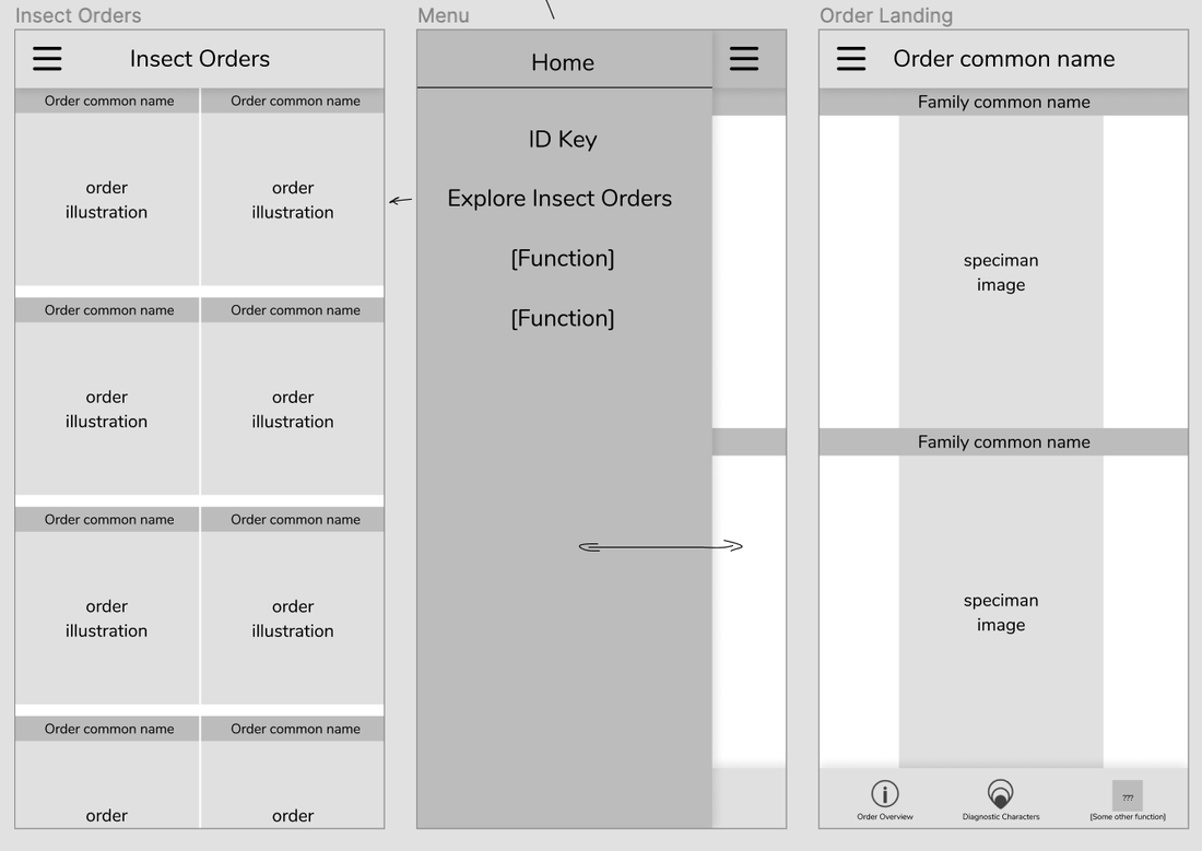
Organization + Hierarchy 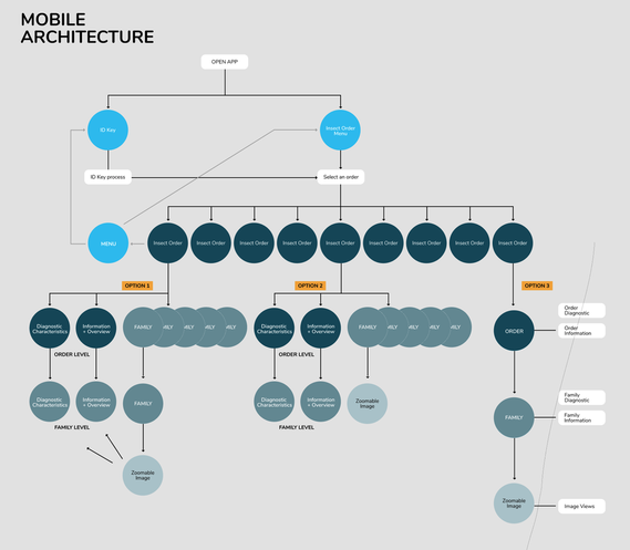 Trying to figure out how everything fits together Once a user selects an order, the organization from Order > Family > Zoomable Image (Genus) becomes a little confusing. Should the user be able to select into a family page (option 1) or does it lead directly to the zoomable image? At what level is family-specific information displayed then? *We established early on that Genus-level information was probably too specific for mobile, trying to keep the app more general
By Emily Chan, Summer 2019 NSF REU One of my main projects this summer was designing a practice game that leveraged our large collection of high resolution images for volunteers to practice identifying macroinvertebrates. BACKGROUND A tool for practicing macroinvertebrate ID has been one of the most requested features by volunteers and educators alike. Before getting started developing a game, we took a look at the current resources available online. While there are an abundance of identification-based practice games on the internet (though hardly any for macroinvertebrates specifically), many of these games have similar designs that use low resolution images or generic illustrations, have little possibility for user visual interaction, and use a handful of example specimens that never change, meaning users can usually only play the game once or twice before being able to memorize the answers. In addition, usually only four choices of answers are provided, multiple choice style. Examples below: In contrast, when conducting ID activities in authentic citizen science practice, volunteers need to be able to identify a large number of macroinvertebrates that may be sampled from a stream, to work around variations in size, shape, and color, and to be able to choose the right identifier from a large list of choices. Our goal in creating this game was to simulate authentic practice, so our design for this practice game was informed by the identification process for water quality monitoring, and the biotic indices used by volunteers to classify macroinvertebrates. PAPER PROTOTYPE One of my goals was to keep the game as similar to the actual website as possible, so that it’d be easy for Chris to actually implement. Therefore, my first prototype mimicked the panel design developed by Alice. Every mystery specimen would be a genus-level page, with the text in the panel replaced by a question panel. The key ideas in the paper prototype were: the game goes on indefinitely until you choose to stop (in order to take advantage of our large collection); after you finish, it compares the water quality rating you would have calculated based on your identifications with the actual water quality rating; it uses the diagnostic characters as hints; when you get an answer wrong, it provides information about the differences between the answer you chose and the correct answer; and it has all the same zooming and changing view functionality as the regular site. Though every single practice game I looked at provided four choices you could choose from, it seemed that this might not make sense for our game--if the choices were randomly selected, we might end up in a situation where the user is asked to identify a mayfly, and the choices are clam, leech, beetle, and mayfly. Having choices that don't actually look similar to the specimen isn't particularly helpful for the user's learning, but if we wanted to only show visually similar choices, someone would have to manually create the choices available for each specimen, which seemed excessive. In addition, in the actual scenario, volunteers need to choose the right identifier from a very large number of choices. Therefore, I sketched a multiple choice version as well as a version with a dropdown menu. XD PROTOTYPE 1 We collected feedback on this first XD prototype at the Macroinvertebrates.org site launch event, allowing educators and trainers to play around with the mockup and asking them about their thoughts. Their main concern was whether the game would be leveled--suggestions included student, volunteer, and expert levels. Who the target audience is turned out to be a central question that the game still struggles to fully address. We chose to focus on volunteers, and get a working version of the game for that audience first. I also considered whether it'd be useful to separate by region or ecosystem (like the Cornell Bird Quiz does), but I didn't have enough information about who'd be using the game and what they'd want from it to make a judgement about that. We made some additional minor changes to the design based on suggestions, such as bringing the diagnostic characters back on the correct/incorrect page, including an illustration of the wrong answer as well (i.e. a small illustration of stoneflies next to "This is not a stonefly"), and trying alternatives to "incorrect" (e.g. "try again", "sorry", etc.). XD PROTOTYPE 2 After getting feedback on the first XD prototype at the Macroinvertebrates.org site launch event, we made the following changes: XD PROTOTYPE 4 For the next prototype, we decided to make use of the annotated illustrations that we had available (with the text enlarged) to replace or complement the informational text. XD PROTOTYPE 5 After consulting with Chris, our developer, we shifted towards a tab-panel design, to maintain consistency with the genus level pages and to make developing the game easier. The hints were shifted to the second tab, similar to the genus-level page, and the third tab would either be an "About this Game" tab, or a score-keeping tab. SPLASH SCREEN Chris also informed us that the instructions and results would have to be shown on a splash screen. Below are examples of splash screens we considered: XD PROTOTYPE 7 After getting more feedback from Tara, we decided to add a list of the ones you'd gotten incorrect in the third tab, with pictures of the specimen and the correct identifier. She also advised us to shift away from having the game be a simulated stream dump (i.e. calculating a water quality rating at the end), and rather focus simply on identification, since there were so many different systems and standards used to measure water quality. ICONS Examples of different icons we considered for the tabs: FINAL PROTOTYPE Minor changes for the final prototype included simplified icons and adjustment of the correct/incorrect screen. FEEDBACK + RECOMMENDATIONS FOR FUTURE CHANGES As it stands, the current game live on the site still needs to have the list and images of the incorrect specimens added, as well as small changes such as adjusting the category names (i.e. "Net-Spinning Caddisfly Larva" to "Caddisfly Larva (Net Spinning) "), swapping in illustrations with larger text, etc. Another major challenge is finding a more elegant way of dealing with the "None of the Above" category. User said that they enjoyed the challenge of identifying uncommon specimens, so I don't think that omitting specimens that would fall into that category is the solution. Since most of the "None of the Above" specimens were either true bugs or fly larva, one user suggested a "True Bugs" category. If future changes are to be made, I would recommend adding a "True Bugs" and a "Fly Larva (Other)" category. Other user suggestions included adding scientific names, since many who used the game were more familiar with scientific names over common names. However, the majority of user feedback centered around the lack of levelling in the practice game. Since the users were recruited from a broad base of experience levels, many wished that there was an expert version for identifing to family or genus; while others noted that they hadn’t been taught the distinction between particular taxa levels of macroinvertebrates, and felt such categories could be confusing. Future work includes producing a “student” (order-level) and an “expert" (genus) level game. Users praised the custom-written informational text and illustrations on the correct/incorrect screen as well as the zoom and hint functionality. In our sample, no users expressed issues with the tab structure, start screen instructions, or the indefinite nature of the game, which were design choices we sought to validate. EXAMPLE EXPERT-LEVEL PROTOTYPE by Chelsea Cui, CMU undergraduate researcher Hi, I'm Chelsea, a third-year undergraduate in Information Systems with a double major in Statistics and Machine Learning. I started on the macroinvertebrates.org project last fall because I was interested in building platform that assists people with online learning. Since I started, I have worked on a few different parts of the project, including log file analysis and development of the mobile app. Right now, I'm working with Jamie to build an interactive Order level key.
We want something to help new users who don't know the insects very well. I took the initial layout by Jamie and made clickable versions. With HTML and CSS, I added hyperlink sections to the couplets in the key, and also implemented pop-up windows on each of them to show the corresponding diagnostic characters. This version is just a quick prototype. I am doing usability tests right now to get feedback before making the final design. In the first round of tests, I found out that our current key design doesn’t look interactive enough to many users. Users may not think the key is clickable because the buttons are kind of simple and plain. For the next step, I’m planning to focus on the interactive design and create several different versions of the key to do more usability tests. The initial version of this key is live on the new site now. Check it out here! (http://macroinvertebrates.org/key). by Jessy Ma, NSF Research Experience for Undergraduates intern, Brown University One of my main projects this summer was to design and develop a mobile companion app for macroinvertebrates.org. Initially, I had to decide whether to make a reference app that would essentially give information like the website does or make a game that would allow people to practice identification. I got feedback from my mentors, and at this point I had also started conducting usability tests for the alpha version of the website, so I got a feel for what users would use the site for and what was most important to them. I decided to do a reference app that would be a simplified offline version of the site, since this would be most helpful to people doing identification out in the streams, where Wi-Fi and cellular service can be unreliable. In order to scale the site down into a mobile app that can be used offline, I had to figure out which features on the site were most important to include and how to include them without compromising user experience. I iterated my design a few times based on feedback from my mentors and from website usability tests, and once I was happy enough with the design, I conducted usability tests with the Young Naturalists at Pittsburgh Parks Conservancy. Here is an example of how one screen (the full specimen view) changed throughout the process: 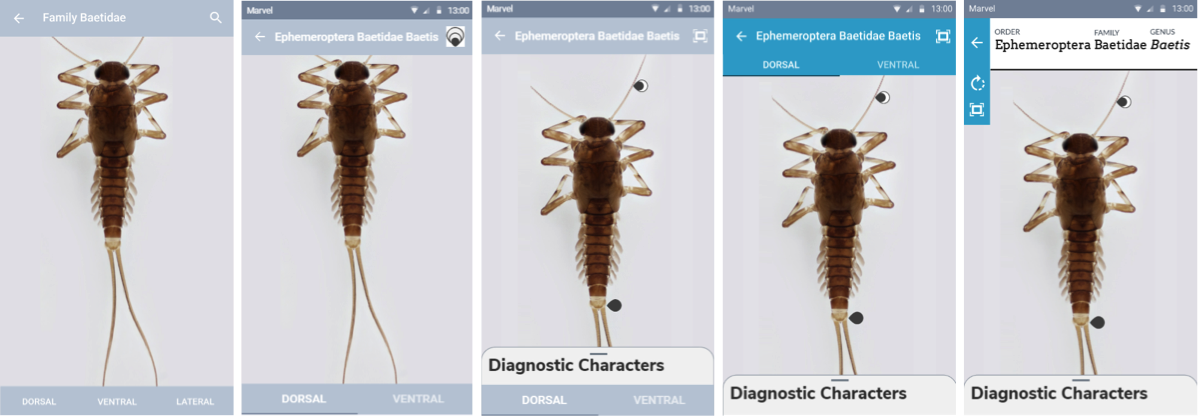 The changes I made after the Young Naturalists' feedback are the final iteration displayed on my poster, which I presented at a poster session with all the other HCII summer REUs. 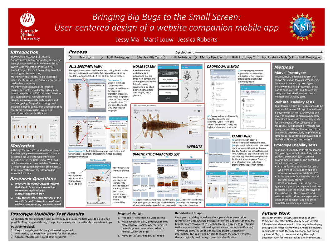 After I had already submitted my poster, I had a meeting with the designers of the website and made further changes to the prototype, which can be found here: https://marvelapp.com/db804b9/.
Because it has yet to undergo usability testing, the current design is not final. Next steps would be to do more usability tests on the prototype, make any necessary changes again, and finally develop the app. I had started development using React Native, a framework created by Facebook for building apps using JavaScript and React. However, the design has changed drastically, my time on this project is ending, and I am a beginner to app development, so the best way for this app to be built successfully is if someone with app development experience takes over. Once we find that person, they will pick up where I left off and hopefully turn my design into reality. by Jessy Ma, NSF Research Experience for Undergraduates intern, Brown University I conducted 8 usability tests for the alpha version of macroinvertebrates.org. Participants consisted primarily of people who had previously expressed in a survey that they were interested in usability testing for the website, so most of them were relatively advanced in macroinvertebrate identification. My interviews were conducted in four main parts: opening background questions, unguided exploration of the site, site tutorial, and closing questions. Overall, participants gave positive feedback. Some of them had used the older version of the site, and others were seeing macroinvertebrates.org for the first time. Most thought the site was easy to use and especially liked how interactive and high-quality the photos were. Many suggestions for improvements to the site were made, shown below. The most commonly suggested changes were adding tooltips (hover boxes) to the set of view control buttons in the upper right, making the blue plus sign more intuitive, making the expanded character list more noticeable, and making the flip arrow button more intuitive. Many of these usability issues could be solved by having a site tutorial video or popup tutorial boxes to guide users through the site when they visit for the first time. Certain features of the site that often went unnoticed or were hard to find, such as the blue plus sign, expanded character list, and flip arrow button, would benefit from redesign. Changes were constantly being made to the website, so some features had already changed by the time I conducted my last usability test. For example, the expanded character list was moved to the Diagnostic Characters tab, and glossary hyperlinks were added to the overviews and expanded character lists. Some people requested that certain information be added to the site. Multiple people wanted a ruler/scale to show size reference, more information about life span and different life stages, and location/distribution maps. People also pointed out that the site’s information is so thorough that it may be overwhelming for beginners. Overall, however, people were very happy with the site, said it would be useful to them in their work, and were excited to share it. 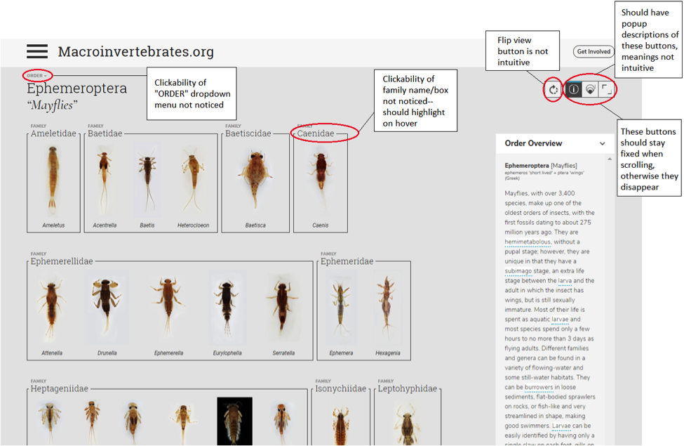 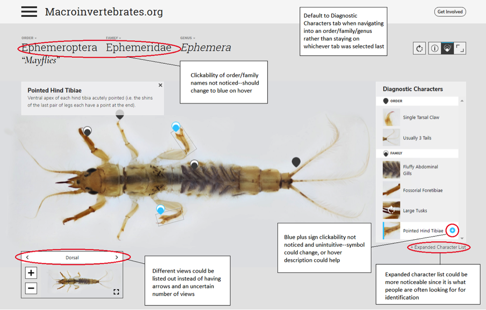
By Jen Liu
The Diagnostic Charactier (DC) annotation tool we are developing for the Macroinvertebrates.org project builds off of the original Interest Point (IP) annotation tool which was developed for museum curators to create, edit and manage the multimedia content overlays associated with interest points placed at set zoom levels in a high-resolution, multiscalar image (e.g. CMNH/Stories in the Rock, Museum of the White Mountains/Beyond Granite).With funding from the Benedum Foundation, Meadowcroft Rockshelter & Historic Village is currently using the IP Tool to annotate gigapixel exhibit images of their archaeological site in Western Pennsylvania that contains evidence of the earliest human presence in North America for online learning. Study Purpose To get a better sense of the disciplinary content management, curation and annotation requirements of different subject matters, we conducted a semi-structured task analysis with Andrew Donovan, the Program Coordinator at Meadowcroft via a video call. He is currently using the tool to annotate Gigapan images of the site to be used as an educational tool for teachers to use with students before and after visiting the Meadowcroft Rock Shelter national historic site. |
Project TeamAn interdisciplinary team Categories
All
Archives
June 2023
|
 RSS Feed
