
|
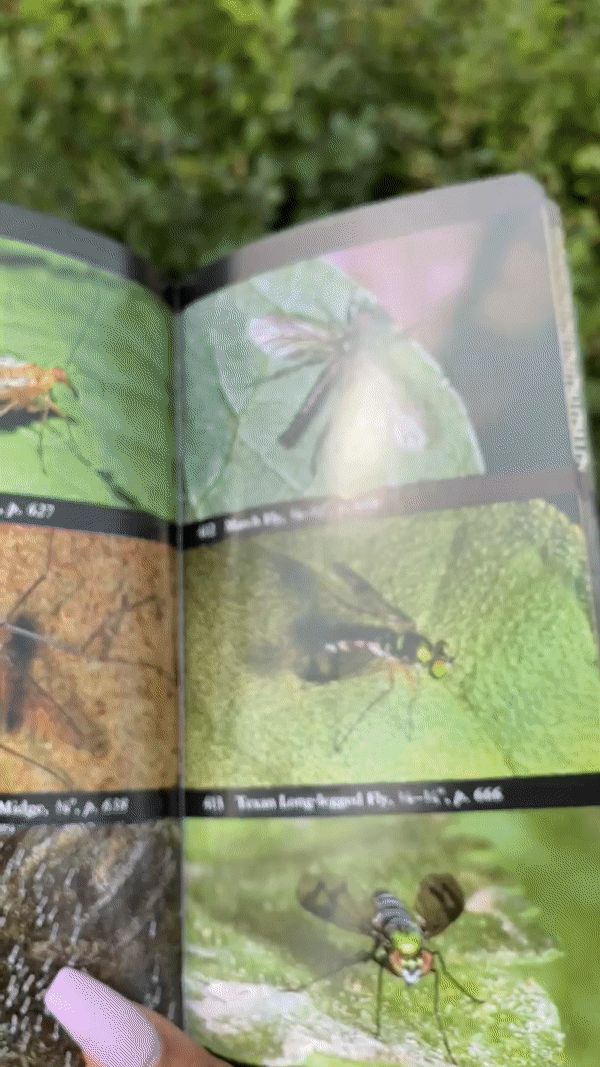
By Dominique Aruede, CMU Cognitive Psychology When I joined, the quiz section had not been developed at all in favor of refining and refreshing the ID key and field guide which are more directly interpreted from the original website. Consequently, it was important to gather human-centered data again in order to assess the efficiency of the current design and determine if we could branch out to the quiz or keep working on the current designs. First Task: Audubon Field Guide Walkthrough & Modeling I spent a little time doing some exploration with a physical field guide and noting how it maps to real-world use and facilitation of citizen science. This step was particularly useful for getting my bearings on what the purpose of the Macroinvertabrates.com project is, how insect identification fits in, and how it works. Second Task: User Testing We conducted several user tests on insect ID experts and novices alike, with a focus on novice user experience from high schoolers and other young students. The purpose of these usability tests was to gauge the design direction of our second iteration and to gather more user input to launch into the next iteration. We reused the protocol from the first round of user testing and changed the questions to capture answers on our new inquiries:
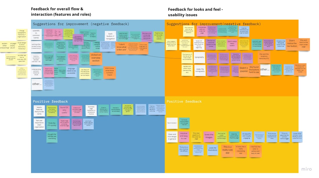
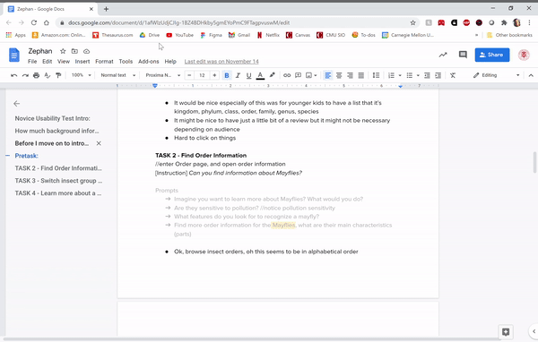 The results revealed to us that the field guide was indeed informative, but subsequently neglected some utilitarian features that would be helpful for novice users. This helped to inform the learning goals and first iterations of the quiz design. Below is an affinity diagram of the synthesized insights. It includes
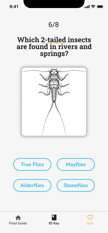
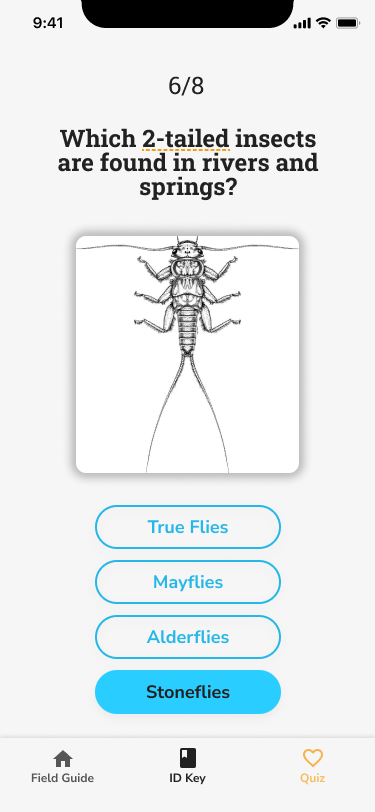
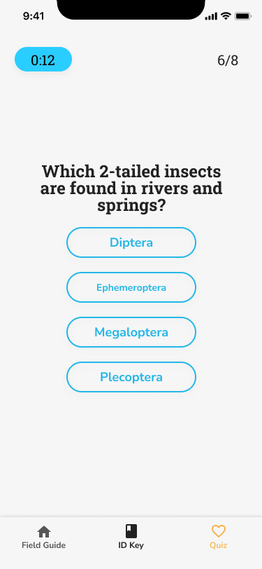
 Third Task: Quiz Design The earliest version of the quiz was a rough sketch I drew up in Figma, but it did not have any learning goal or research claim behind it besides identifying some image as belonging to an order. These are the sketches below.
After further visualization, we wrote out the learning goals we thought would be the best to target in quiz mode based on the insights gleaned from the previous affinity diagram. The learning goals are summarized here:
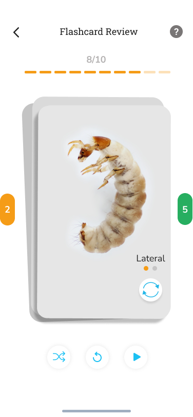
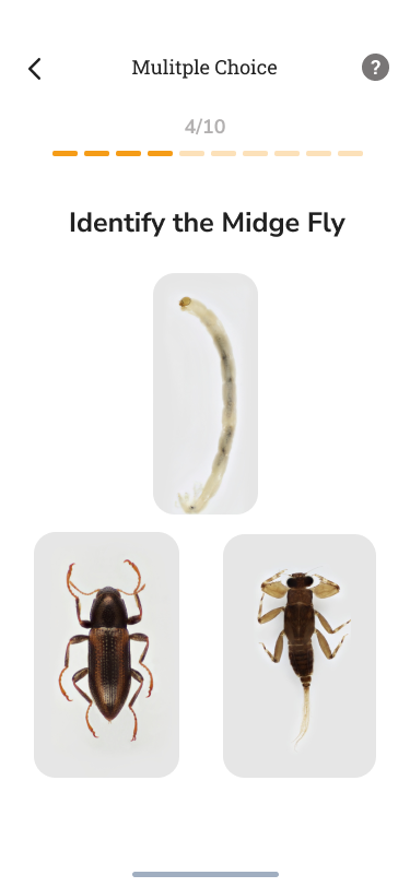
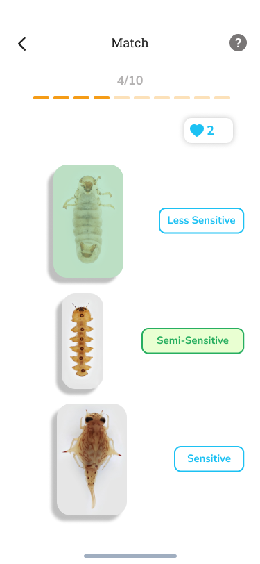
After we gathered our quiz references, including Quizlet and Duolingo, we used our learning goals to consolidate designs for one flow of the quiz section. Users select their quiz type first, then their learning goal. An alternative flow that we are yet to explore involves switching those two options. Then we incorporated three quiz types: a flash card review, multiple choice quiz, and a matching quiz. We drew this up on Figma and discovered a few issues/limitations
Afterwards we consulted our collaborator, who is an expert in aquatic macroinvertebrate education to give her opinion on the content and direction. From her insights, we decided to scrap learning PTV as a learning goal due to the inaccuracies of generalizing at the order level.
The next steps we plan to take include developing all the content necessary for accurate quizzing, fleshing out the flashcard review, the between order quiz learning goal for all quiz types, the common features learning goal for all quiz types, the common mistakes learning goal for all quiz types, exploring a new learning goal: “learning life history and fun facts about insect orders” as a deck in the flashcard review, and testing the usability and flow of our current design. By Alice Fang, CMU Design 🐞📱This semester, I've also been working on the design of the ID Key. As the Field Guide became more refined, we knew we had to focus on the other aspects of the app, less the design becomes incoherent. With previous key designs, we didn't really explore the edge cases, focusing on one prototypical 'question' and hint structure; soon I learned this question layout would not work with most of the interactive key. Previous Design 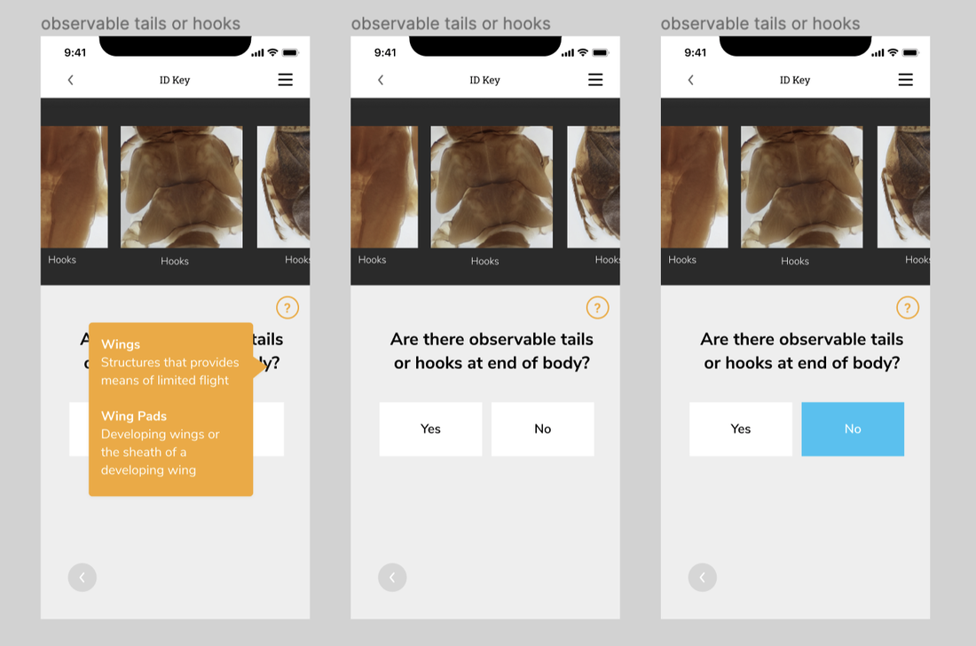 Questions we were grappling with over the summer:
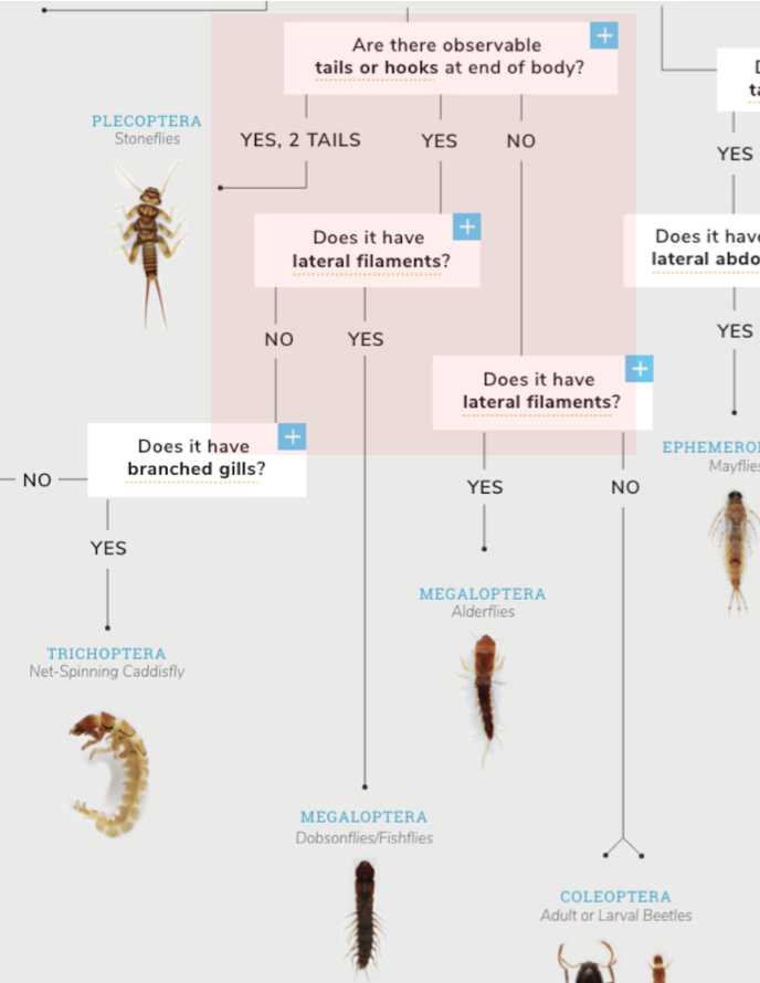
Low-Fi Flow 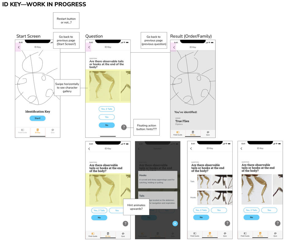 While refining the first wireflow for the Field Guide, I began thinking about the interaction flow of the ID Key in its most basic components using the visual style of the Field Guide. The simplest flow for the ID Key is a start page, a question page where the user has to make a choice, an optional hint, which will eventually result in identifying an Order, where the user can jump to that Order in Field Guide . Issues 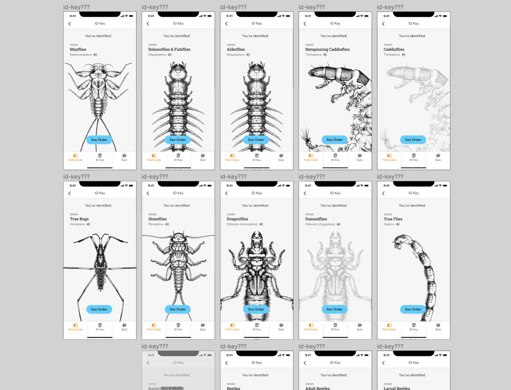 I began to mock up a flow with all of the questions and paths, in order to design the end pages for each decision; at this point, I discovered some discrepancies with the website’s ID Key
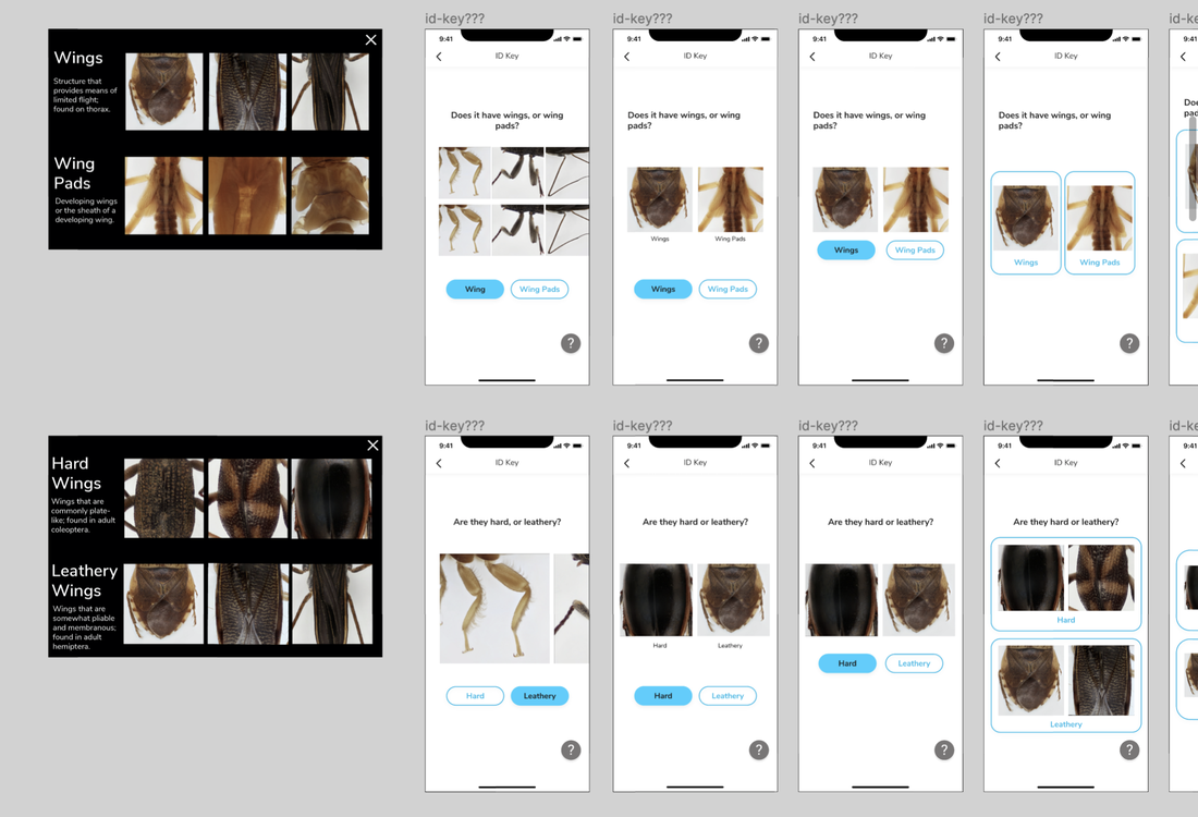
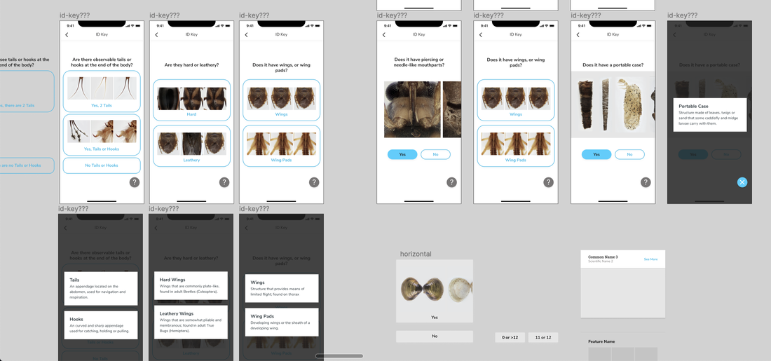
Button Explorations 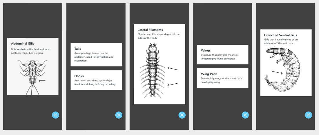 As with the rest of the app, to take advantage of the unique-ness and affordance of Macroinvertebrates.org's photography, the ID Key takes an Image-forward approach. For the Key, this means taking the images from the cards on the site ID Key and bringing them to the actual questions on the mobile app. In doing so, what do the hints look like now? Are they just text definitions?
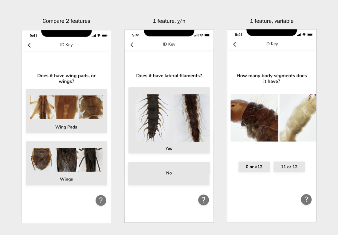 In the process of mocking up different questions, I realized there are 3 general types of question pages, which would need to inform the type of button they had. The three types of questions are: Yes or No for 1 trait, variable answers for 1 trait, or choose between 2 traits. How can I design a button that a. looks clickable and b. can still show a range of photographs? I didn't want to use one 'prototypical' image to represent each trait, because part of the beauty of the collection is being able to see the range of differences for a single trait. Wing Pads look different across different Orders, as do Tails. Another button design I had to work out was representing the ~absence~ of a trait. The original key design had one image gallery, with choices underneath it; however, in choosing between Yes and No, it felt like there was some disconnect between seeing the trait, and then clicking 'No.' Current FLow 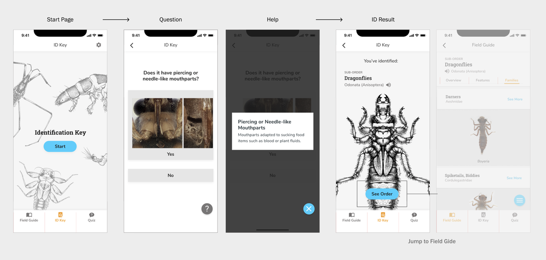 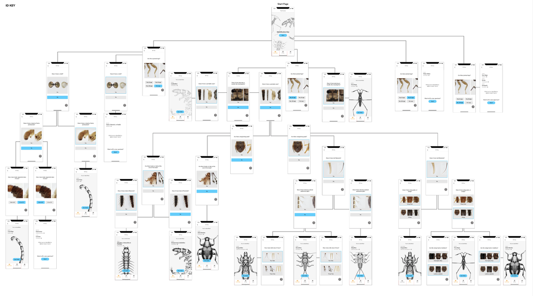 by Estelle Jiang Before sharing about the work the team and I got done, I want to quickly wrap up about the main functionalities of the application, the app condenses the following aspects in terms of learning and teaching freshwater insect identification after a range of use cases centered around exploration: 1. Field Guide 2. Identification (ID) Key 3. Quiz This is a blog that further elaborate on the work and tasks the design team finished over the past semester. Moving from the summer work where we finished a big round of testing with users for the field guide design and interaction, the design team mainly focuses on iterating the field guide through second round of user testings and also switched the gear towards design for Macroinvertebrates assessment - design a quiz functionality to allow users to review the learning contents from the field guide and also quiz themselves on the understanding. 01. Field guide iterations and finalization 1. Brainstormed and explored the design interaction for the field guide: There are some small features and interactions, such as global navigation and the zoomable page interaction that are not fully considered over the summer. Therefore, Alice and I started exploring different interaction and design possibilities before going to testing. Here are some my explorations that inform our final field guide page design: A. Global navigation  B. Zoomable image flipping 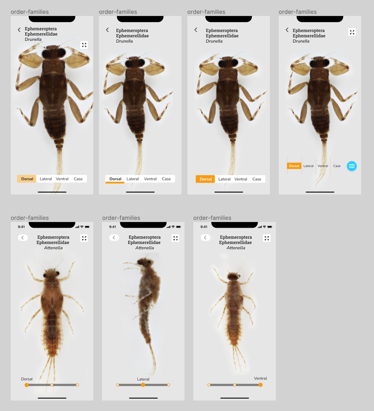 C. Onboarding instruction and design 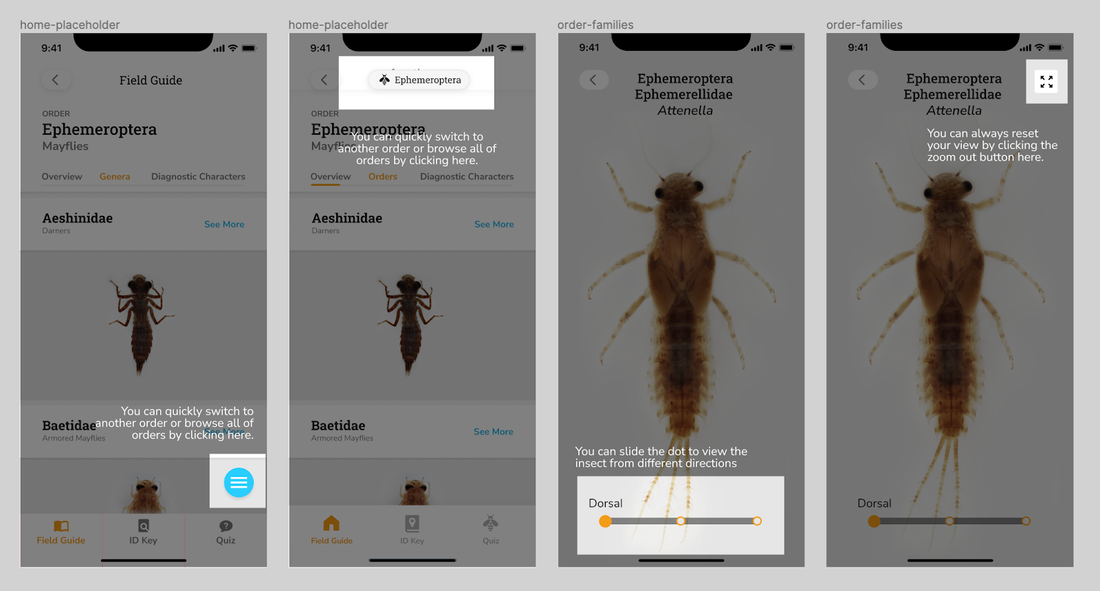 2. Provided guidance and drafted out the design system for the field guide and entire app. Along the way, we decided to start consolidating the design guidelines and system for the team and product which can be useful for further development and also team collaboration. I started the finding good industry practices in terms of generating and designing the system, provided guidances and gave feedbacks while Alice consolidated the overall visual/layout and turned them into components in Figma to better speed up the design process. 3. Facilitated the second round of user testings with product evaluation and conducted synthesis workshops on Miro - Instead of getting insights about application flow, logic and concept aspects of the app, the major goals of the second round testing are identify the specific usability issues for overall navigation and zoomable pages new design and evaluate more on the overall engagement and usability. Based on the 8 testing results, I facilitated the synthesis workshops on Miro with the team to generate iteration insights and help the team finalize the field guide MVP. For the main insights: You can refer Alice's post: [Mobile App Pt. IV: Refining the Field Guide] 02. Quiz / game to assess the learning goals 1. Explored the market product interactions. Before designing the quiz, we firstly explored some predecessors that have quiz features, such as Quizlet, Duolingo, and Lumosity. It helped us generate several possible formats of the quiz as well, such as matching games, card flipping games and flashcard reviews. 2. Considered what we want to assess and the learning goals of the application before going deeper into the user experience and interaction design. We took a pause and realized that know the learning goals and purpose of making the quiz is the first priority comparing to brainstorm design solutions for quiz. Without understanding what we want the learners to learn, we cannot provide the suitable design to meet their needs. I summarized some potential learning goals before meeting the current trainers and experts: 1. Distinguish orders, especially for the orders that look similar. 2. Recognize the common features for specific order. 3. Review common mistakes that found by trainers to help learners avoid making them again. 4. Help learners quickly recall and be aware of the tolerance level. 3. Mapped out the design formats and interaction and finalized the flow and logics for each learning goal we defined. A. Initial flow explorations (without knowing the learning goals) 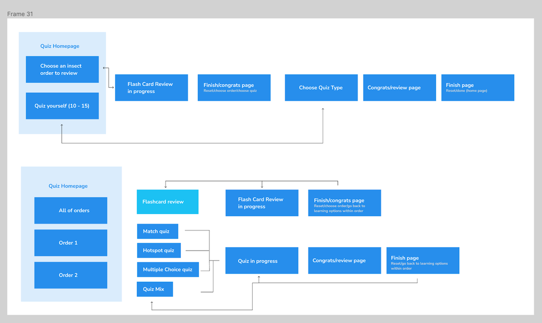 B. New flow explorations that better inform the design with rationales. 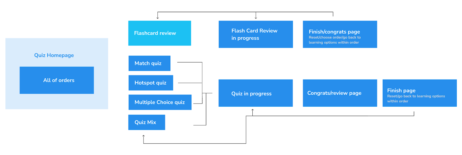 C. New quiz flow by following and considering the design goals  D. Designed for varied use cases + learning cases - considering limitations and tradeoffs 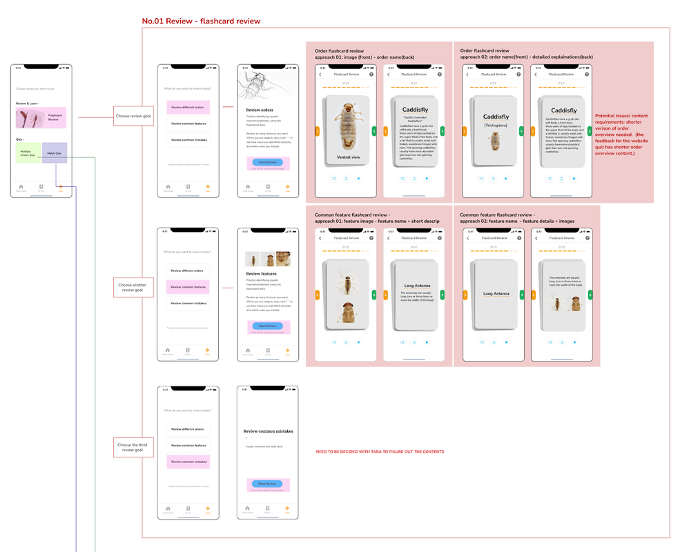 —Critiqued and iterated the design with engineers and trainers/experts to narrow down the scope. Review the feedback we gathered from Dominique's post: Macro App Tasks This Semester 03. Designing while wearing different hats and entering the development stage
While our design team kept working on the ID key and quiz design and conducted further testings, we got in touch with Chris Bartley, an experienced engineer and involved him into our design process along the way. We are still figuring out the better and more efficient way to collaborate, here are some attempts we took so far:
By Alice Fang 🐞📱This past semester, I refined the design of the field guide that Estelle and I worked on over the summer. With the main structure of each page layout figured out over the summer, this fall, I worked on global navigation, refined the design system of components and typography, and finalized some of the interactions. These design decisions informed the design and look of both the ID Key and Quiz. Previous Version 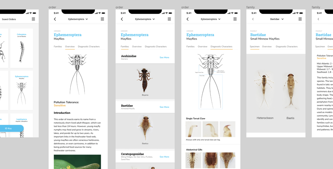 Prototype from summer, used in first round of user testing The prototype we had over the summer followed the scientific-name as its organizing convention. With blue type in Roboto Slab, the scientific name stood out on each page, but conflicted in hierarchy with other type. What does the opening page look like when a user first opens the field guide function of the app? And how do these elements translate to the other two functions, ID Key and Quiz? Global Navigation, Menu List, Flipping Images 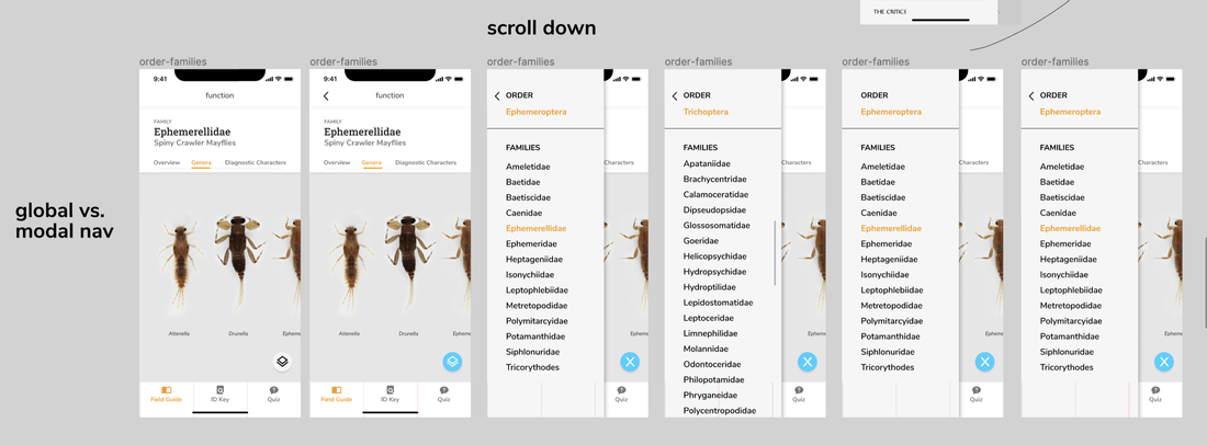 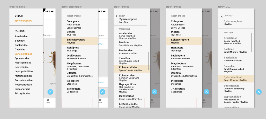 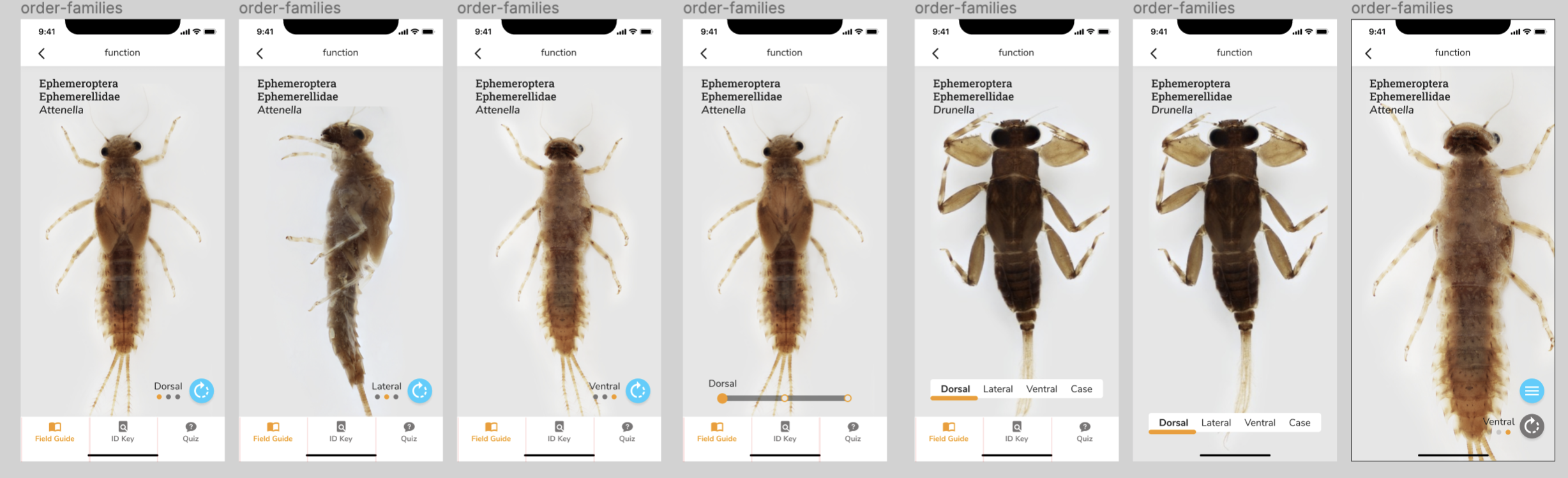 We wanted color to be used more intentionally and consistently. Blue became actionable, orange represented 'state.' Following this convention, I changed the typographic system, exploring type size, weight, and style. Thinking more holistically about the app, how does a user switch from the field guide to the ID Key? How does navigation work? Where does the back button go to? We used the bottom bar for global navigation, to switch between the main functions. Each function is its own independent section of the app, with tap to switch, not swipe. I also explored more modal navigation methods; over the summer, we had designed a drop-down menu. However, during user tests, we received mixed feedback about people's mental models about the taxonomic structure. How else could we show Order > Family navigation, across all three sub menus: overview, diagnostic characters, and families? The blue action button on the lower right floats on top of any content on any sub menu page. Selecting it on an Order page brings an overlay with other Insect Orders; on a Family page, it brings an overlay with the current Order, and a list of the families within the current Order. This way, users can get a better understanding of the nested structure of Order > Family > Genus. I also explored different ways to flip / switch images at the Zoomable page level. How can someone recognize that a. an insect has multiple views, even if they don't know what 'ventral' and 'dorsal' mean; b. that there is an icon that actively flips the image? User Testing Round 2 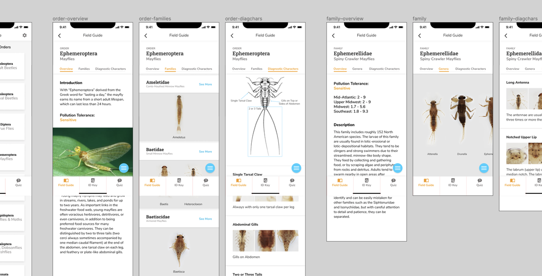 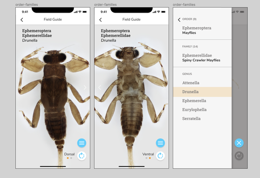 We conducted a second round of user testing with teachers, novice learners, and trainers. We asked them to speak aloud through a prototype of the app, and used a similar research protocol as the first round of testing. Main Insights:
Iterations Informed by Testing 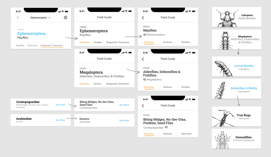 I flipped the type system; the name with highest contrast is now the common name, with the scientific name quieter underneath. Common names were in Roboto Slab, and scientific names in Nunito Sans; this also allowed the Order Family genus naming convention to be used (Roboto Slab doesn't have an italic). Previously, we went with scientific names because of length; it was easier for edge cases to fit within the design. To switch to common names, I redesigned the headers, bars, and menu components for the reversed typography. 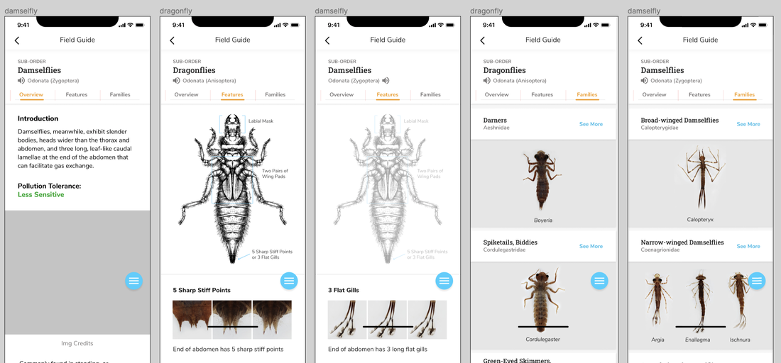 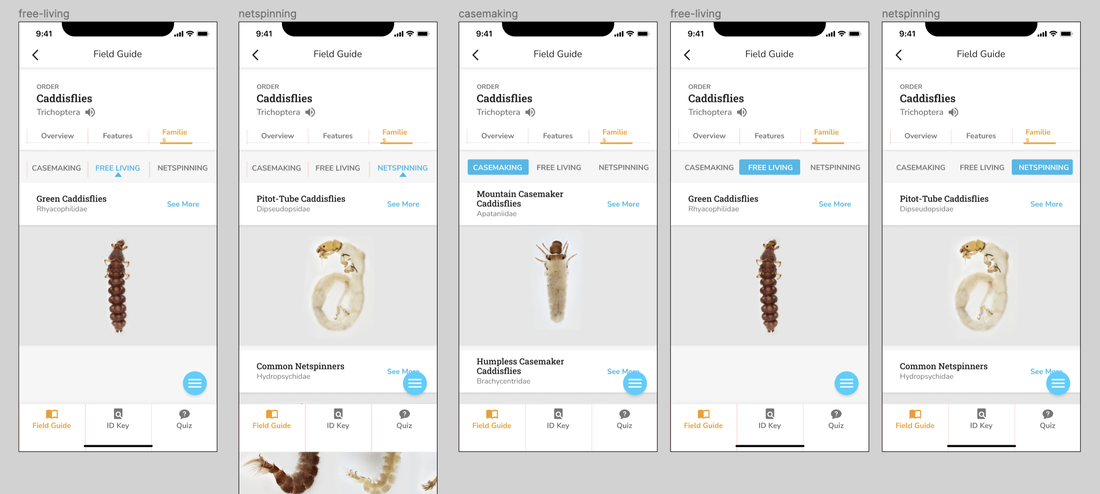 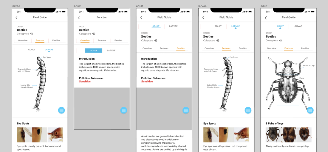 I also had to consider how components would fit in Orders outside of Mayflies. There are several important subcategories for identifying macroinvertebrates. Therefore, I had to separate Damselflies from Dragonflies, and toggle between the three categories of Caddisflies (case-making, free living, net-spinning). If there was a toggle for Caddisflies, then why are Adult and Larval Beetles separated into two different 'Order' pages? For the logic of the app structure, I grouped them back together; this meant we needed some toggle or filter system for Beetles as well now. Building the Design System 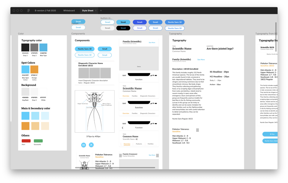 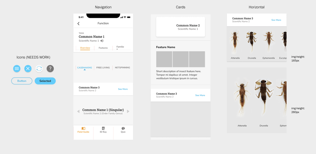 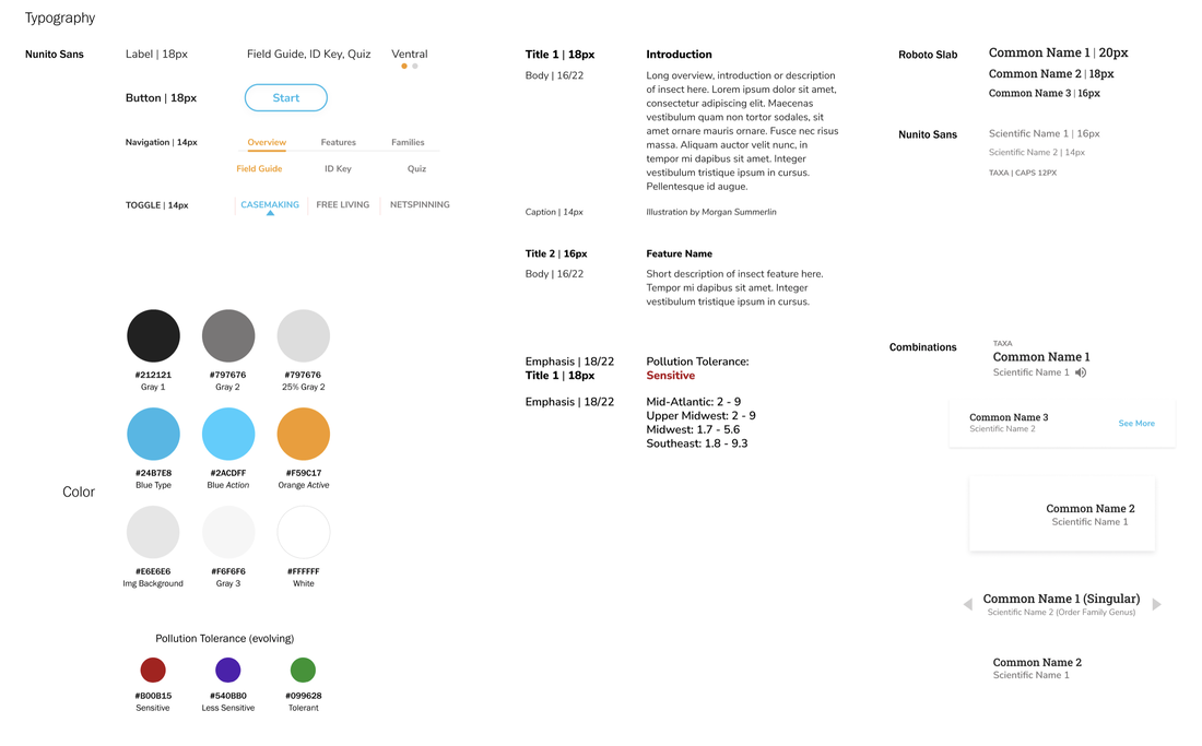 Throughout the semester, I've been creating and updating a style sheet, so that all of the components were the same across all of the many frames and pages. When redesigning components, I also consolidated and organized all of the visual elements and typography. (This... is a more tedious process than I previously imagined.) Field Guide Wireflow—All the Interactions 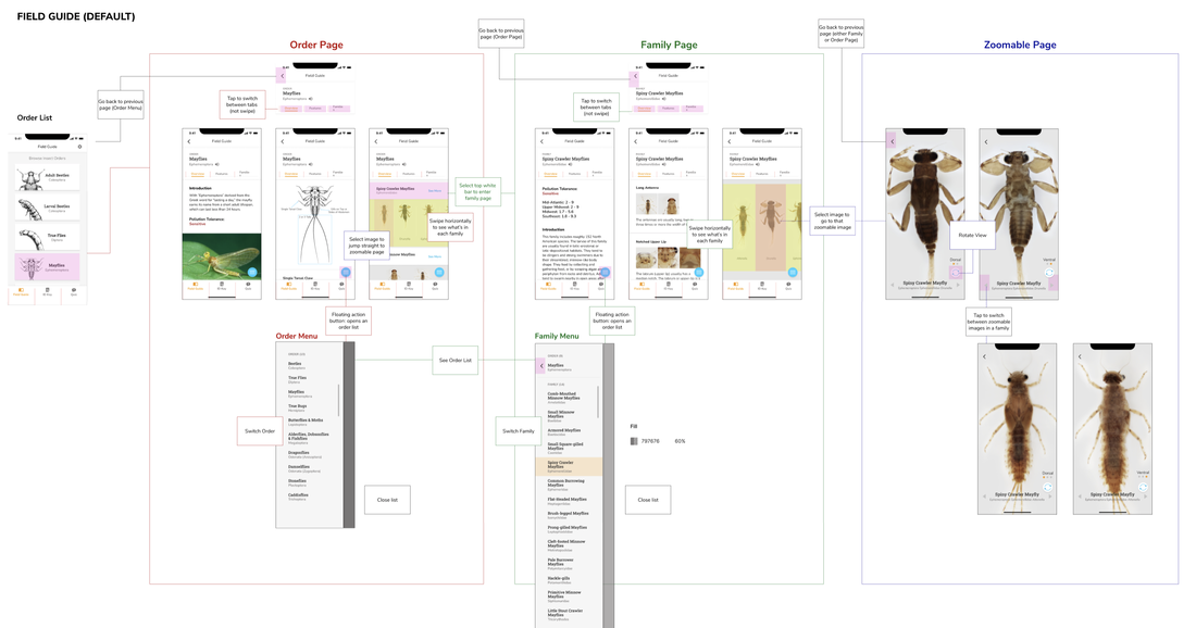 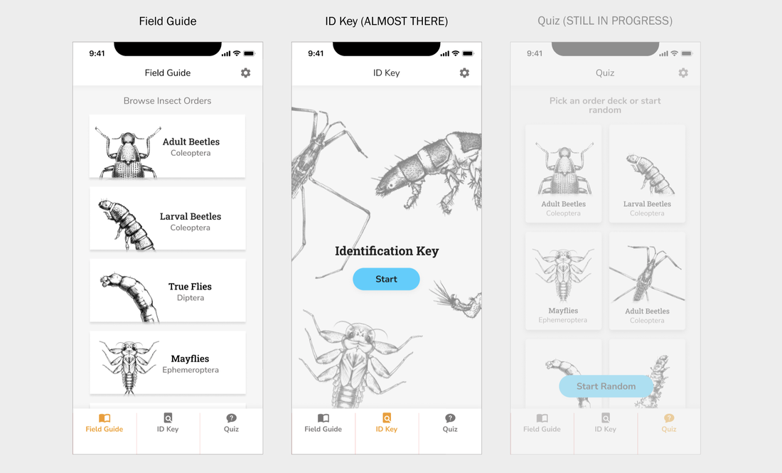 I also organized a wireflow for the team to understand the interactions of the Field Guide, so we're all on the same page. The three main functions of the app, Field Guide, ID Key, and Quiz, are also laid out for reference. A bit (and tedious) part of this project has also been organizing all of the resources, references, and assets for the developer and the rest of the team.
|
Project TeamAn interdisciplinary team Categories
All
Archives
June 2023
|
 RSS Feed
