
|
By Alice Fang, CMU Design 🐞📱This semester, I've also been working on the design of the ID Key. As the Field Guide became more refined, we knew we had to focus on the other aspects of the app, less the design becomes incoherent. With previous key designs, we didn't really explore the edge cases, focusing on one prototypical 'question' and hint structure; soon I learned this question layout would not work with most of the interactive key. Previous Design 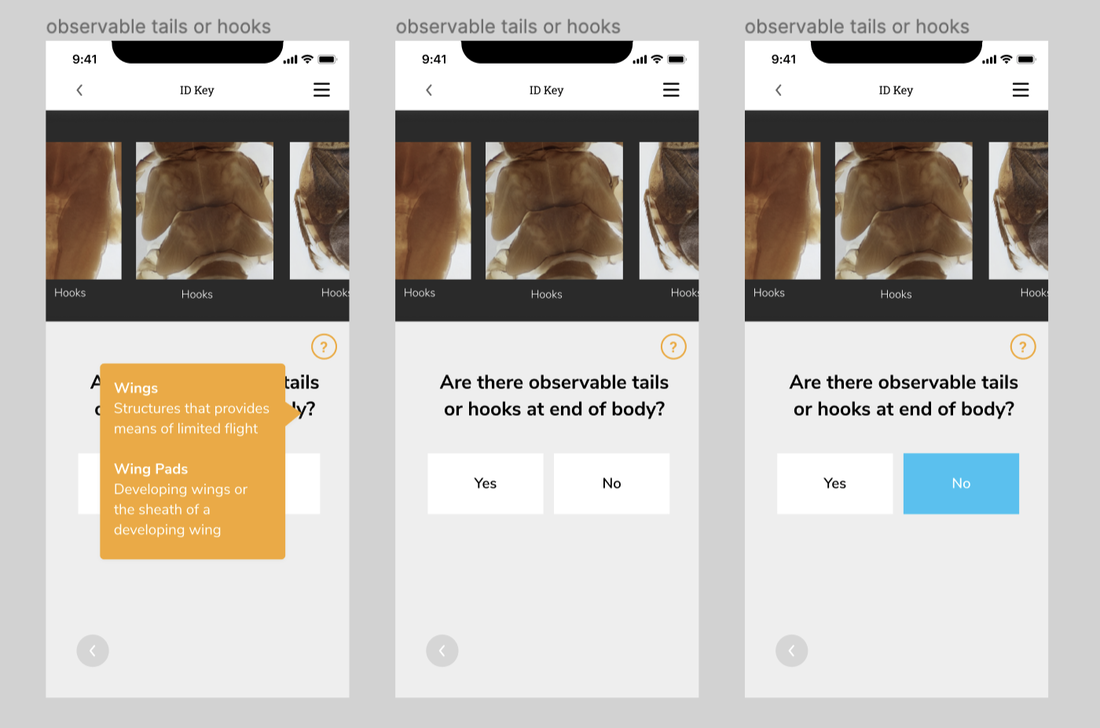 Questions we were grappling with over the summer:
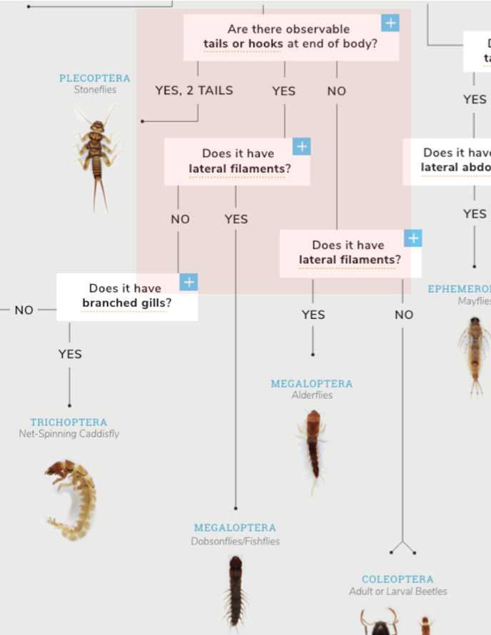
Low-Fi Flow 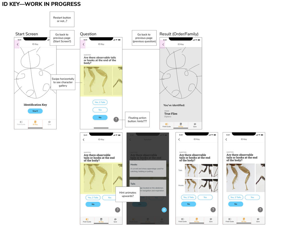 While refining the first wireflow for the Field Guide, I began thinking about the interaction flow of the ID Key in its most basic components using the visual style of the Field Guide. The simplest flow for the ID Key is a start page, a question page where the user has to make a choice, an optional hint, which will eventually result in identifying an Order, where the user can jump to that Order in Field Guide . Issues 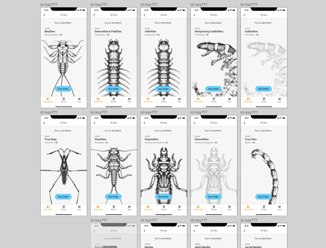 I began to mock up a flow with all of the questions and paths, in order to design the end pages for each decision; at this point, I discovered some discrepancies with the website’s ID Key
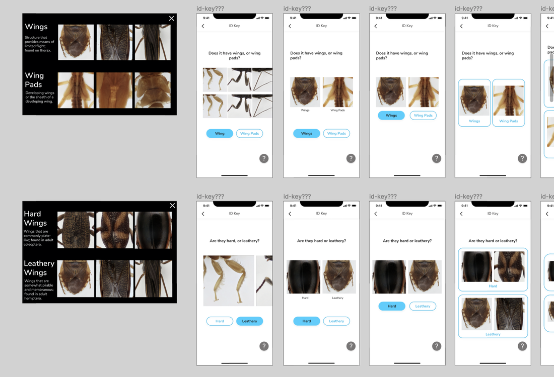
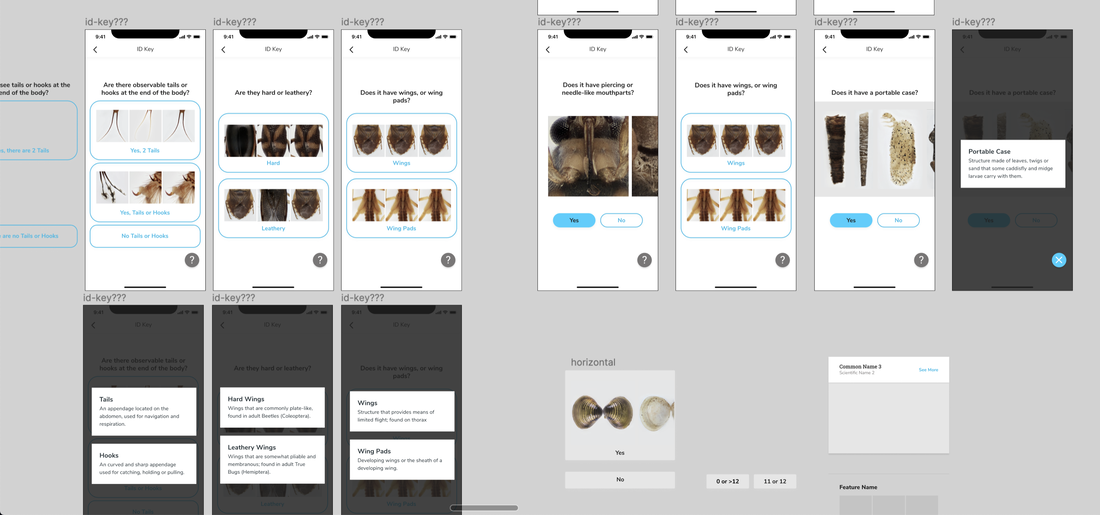
Button Explorations 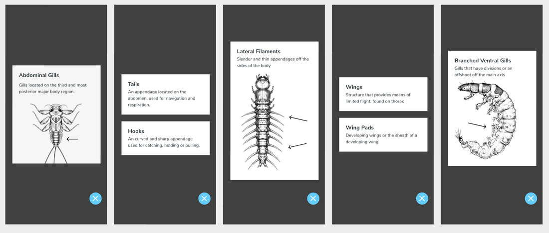 As with the rest of the app, to take advantage of the unique-ness and affordance of Macroinvertebrates.org's photography, the ID Key takes an Image-forward approach. For the Key, this means taking the images from the cards on the site ID Key and bringing them to the actual questions on the mobile app. In doing so, what do the hints look like now? Are they just text definitions?
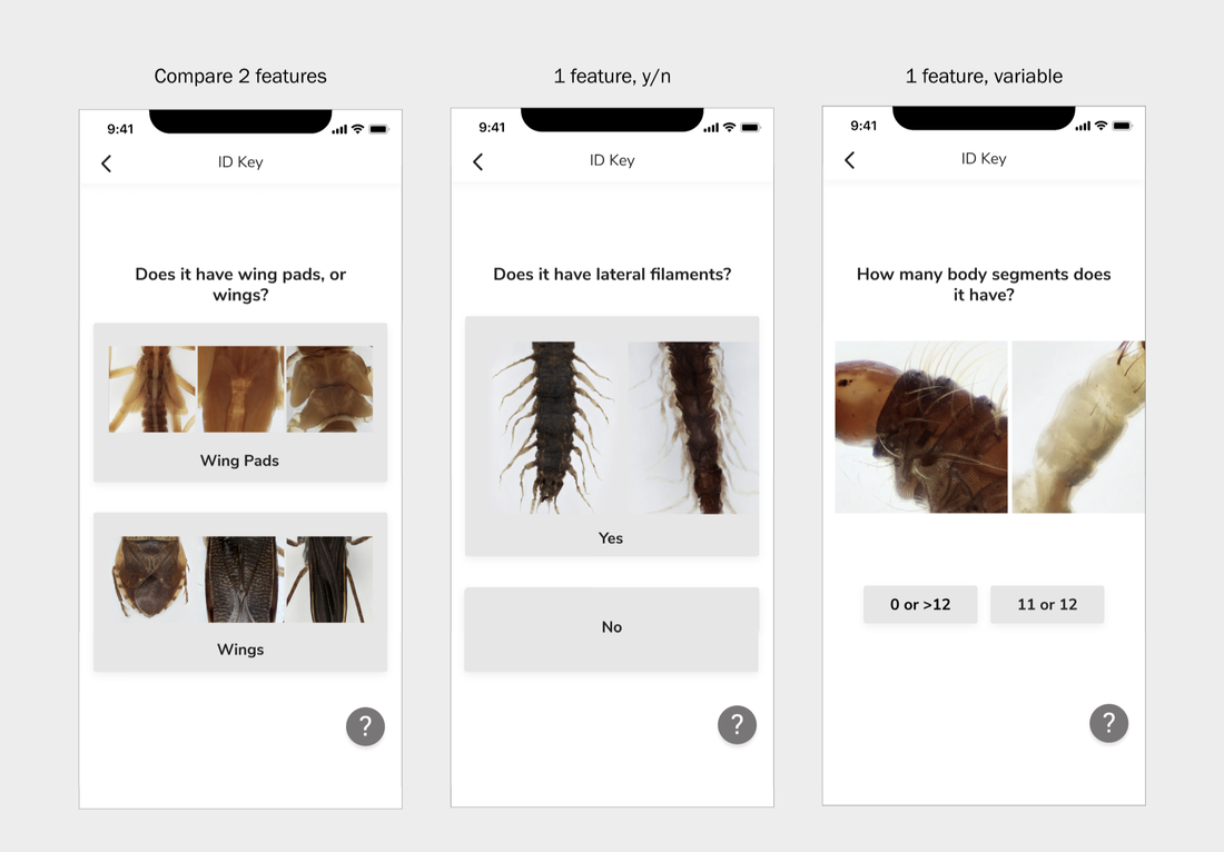 In the process of mocking up different questions, I realized there are 3 general types of question pages, which would need to inform the type of button they had. The three types of questions are: Yes or No for 1 trait, variable answers for 1 trait, or choose between 2 traits. How can I design a button that a. looks clickable and b. can still show a range of photographs? I didn't want to use one 'prototypical' image to represent each trait, because part of the beauty of the collection is being able to see the range of differences for a single trait. Wing Pads look different across different Orders, as do Tails. Another button design I had to work out was representing the ~absence~ of a trait. The original key design had one image gallery, with choices underneath it; however, in choosing between Yes and No, it felt like there was some disconnect between seeing the trait, and then clicking 'No.' Current FLow 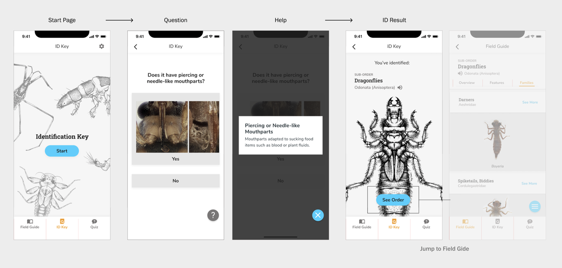 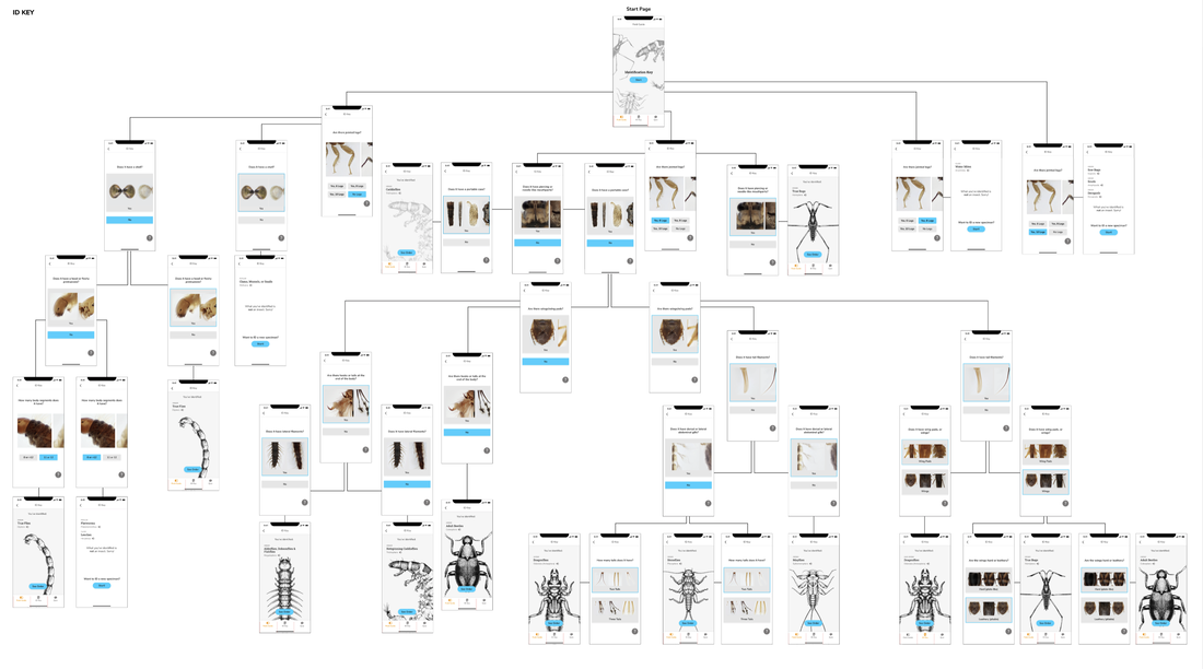 Comments are closed.
|
Project TeamAn interdisciplinary team Categories
All
Archives
June 2023
|
 RSS Feed
