
|
By Alice Fang, Summer 2019 NSF REU In preparation for the launch of the website at the end of June, I’ve been working on creating print materials and other miscellaneous items. This includes designing a promotional rack card, editing and refining t-shirt designs based on images created by Jamie Dorst, creating bandana designs, cleaning up photoshop files for a lot of bugs, and managing wordmark and logo updates for consistency across the printed materials. It’s been a lot of fun working on these other things, and it’s given me a chance to really appreciate the illustrations that Morgan Summerlin drew, and the super fine details of all the bugs in a way that I probably wouldn’t have if I hadn’t photoshopped a lot of them. By Alice Fang, Summer 2019 NSF REU Another major Macroinvertebrates.org site feature that we iterated on was the dorsal/ventral/lateral view changer function, that existed as a rotating icon on the order and family pages, but also as a click-through menu on the genus pages. From prior usability tests, people failed to recognize the rotation icon was there, or that the function existed across the order/family level pages. Dezudio provided some solutions using a bar on the bottom left of the page, that had a blue triangle indicating which view was open. However, several issues arose with that solution:
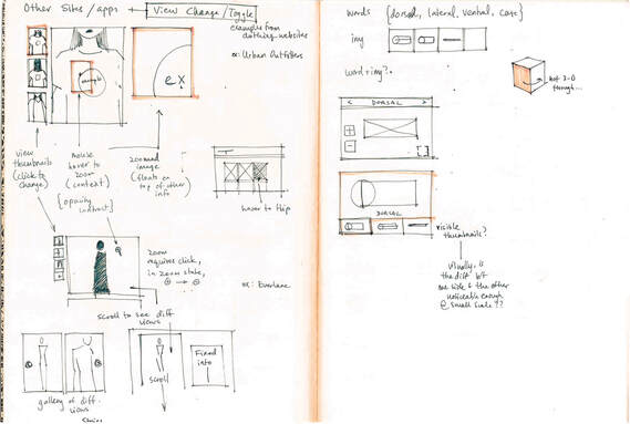 Looking at how fashion websites addressed multiple views 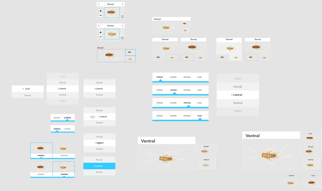 So many different thumbnail attempts... 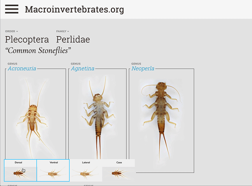 Trying out thumbnails on the family level page, with limited success. Originally, I looked at different fashion and clothing sites, because those webpages had to find ways to display multiple views of items for customers. A common thread in every fashion site was the use of thumbnail images; that way someone could see all the possible images (and therefore all the views), but also know which image is in focus or zoomed in. I explored using thumbnail images of different views, but at a small scale, it became difficult to tell between dorsal or ventral views. There was also no way to implement this at the order/family level. Instead, I returned to the Dezudio design, and looked at how sites like Netflix presented numerous shows all at once, and the small visual cues they used for scrolling and clicking through the choices. I played around with different click-through, infinite scrolling of views; this method of displaying information failed to account for a ‘total view’, so someone would have no idea how many total views existed for a macroinvertebrate unless they actually clicked through every single option. To workaround this, I added what Marti likes to call a “cookie-crumb trail” where small icons show the total number of views, and as each view is scrolled through, the “crumbs” also scroll through. 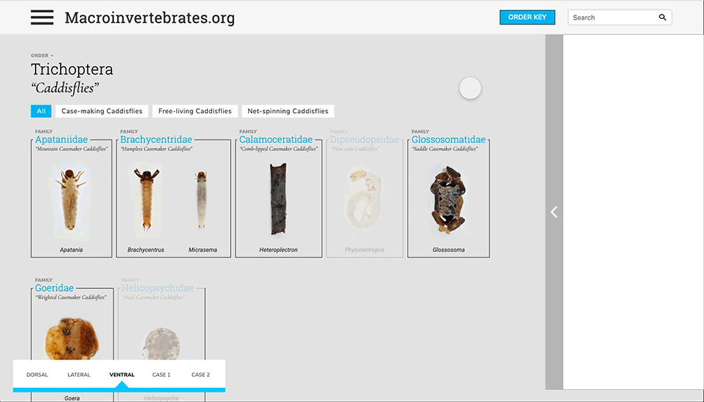 A mockup of greying out a macroinvertebrate if it didn't have the specific view. The actual images don't match up, I was just prototyping based on the total number of views each macroinvertebrate had. 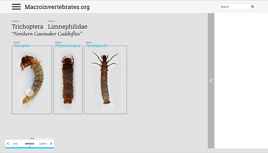 A family level page, using Caddisflies as the prototype because of the numerous views. 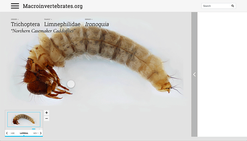 Translating the same function to a genus level page. A little redundant having infinite scroll with only three views, but it keeps the action consistent between pages. Chris implemented this differently on the live site. The triangle icon is grey when on hover, and blue when selected, and re-clicking the view returns it to its default; this reduces the copy/written information needed. If a view is selected, and a specific macroinvertebrate doesn't have that image, it is greyed out entirely, which I think looks really nice on the live site. 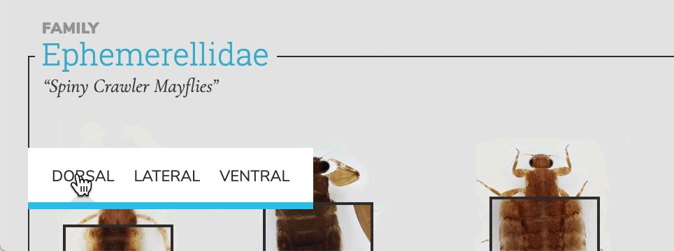 This eliminates the scrolling function; in hindsight, most macroinvertebrates didn't have so many views that the scroll was entirely necessary. Hi! I'm Alice, a rising junior at Carnegie Mellon University studying communication design with a minor in professional writing. I joined the macroinvertebrates team this summer as a design/research assistant, and I’ve been working on some site iterations for macroinvertebrates.org the past three weeks—namely, building stronger relationships between icon navigation and the actual informational content. I’ve learned a lot about prototyping quickly and keeping my work organized, in order to present solutions that have to rapidly be pushed to development. Having learned some basic web design and HTML/CSS, it was also a good learning opportunity in working with a developer to figure out what can or should be coded. On the previous version of the site, navigational icons floated above the panels that held important and interesting content. We wanted to change the structure for organizing the content without creating a major overhaul of the previous system. 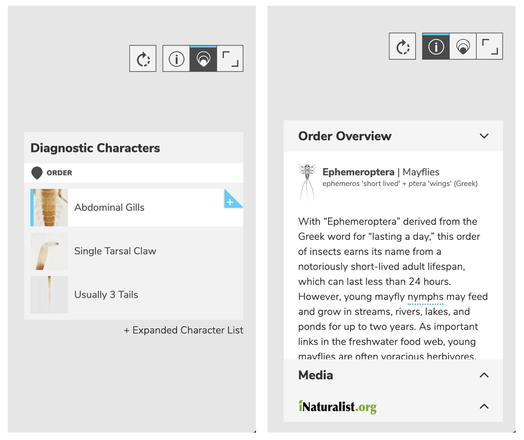 The original structure for information, with four icons floating above. Some of the questions I had to figure out for creating a side panel:
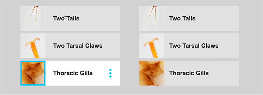
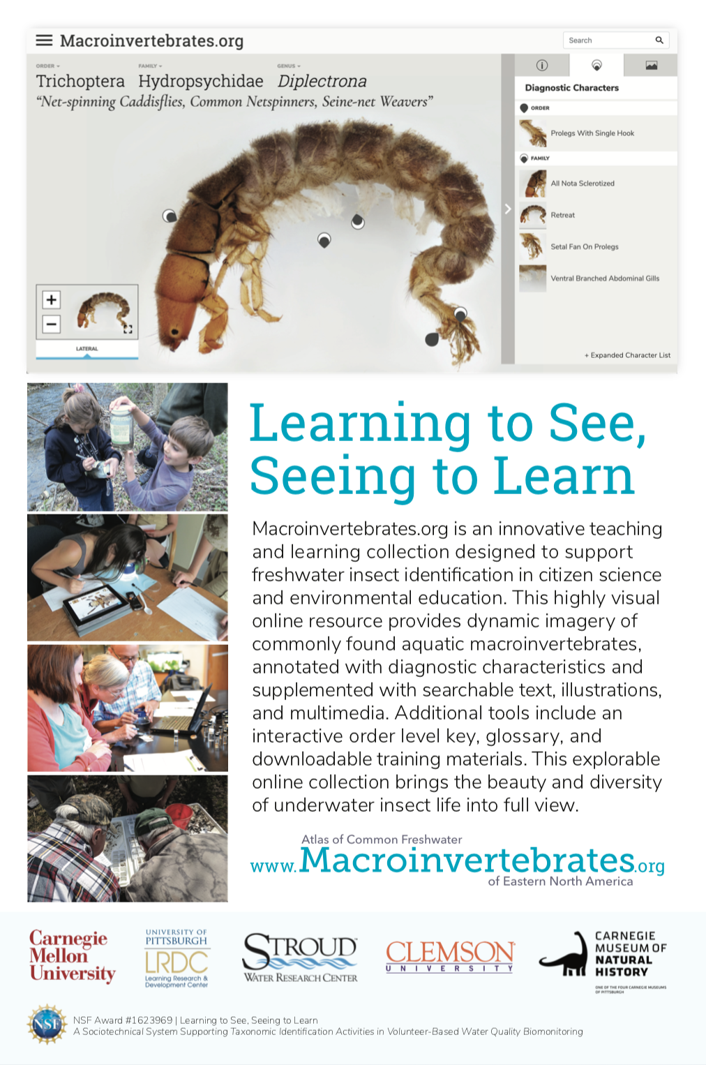
One major issue was having a system where all of the content (order/family overview, media, iNaturalist photos, life history, characteristics) could be visible together but still consolidated. The original site had some strange floating/scrolling rules in order to fit all of the information. To address this, I explored different ‘drawer’, or side-panel, designs. 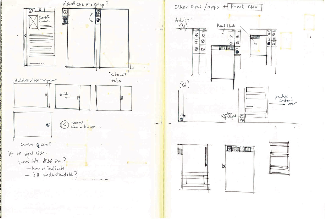 Sketches of tab functions, and existing navigation panels on other platforms. In the end, we took the ‘Media’ content and the iNaturalist photos and grouped them into their own separate category, which was then referred to as the Media Tab. The panel thus had three tabs at the top: Information, Diagnostic Characteristics, and Media. In trying to incorporate the ‘clear all’ function, to show the macroinvertebrates without any identifying information, we took advantage of the structure of the panel; when the panel closed, it also cleared all information, leaving just the images of the macroinvertebrates. The default then became having the panel open to the diagnostic characteristics tab. 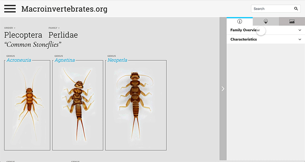 Three tabs organizing the information in the panel. 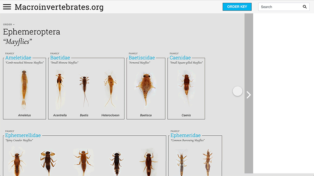 Closing the panel clears the information. I also played around with different hover cues for the diagnostic characteristics. Clicking on a characteristic opened up a gallery that compared that characteristic for the selected macroinvertebrate with others that had the same feature.
 Playing with different hover states. Exploring different icons and color indicators. https://www.cmu.edu/news/stories/archives/2019/june/online-aquatic-insect-atlas.html  Hi! My name is Wei Gong, a graduate student in HCI Institute, majored in Educational Technology and Applied Learning Science. I will explore the application of NFC technology in informal learning contexts this summer. Specifically for the Learning to See Project, I will design a popup kit for the Carnegie Museum of Natural History to engage kids in macroinvertebrate identification.
I will graduate in 2 months, so this will be a super busy summer for me, but I'm excited about it! My personal goal in doing this summer research is to explore the design opportunities in museum settings since I'm a museum fan. Identification Task To get started with the project and to gain an understanding of the design challenge, I did an macroinvertebrate identification task using various resources including field guides and key printouts. Identified four bugs in total. In order to experience different materials, I tried nearly all the materials at hand. Generally, the overall experience of the ID task is fun. It took much less time than I thought I would, which was a relief. Regarding the materials for the ID task, I personally found the flashcard most helpful and the big field guide book ( An introduction to the aquatic insects of North America) least helpful. The flashcard is quite straightforward with big images of the bugs and just right amount of text explanation. When I was using the flashcard to identify the bug, my process was to first visually match the specimen with the order level identification in the flashcard, and then observed the specimen in more detail, found its obvious traits, compared it with different families on the flashcard until finally distinguished it. I barely read the texts unless it's really necessary. I found the big guide book least useful because there's too much information which scared me away, and I think if only for the task of identification, it's not necessary to provide so much information. The key insights I got from this task are: 1. We can deliver to the kids the idea that the macroinvertevrate ID is not scary or time-consuming, but can be fun. 2. We should reduce the cognitive load for the volunteers/learners to identify the insects. One possible way is to utilize more media like comic/animation/image than text. By Emily Chan, Harvard University, Summer 2019 REU
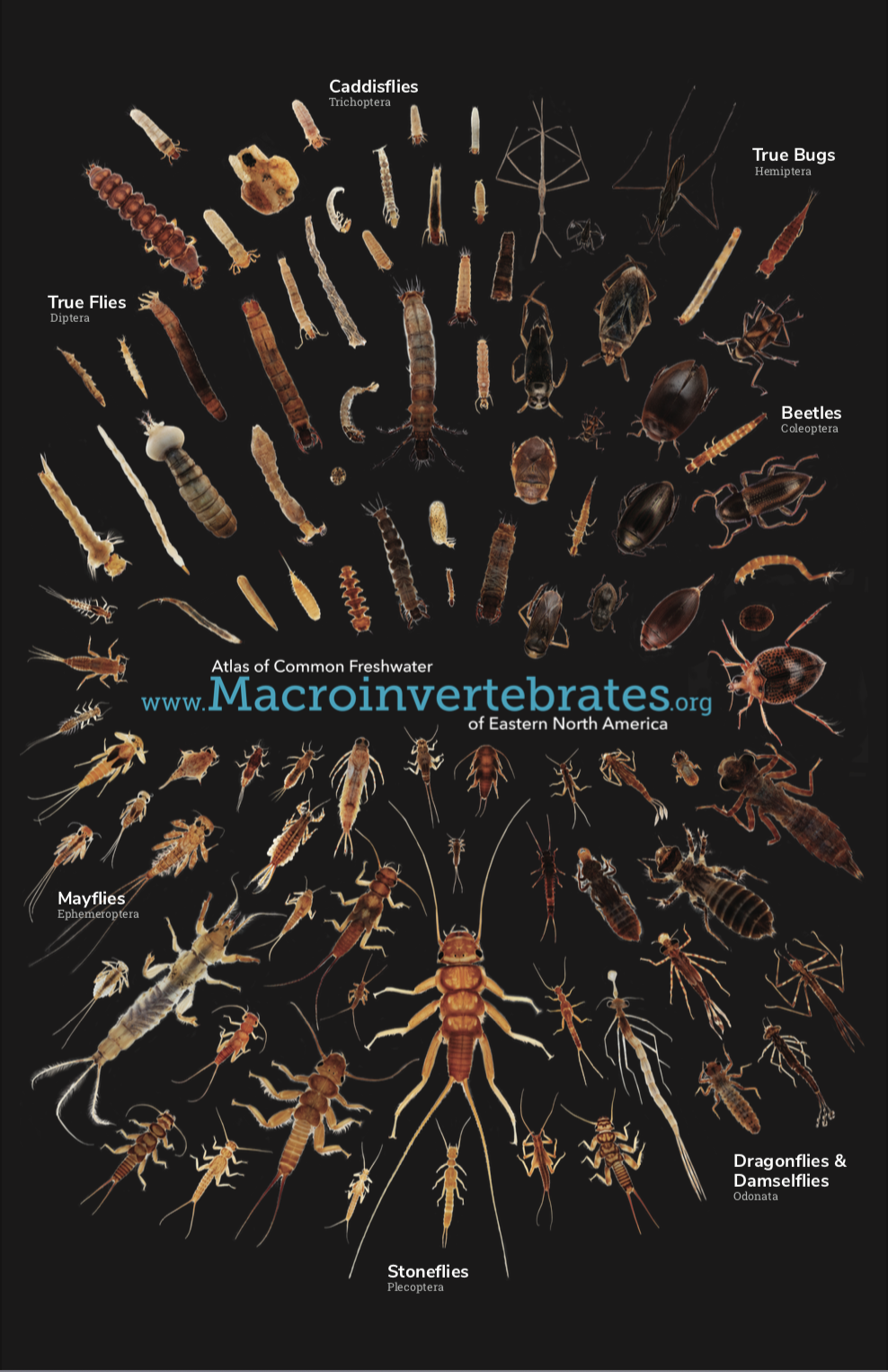
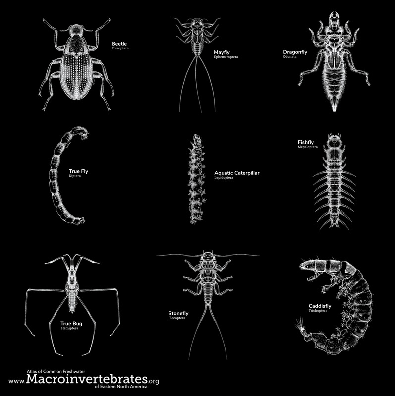
Hi there! I'm Emily, a rising junior at Harvard studying computer science with a minor in statistics. I'm a week and a half into the HCII REU, and I'm working on two projects with Marti Louw, one of which is Macroinvertebrates.org. I came to the HCII REU because as a computer science major and an artist, I'm interested in learning more about design, and I also want to experience what doing research is like. Some of my personal goals for the summer are to understand how and why design choices are made, get hands on experience developing tools for users using design principles and user feedback, make something that I can show people/people will actually use, and learn about prototyping with smart devices. My tasks for Macroinvertebrates.org for the foreseeable future include doing usability testing for the new dichotomous key, glossary, and search functionality; creating an improved popup kit for museums to use to engage kids in macroinvertebrate identification, trying to leverage the high quality media that we have and potentially using smart technologies such as NFC tags, etc.; and possibly working on developing identification quiz practice functionality for the site. Identification Task To gain an understanding of the design challenges at hand, we did an identification task using the current resources available to volunteers--field guides and key printouts. The sheer amount of materials was slightly overwhelming, so as someone with no experience doing macroinvertebrate identification, I just chose two field guides that had pictures and stayed with those. I identified five bugs, four using the field guides and one using the website. What I noticed when using the field guides was that the detailed text descriptions of the bugs was essential for family level identification, but the volume of the text also gets in the way when it comes to order level identification. My process was to first do visual pattern-matching to the order level, and then read the descriptions of ones that looked similar to the specimen to find traits that would help distinguish between families. I was surprised by how identification wasn't as difficult or time-consuming as I anticipated, but I also didn't use most of the materials, and never used a key. When I switched to using the website, I tried a similar approach, but the website's organization was slightly different from a field guide (I couldn't just flip through quickly to scan for pictures and then selectively read descriptions), which took some adjusting to. The home page worked well for facilitating my initial pattern-matching approach, but I can see how if I were trying to identify a ambiguous looking larvae, I would want the home page to be more explorable (to be able to zoom in more), since some of the pictures were quite small. Once I clicked through to the order page, I definitely don't think I would have known how to get rid of the diagnostic characteristic boxes obstructing the actual pictures that I wanted to look at. However, since I was already familiar with how to do that, I was able to match the specimen to the common burrowing mayfly just by appearance, but I wasn't able to find the characteristics that might help distinguish between similar looking families in a convenient place. For me, this raised the question of whether the purpose of Macroinvertebrates.org is primarily to be a learning resource or an identification resource. |
Project TeamAn interdisciplinary team Categories
All
Archives
June 2023
|
 RSS Feed
