
Mobile App: More details for field guide revisions, quiz feature design and team collaboration.1/28/2021
by Estelle Jiang Before sharing about the work the team and I got done, I want to quickly wrap up about the main functionalities of the application, the app condenses the following aspects in terms of learning and teaching freshwater insect identification after a range of use cases centered around exploration: 1. Field Guide 2. Identification (ID) Key 3. Quiz This is a blog that further elaborate on the work and tasks the design team finished over the past semester. Moving from the summer work where we finished a big round of testing with users for the field guide design and interaction, the design team mainly focuses on iterating the field guide through second round of user testings and also switched the gear towards design for Macroinvertebrates assessment - design a quiz functionality to allow users to review the learning contents from the field guide and also quiz themselves on the understanding. 01. Field guide iterations and finalization - 1. Brainstormed and explored the design interaction for the field guide: There are some small features and interactions, such as global navigation and the zoomable page interaction that are not fully considered over the summer. Therefore, Alice and I started exploring different interaction and design possibilities before going to testing. Here are some my explorations that inform our final field guide page design: A. Global Navigation  B. Zoomable Image Flipping 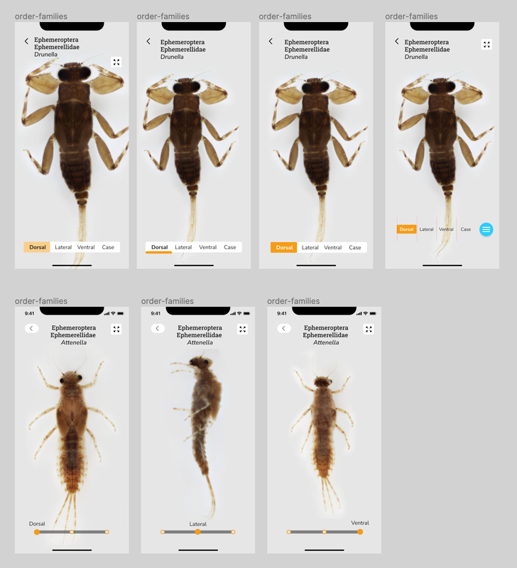 C. Onboarding Instruction and Design 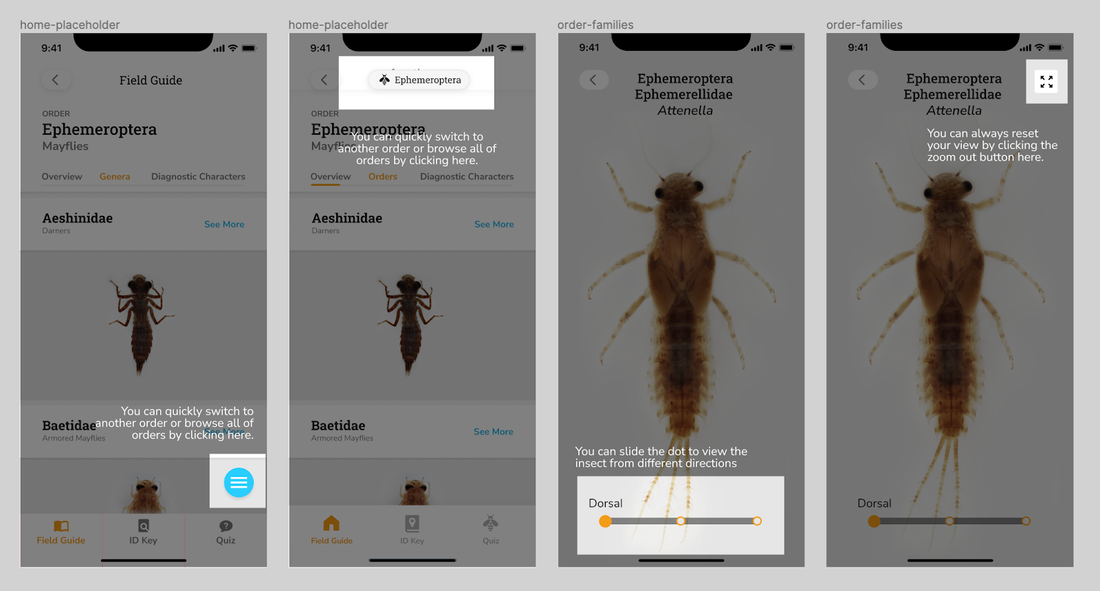 2. Provided guidance and drafted out the design system for the field guide and entire app. Along the way, we decided to start consolidating the design guidelines and system for the team and product which can be useful for further development and also team collaboration. I started the finding good industry practices in terms of generating and designing the system, provided guidances and gave feedbacks while Alice consolidated the overall visual/layout and turned them into components in Figma to better speed up the design process. 3. Facilitated the second round of user testings with product evaluation and conducted synthesis workshops on Miro - Instead of getting insights about application flow, logic and concept aspects of the app, the major goals of the second round testing are identify the specific usability issues for overall navigation and zoomable pages new design and evaluate more on the overall engagement and usability. Based on the 8 testing results, I facilitated the synthesis workshops on Miro with the team to generate iteration insights and help the team finalize the field guide MVP. For the main insights: You can refer Alice's post: [Mobile App Pt. IV: Refining the Field Guide] 02. Quiz / game to assess the learning goals 1. Explored the market product interactions. Before designing the quiz, we firstly explored some predecessors that have quiz features, such as Quizlet, Duolingo, and Lumosity. It helped us generate several possible formats of the quiz as well, such as matching games, card flipping games and flashcard reviews. 2. Considered what we want to assess and the learning goals of the application before going deeper into the user experience and interaction design. We took a pause and realized that know the learning goals and purpose of making the quiz is the first priority comparing to brainstorm design solutions for quiz. Without understanding what we want the learners to learn, we cannot provide the suitable design to meet their needs. I summarized some potential learning goals before meeting the current trainers and experts:
3. Mapped out the design formats and interaction and finalized the flow and logics for each learning goal we defined. A. Initial flow explorations (without knowing the learning goals) 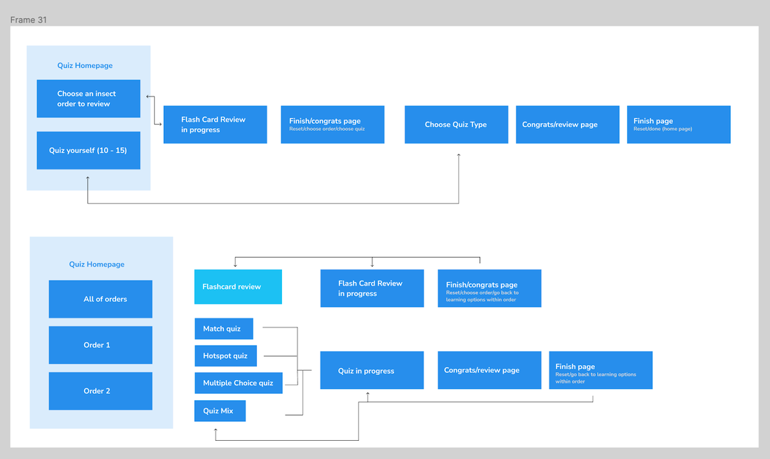 B. New flow explorations that better inform the design with rationales. 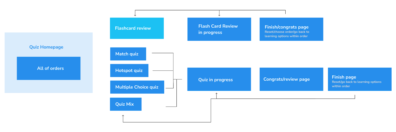 C. New quiz flow by following and considering the design goals 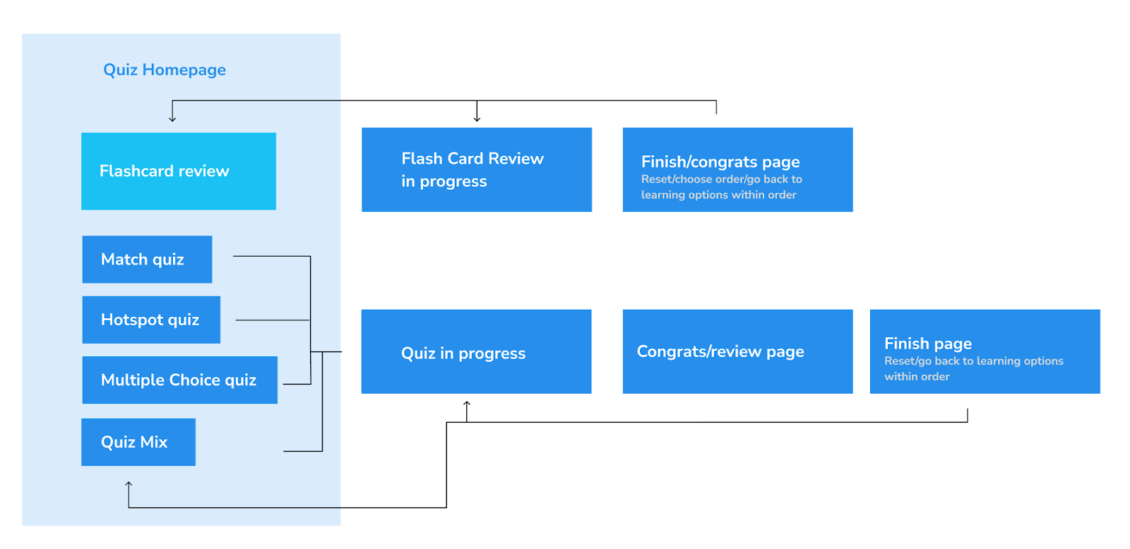 D. Designed for varied use cases and learning cases - knew limitations and considered tradeoffs 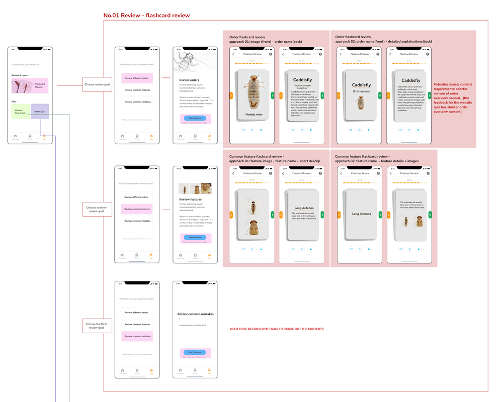 —Critiqued and iterated the design with engineers and trainers/experts to narrow down the scope. Review the feedback we gathered in Dominique's post: Macro App Tasks This Semester 03. Being a designer by wearing different hats and entering the development stageWhile our design team kept working on the ID key and quiz design and conducted further testings, we got in touch with Chris Bartley, an experienced engineer and involved him into our design process along the way. We are still figuring out the better and more efficient way to collaborate, here are some attempts we took so far:
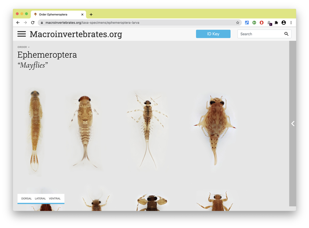
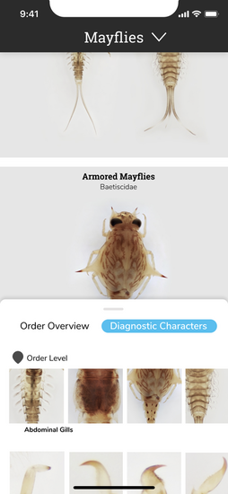
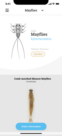
Personas are a common design research consolidation technique to make sense of user research data. Here findings from observations, interview transcripts, and organizational document analysis were synthesized and a set of representative user types were created to allow the design team an abstracted view of a range of user types, their needs, motivations and use cases to continually consider in decision-making as the design evolved . Below are a fictionalized set of personas we created based on our data to characterize typical users of Macroinvertebrates.org. Personas developed by CMU design student Adrian Galvin. By Estelle Jiang and Alice Fang 🐞📱Moving to a higher fidelity prototype by following the design system. After showing our low-fidelity prototype to the entire team and developers, we decided to move forward by applying a more detailed design and developing the visual + design system. We also figured out how to showcase the relationship between orders, family and genius on the mobile application, and the UI components for each type of 'page'. It was one of the biggest challenges we met previously. For the color theme, we followed the guidelines the project used on the website and applied the blue color to highlight actionable parts. To keep the app clean and concise, we used white for the major user interface design. As for the typography, the body font is Nunito Sans and the title font is Roboto Slab. Due to limitations with the database information, and in an effort to bring about the features of the specimen in photography, we also worked with the gigapan background color, creating a floating, borderless 'under a microscope' look [see image on the right].
Changes we made for the high fidelity prototype after discussion: 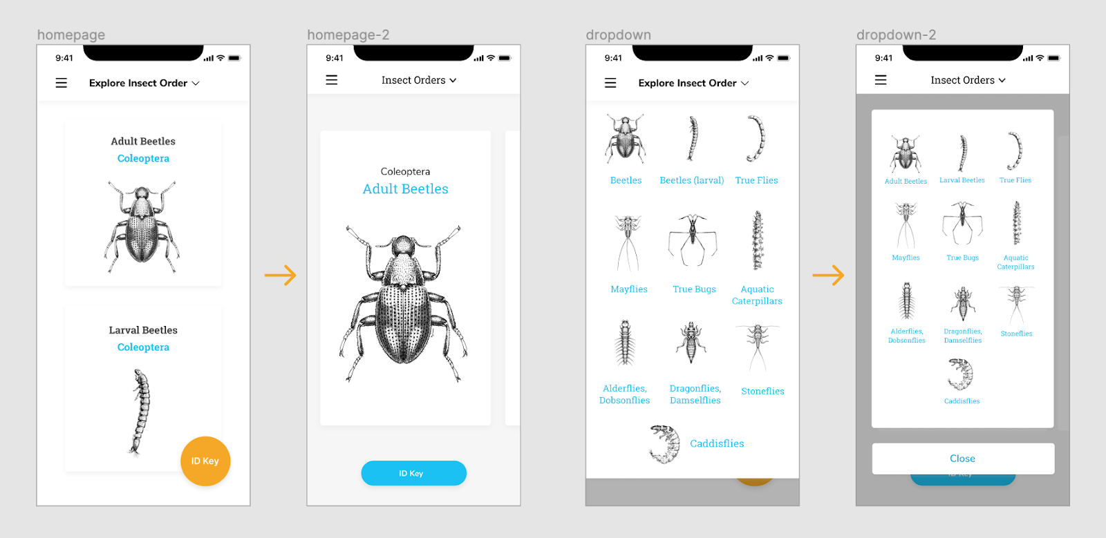 Homepage - We thought the card view can be bigger to attract people’s attention and intrigue their interest. Since we only have 10 orders, we did not have too many concerns about accessibility at the very beginning. The ID key button is also replaced on the home page. The dropdown menu was also changed to help user easily navigate and get back to main page. 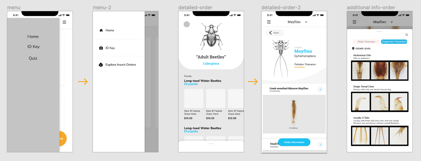 We also added icons to explain the functionalities and applied color for the side menu to make it stand out more. As we mentioned on the previous post, we were struggling between a button to expand, and swiping up. Since we were worried about the experience of swiping up which is too hidden on the bottom of the screen. we iterated and created a button on the bottom for accessibility instead. Planning and preparing first round usability testing To conduct our first round of testing, we started with writing the testing protocol, thinking about the purpose of the testing and the goals we want to achieve. The purpose of our testing was to test the logic of the user flows, and to identify potential navigation and usability issues. We wanted to understand if the application is engaging to users, and is useful in identifying macroinvertebrates and learning their characteristics. We assigned a few small tasks for users to finish during the testing: Pre-task: Users will be given 30 seconds to get familiar with the application before doing task. First task: Users are asked to browse the different orders though different ways. This way, we can then tell whether the design makes sense, and take note of how users navigate through the different levels of information. Second task: This task was focused on the detailed Order & Family page designs, users are asked to find out more detailed order and family information, as well as specific diagnostic characters for a specific family. By asking the users how difficult the task is, we can evaluate the slider design idea we had, and how accessible / noticeable the actionable button is. We also asked additional questions at the end of testing to check whether they can have a clear understanding about our application throughout the testing process, including:
Synthesize the findings to guide our next iterations. Overall, we conducted five user interviews, with macroinvertebrate experts, people familiar with the site, and a novice user; I also got feedback from my friend who knew nothing about the concept or field in order to get additional novice learner’s insights. Rather than use the normal user research method - affinity diagramming to synthesize the testing findings, Alice made the excel sheet to list out the key points the interviewee made for each task. It helped us highlight the common suggestions and feedback. 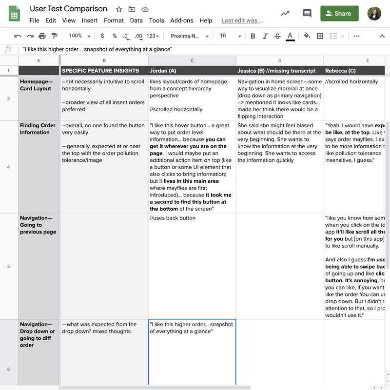 Here are the findings that guided our next iterations:
Iterations we made. Since the first version of high fidelity prototypes are hard for novice learners to learn and understand the additional information, I quickly brainstormed two other versions to display the information and hierarchy between orders and families. 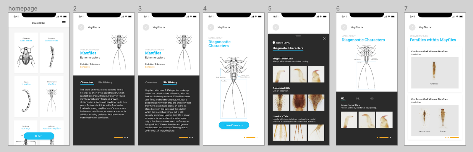 The first version allows users to swipe and learn along the way. The experience is more immersive and easy to follow if the users have no idea about the insect and the order. However, it doesn’t give enough freedom and choices for users to explore themselves, and quickly becomes repetitive for more experienced users. 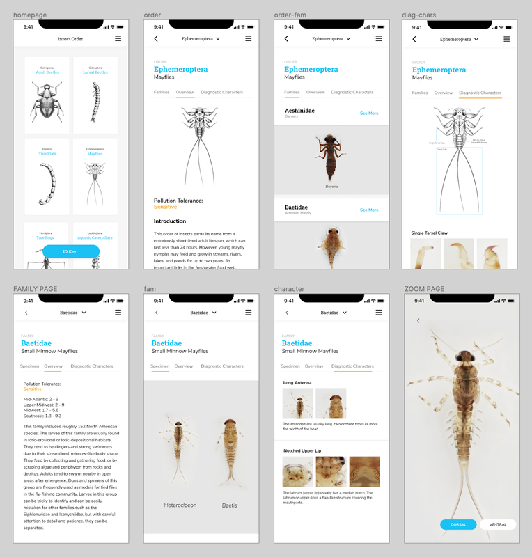 The second version can cater the needs of both experienced users and novice learners since it allows them to quickly switch between various levels of information. The structure of the insects are also easy to tell and discover. The homepage was also iterated from showing only one order to display multiple orders at once.
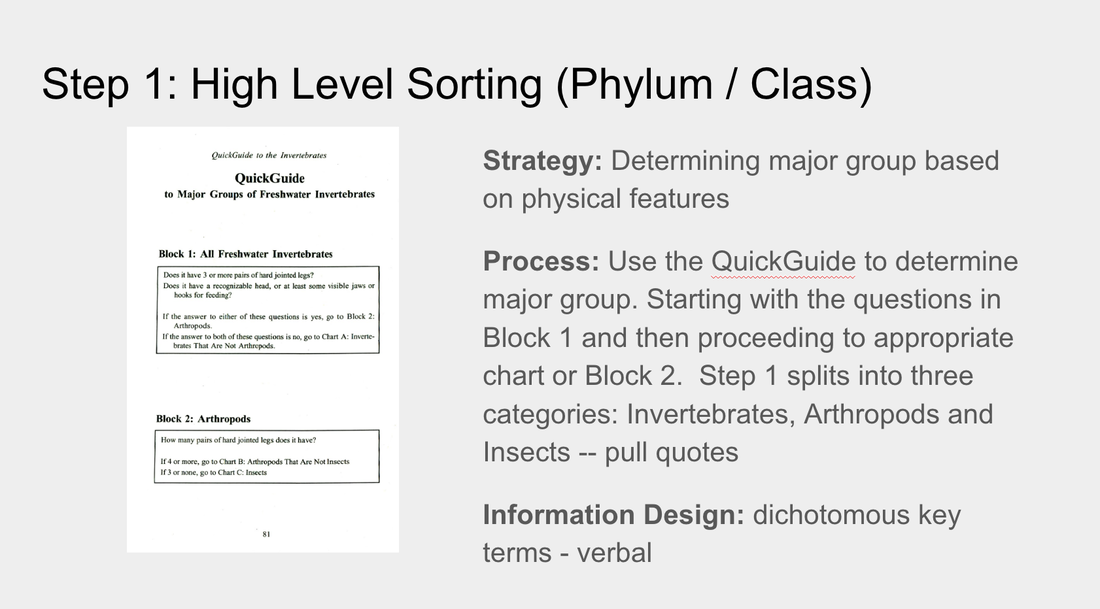
The developers moved forward with this version, and worked to develop a beta version. It was interesting and difficult figuring out how to work in parallel; they were focused on setting up the database and structure, while we were iterating through the designs, but we couldn't progress too far or change too many things after they began developing the pages. By Alice Fang 🐞📱Re-framing with a new team! Chelsea and I were joined by Estelle (Yi Cheng) Jiang and Dakota (Zi Qi) Dong in late May. Moving forward, Chelsea and Dakota will be working on development, while Estelle and I will be working on the design and user-testing of the app. There was an adjustment period as we introduced the project to the new members and got everyone acquainted while figuring out how to work collaboratively in a remote wfh environment. Through this process, we've been utilizing google docs and spreadsheets, as well as Figma, but coordinating between design and development has been tricky. Accommodating and synching the design and development timelines was difficult, and it was a bit touch-and-go. Spreadsheets and Organizing Data Previously, I struggled with establishing a structure to the app that allowed for navigation in and out of orders/families. To make the taxonomy clear (as we are non-scientists and non-bug experts), and to organize the information for design purposes, I created a spreadsheet with the following: 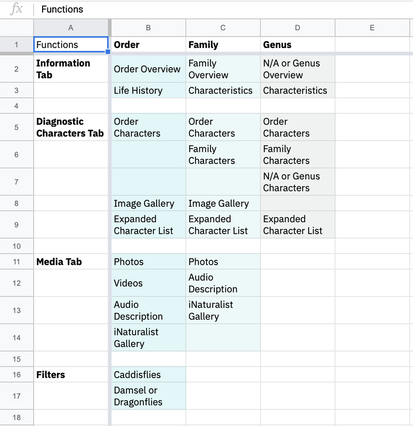 1. Inventory of functions that exist on the website In order to figure out the minimum viable product that can be developed by students within a summer, and to compare what needs to change from Order to Family, I listed all of the functions for Order/Family/Genus. 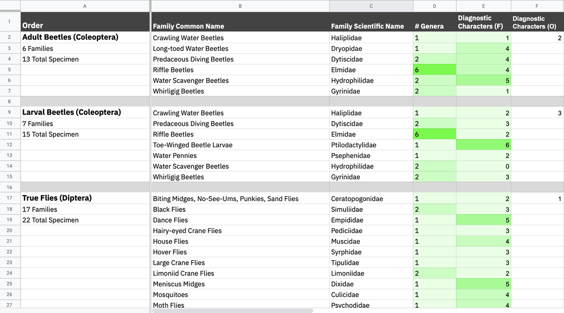 2. List of insect orders, the families in each order, and the number of specimen (genera) in each family, and the number of diagnostic characters for each family and order While many of the families have similar numbers of specimen, there were a lot of outlier cases we needed to keep an eye on, and account for while designing. The length of names, both common and scientific, impacts the typographic system, and the number of diagnostic characters affects how we visually set up that information. Some of the cases are as follows:
*Dev team has to set up the database (I don’t know the exact details). We ran into a challenge late in the summer [early August] where the Gigapan database had to be moved, and there was no way to extract some of the family traits and text information, requiring manual copy and pasting Collecting References and Resources for Ideation Round II Getting the design team on the same page. I showed Estelle the previous mockups and ideas that I had for the mobile app, but in order to refresh and sort of create a mutual visual language, we took the time to research and look at other apps. We compared and discussed field guide apps, quiz apps, and other text-based apps like news/media. 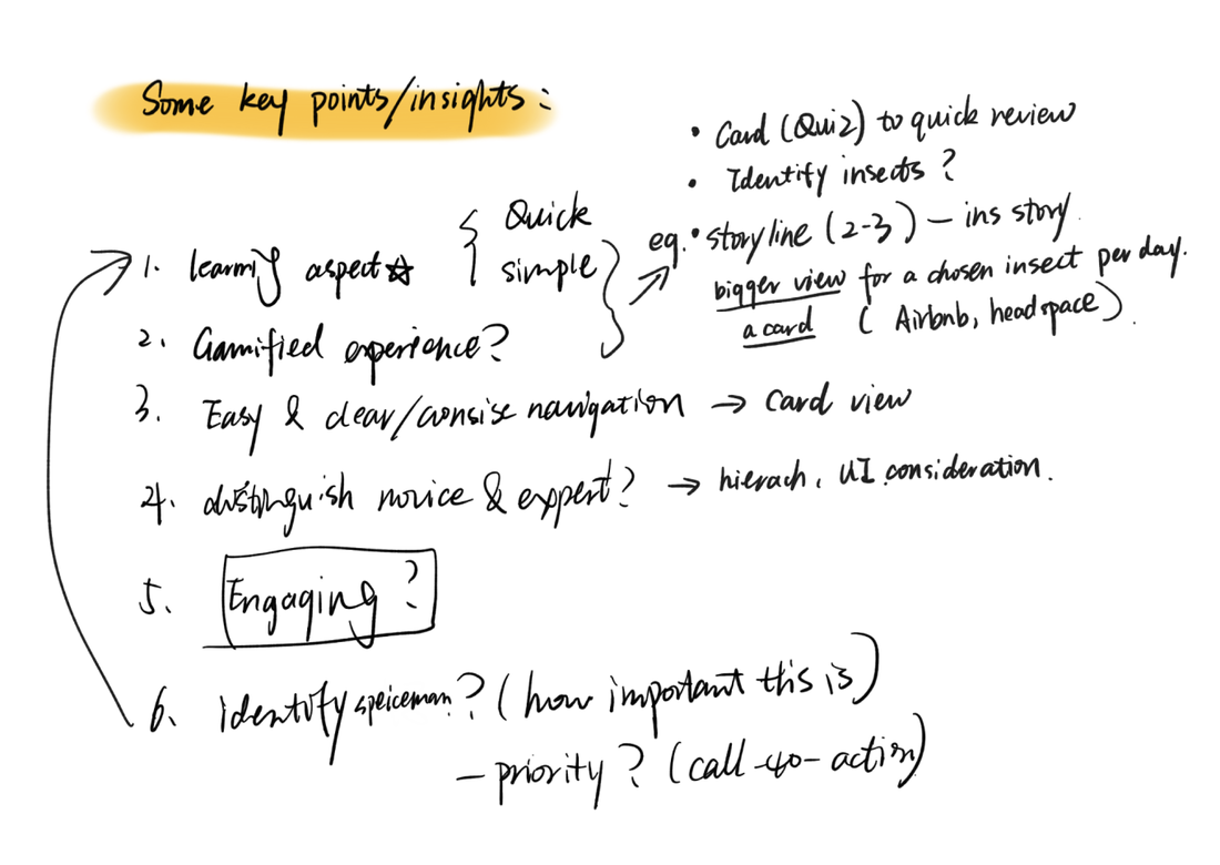 Estelle's feedback + insights 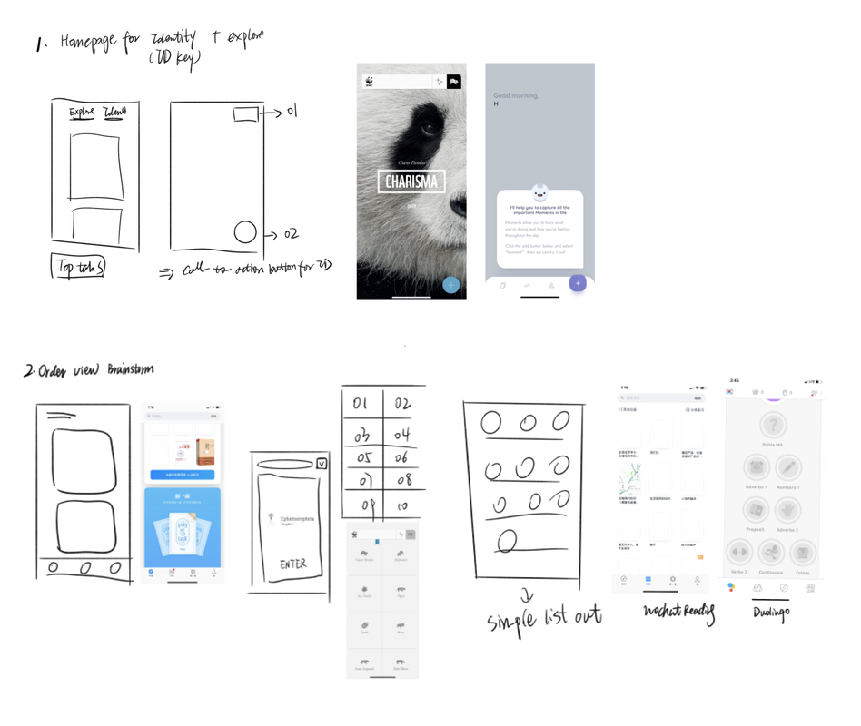 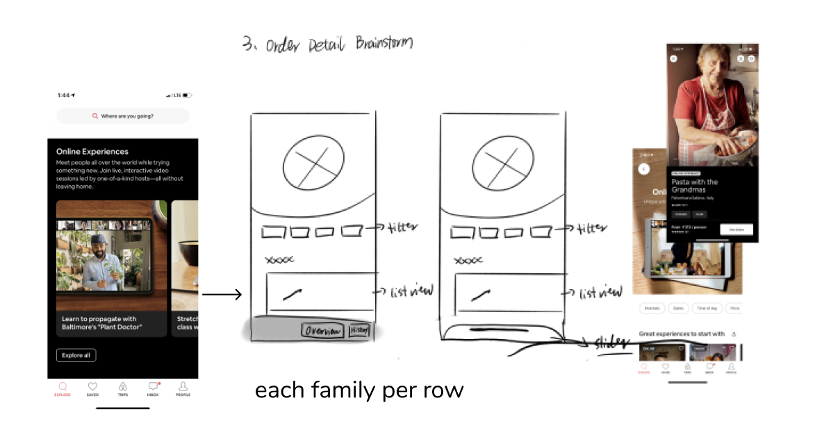 *Referencing Headspace, AirBnB, Medium, WWF Together Alice’s Points:
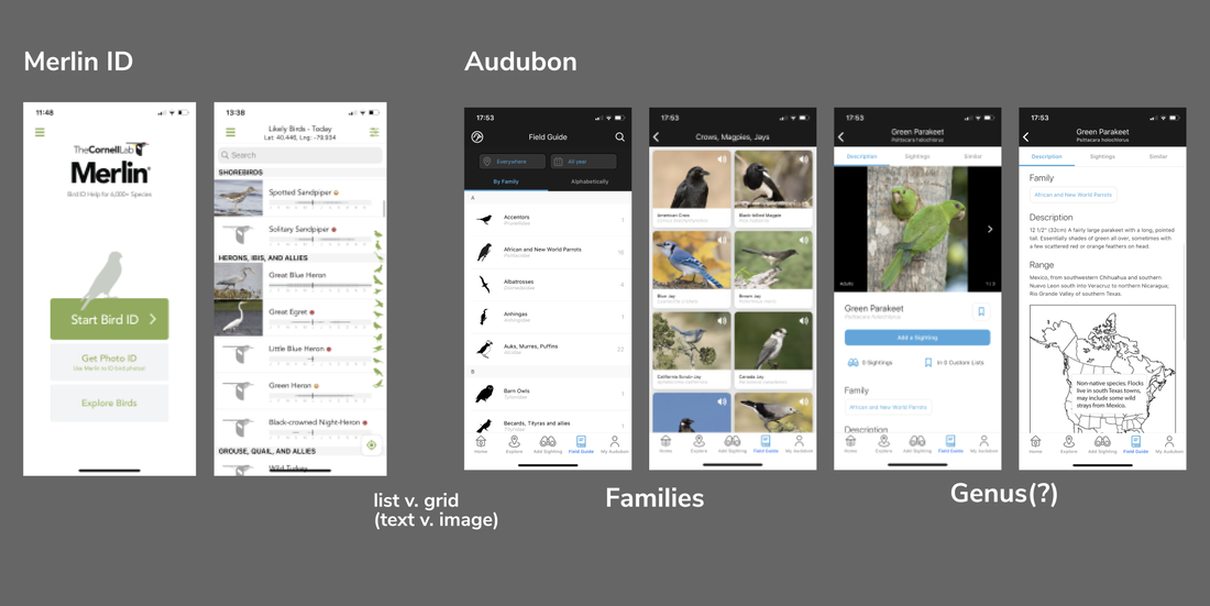 *Referencing Twitter, Google Maps, Medium Merlin ID, Audubon Lo-fi Version 2 New Ideas and Changes Estelle quickly mocked some basic page structures, and documented user stories. This allowed us to see possible entry points and user profiles for the app. What are possible ways people would use the app? What would they be looking for? And how do we prioritize that development at the same time?  User Stories 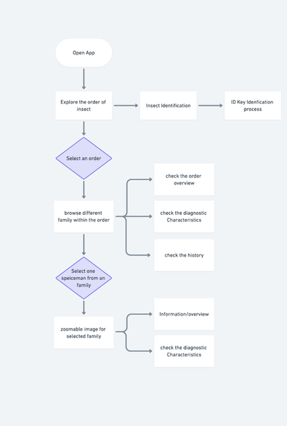 She also created this flow diagram of entry in the app and access points to different functions; however, it didn't include navigation and returning to previous pages, or other major functions we hope to implement in the future, like a quiz. 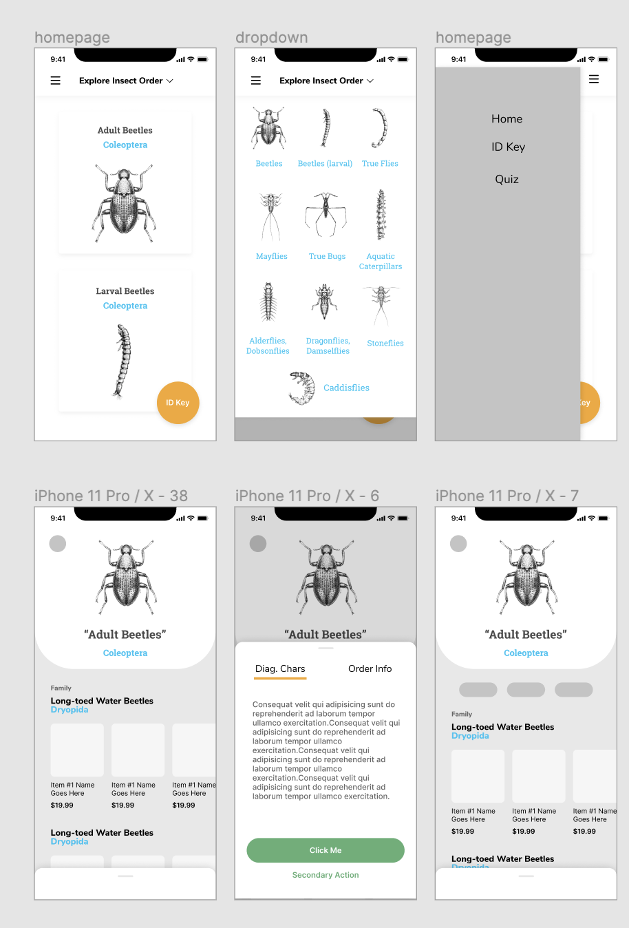 Home Page and Order Page Templates that Estelle created
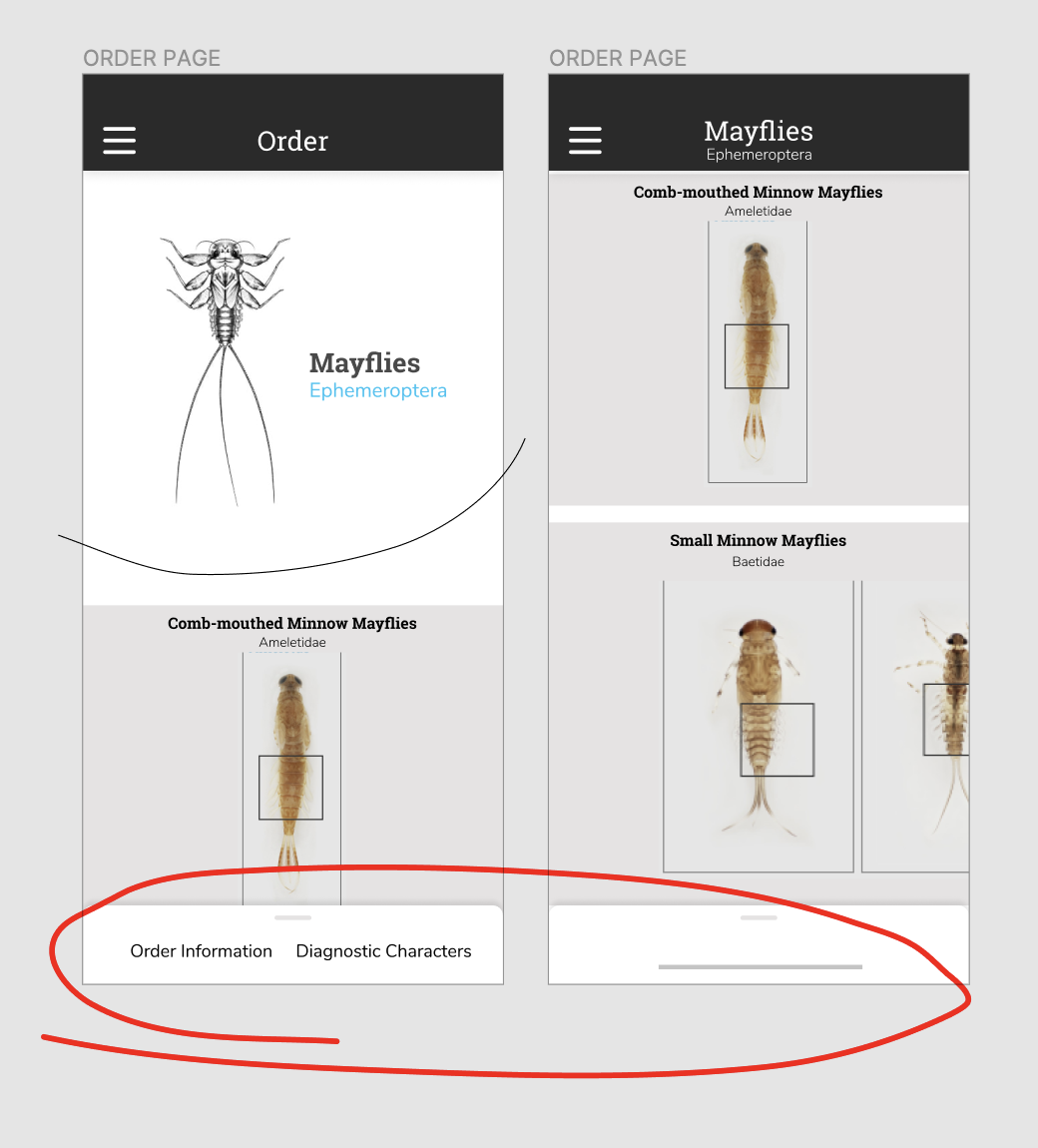 Scroll-up Popup for additional information, as well as an 'introduction' to the Order Page
*Comparing what a bottom pop-up that scrolls up, and a button on the bottom, would look like. Between a button to expand, and swiping up, we originally decided on a swiping up action, but were worried about the screen experience that it would be too hidden on the bottom of the screen. As we moved into user testing, we created a button on the bottom for accessibility instead. It stood out more, and for someone holding a phone, was located in a position that was easy to access. 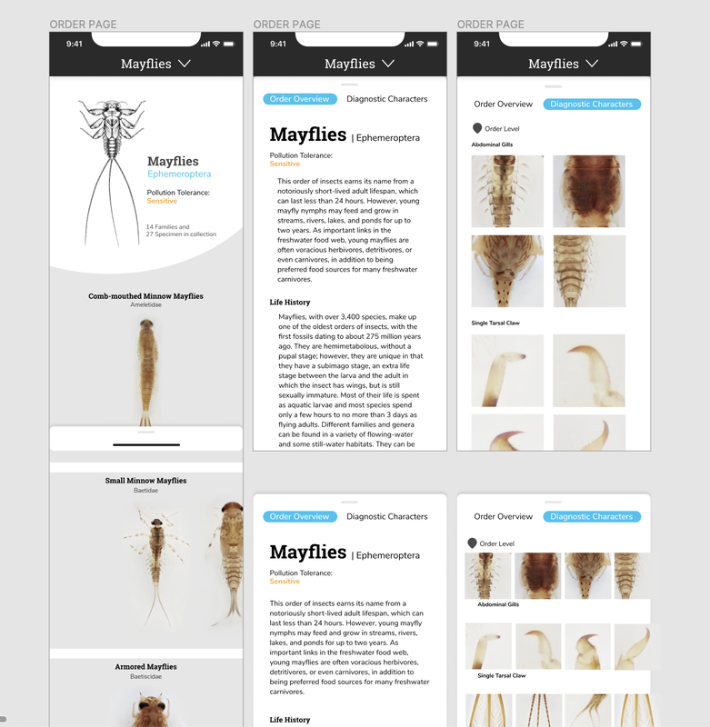 Through this process, we also started to get into the look and feel of the application. As the focus and beauty of the collection is the high definition images and close-up thumbnails, I really wanted typography to play a role in the visual style while staying close to what the desktop site looks like.
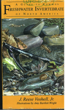
Hello! My name is Tom Garncarz, and I’m a new member on the Learning to See project. My role for the next few months will be to design and develop an interactive game to help new learners better test their ability to identify macroinvertebrates and consequently, water quality. I will be posting occasionally to document my research and design process throughout the semester. Over the course of the past two weeks, I’ve been conducting secondary research and ideating on early designs for such a game. Given my unfamiliarity with macroinvertebrates prior to this project, my research has been primarily focused on developing a broader understanding of this domain from a scientific perspective. However, because I have the unique opportunity to teach myself a knowledge domain directly before creating a design to teach others, I can examine the materials I’m using to teach myself on a meta-evaluative level. The first section of this blog post will discuss the resources I’ve looked at, how they teach their content, and what insights I can derive from them towards the design of an interactive game. Research Guide to Aquatic Insects 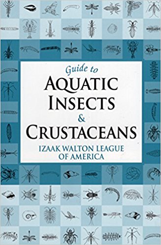 The first resource that I examined was the Izaak Walton League’s Guide to Aquatic Insects and Crustaceans. This book was recommended to me as a primer guide for getting familiar with the domain of macroinvertebrate research, and as such, it seemed like a logical place to start my investigation as well. The Guide is written largely in prose, and reads somewhat like a textbook. Different classes of macroinvertebrates are anatomically and contextually detailed, accompanied by black and white illustrations. Guide describes each of these organisms in terms of what anatomical features can be used to disambiguate it from similar-looking macroinvertebrates, which comes as a welcome feature for new learners. These descriptions, in conjunction with the provided illustrations allow for a high-level understanding of what features define each class of macroinvertebrate. However, because this resource is written in prose, it’s definitely designed to act as a book to be read front-to-back, rather than a field resource or a teaching tool to be quickly consulted. This isn’t necessarily a bad thing, but it distinguishes Guide from some of the other resources to be mentioned in this post. Flashcards of Common Freshwater Invertebrates of North America My next resource was the Voshell/Wright set of Macroinvertebrate flashcards, a set of flashcards that detail 30 different EPT insects. Each card has a large color illustration with a size key on one side, as well as information about its insect on the other. This information includes the insect's categorical info (phylum, class, order, etc.), as well as what visual features define it, what habitat it lives in, how it moves, and what its presence means in the context of water quality. There a couple of interesting features of these flashcards that set them apart as a useful resource; each card has a size key, indicating the range of possible size that each insect could be. Additionally, indicating not only the insect's visible features, but also its habitat and how it moves, is likely useful when attempting to identify insects in the wild. I do wonder if it'd be useful to have some sort of visual indicator of habitat, however; it's difficult to visualize habitats purely from text at times, and in the context of a training game, it would be good to train players on stimuli as close to the real thing as possible. 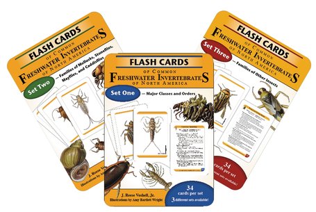 Leaf Pack Macroinvertebrate Identification Flashcards I also looked at a series of macroinvertebrate-focused Leaf Pack flashcards as part of my research. These flashcards are similar in structure to the Voshell flashcards, with color photographs of each macroinvertebrate on the front and descriptions and information on the back. The backs of each cards are less verbose than the Voshell cards, but they also contain annotated black and white top-down illustrations of the insect in question. Key characteristics of each insect are bulleted and outlined. Additionally, the set contains a glossary card that details macroinvertebrate anatomical terminology, as well as a high-level, generic overview of macroinvertebrate anatomy with annotated illustrations. The presence of this glossary card is the most interesting thing about this set when compared to the Voshell flashcards; since the client has indicated that they would like learners to be able to talk about EPT with the appropriate terminology, this seems key. A game should strive to incorporate this (though it does run counter to the idea of a more visually-focused experience). 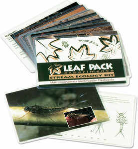 Macromania! Since my role on the team is to develop a game, it seemed prudent to look into other efforts to create games around the topic of macroinvertebrates. Macromania! is a game about water quality determination by identifying cards with EPT on them. Each card has a black and white illustration of an insect on one side, and its common name, class, order, family, life stage, and pollution group on the other. Students are tasked with identifying these cards, then understanding whether their presence in certain ecosystems (farm, forest, or city) is indicative of what quality of water. I'm intrigued by the idea of categorizing insects by the ecosystems where they are found; because the game focuses primarily on water quality identification, this makes a lot of sense. It's definitely the most comprehensive teaching aid in terms of covering the entire process of water quality testing; it does seem to lack a little something to make it fun. However, taking players through the entire process (rather than just focusing on the EPT ID) is an interesting idea that might be worth exploring. 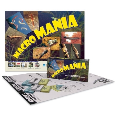 Electrocity Electrocity is an online game in which players have to act as mayor of a virtual city and make meaningful decisions with regard to how the city is powered. Building different kinds of power plants can impact cities' productivity and electricity output, but can also impact the environment. Although it has little to do with macroinvertebrates, and its scope isn’t really possible given the development timeframe of a few months, it provides an interesting perspective on designing an educational game. Electrocity puts students in a position to learn through these very high-level actions; building rapport with these concepts because of their impact on the player's city (something the player cares about!) is an interesting way to make players want to learn. I wonder if something similar couldn't be done for our domain. 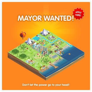 Research Takeaways
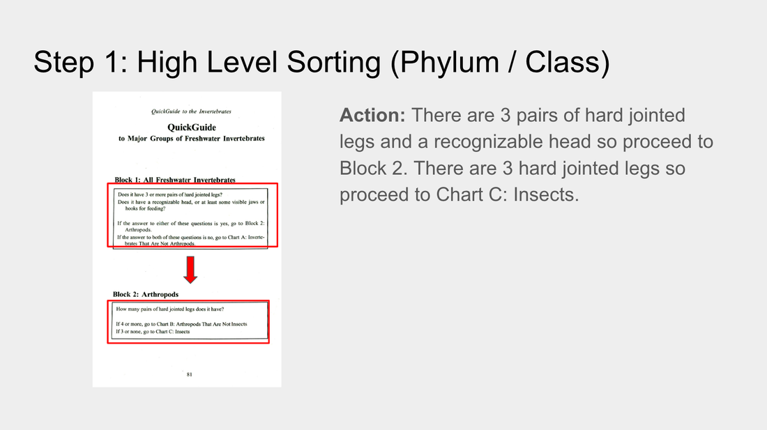
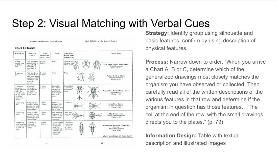
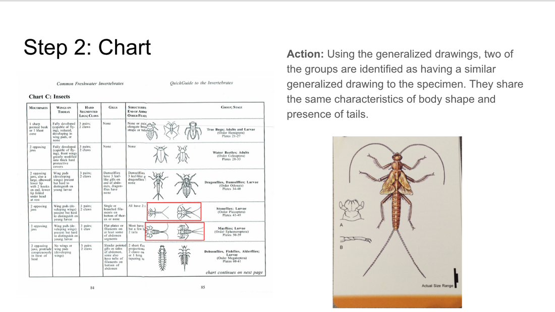
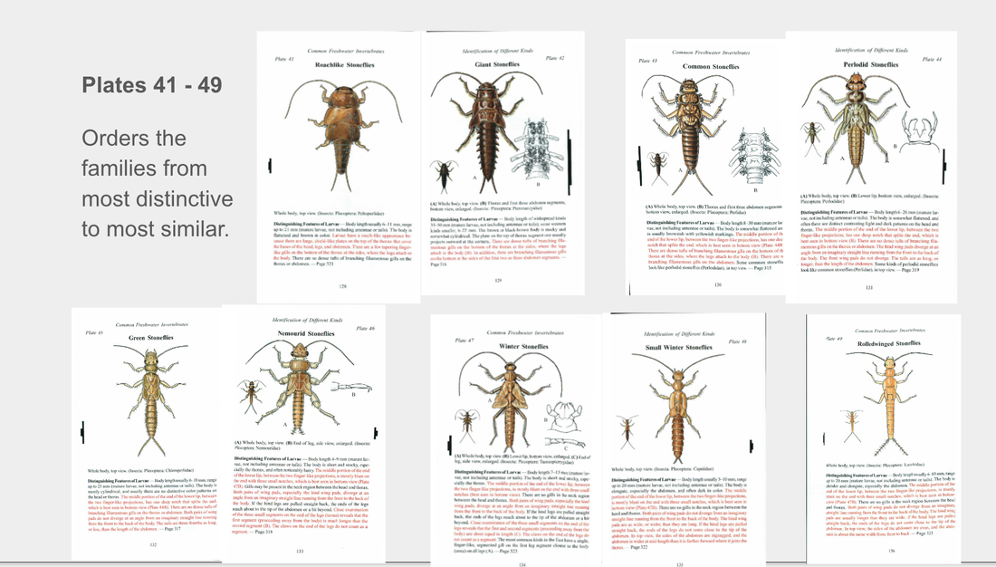
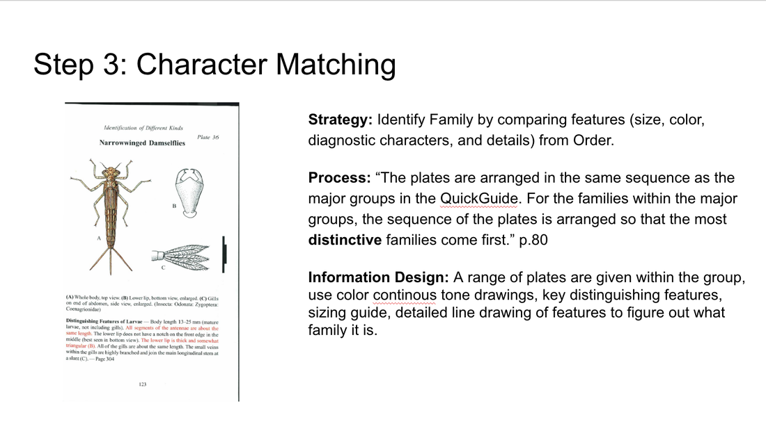
Based on my research, I generated a few high-level takeaways as reference points for the design of my game. The first is that some way to introduce players to the terminology used to categorize and define macroinvertebrates is important. Because most trainers (and indeed, anyone else in the community) will likely refer to macroinvertebrates by these terms, it’s important that my game help players use these terms to describe and understand the subject matter. My second high-level takeaway was that providing a context in which learners must identify macroinvertebrates is important. Although the illustrations present on the Voshell flashcards and in the Izaak Walton guide are great for anatomical identification, it’s important to show that these organisms exist in a real-life context. Telling players that these organisms are usually found in a forested area feeding on leaf detritus, for instance, will help with field identification, as learners who have played the game will be able to narrow down their possibility space to something much smaller than if the macroinvertebrates were taught independent of some local context. Finally, water quality is a personal issue; my game should make it feel like one. Often times these kinds of tasks can seem too heavily abstracted to feel meaningful (its impact on memory notwithstanding, the Greeble recognition task comes to mind). It seems important that players, when identifying different macroinvertebrates with my game, be able to understand the significance of what they are doing. Tying this work to environmental health is key to making the task feel important and meaningful, and will hopefully encourage understanding of the weight of the real-life identification task as well. By Jen Liu In preparation for the website redesign, we are conducting in-depth background research on existing guides and keys for identifying macroinvertebrates. The goal of this research is helping us develop a framework that maps out the design techniques and learning strategies used to scaffold the identification process, and compare those approaches across multiple sources. This framework and inventory of solutions will help us reference and address challenges in the redesign process. Some of the guides and key we are using for this analysis include:
Our sources were selected to include a diverse range of users from novice identifiers to trained experts. This selection was made to reflect the range of users that we anticipate will be using our website.
In redesigning macroinvertebrates.org, we are focusing on three levels of the current system: the macro, or the architecture of the site, where pages go in relation to each other, and what the general structure and flow of the website is like - whether the site will be structured more like a key or a guide, for example. At the meso-level, our concern is with the interactions on the page – what the layout and structure of each page will be like, what content and how it will be available. At the micro level, we are concerned with the microinteractions, the various cues and feedback mechanisms that the user will encounter interacting with the site.  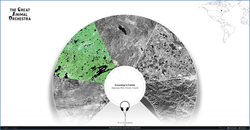 I’ve been assembling a list of precedents looking at macro and meso level strategies in dealing with content. The Great Animal Orchestra is a great example of a website that seeks to train people to listen and identify various biomes and animal sounds. It encourages the user to put on their headphones, and leads them through a selection of various regions, using circular spatial metaphors to slowly train users to isolate specific sounds. A multiple choice game that asks you questions about what you’ve just heard is an interesting way to evaluate if users are learning. 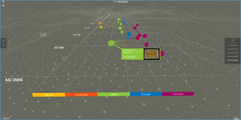 The British Museum’s website has an interesting way of isolating and highlighting various paths the user can take to view information. While the current site follows a chronological format, the user can isolate specific areas to view chronologies of. The website also uses overlays to give away information in a neat, concise manner. 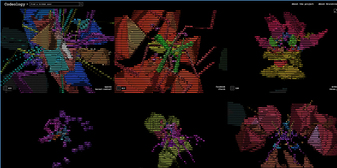 Codeology is interesting because of the way that the grid structure is laid out, where hovering the mouse over a specific square causes it to animate and rotate. Possibly could be used as a precedent for interactions for the website where hovering over an insect square enlarges and magnifies it. 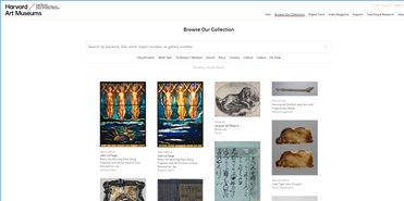 The Harvard Art Museum website uses a more standard grid interface, but interestingly allow for panning and zooming into the high resolution images on the site.  The Google font gallery uses a detailed sidebar with the ability to use sliders to change variables and update things in realtime. In addition to this, the various modules in the grid also allow for changing around variables and being able to see how the type changes and looks - this is really important as an example of how to manipulate and compare different images without necessarily diving in a level deeper.
By Lauren Allen, Learning Media Design Center @CMU Cognitive Task Analysis & Contextual Inquiry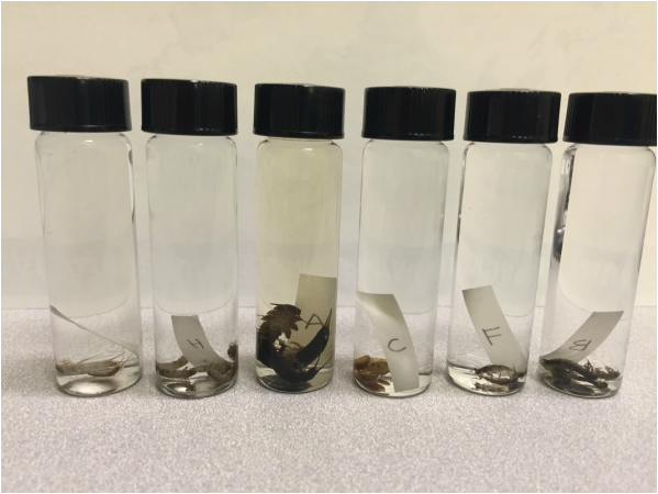 Unknown specimens in their vials. Some taxonomists knew family and had a good guess on species without even removing specimens from the vial. Others worked through the dichotomous key to find family and genus classifications. By Jen Liu
The Diagnostic Charactier (DC) annotation tool we are developing for the Macroinvertebrates.org project builds off of the original Interest Point (IP) annotation tool which was developed for museum curators to create, edit and manage the multimedia content overlays associated with interest points placed at set zoom levels in a high-resolution, multiscalar image (e.g. CMNH/Stories in the Rock, Museum of the White Mountains/Beyond Granite).With funding from the Benedum Foundation, Meadowcroft Rockshelter & Historic Village is currently using the IP Tool to annotate gigapixel exhibit images of their archaeological site in Western Pennsylvania that contains evidence of the earliest human presence in North America for online learning. Study Purpose To get a better sense of the disciplinary content management, curation and annotation requirements of different subject matters, we conducted a semi-structured task analysis with Andrew Donovan, the Program Coordinator at Meadowcroft via a video call. He is currently using the tool to annotate Gigapan images of the site to be used as an educational tool for teachers to use with students before and after visiting the Meadowcroft Rock Shelter national historic site. |
Project TeamAn interdisciplinary team Categories
All
Archives
June 2023
|
 RSS Feed
