
|
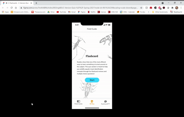
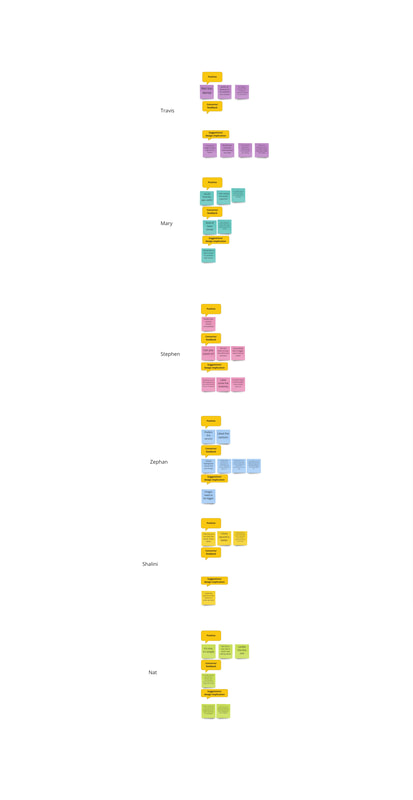
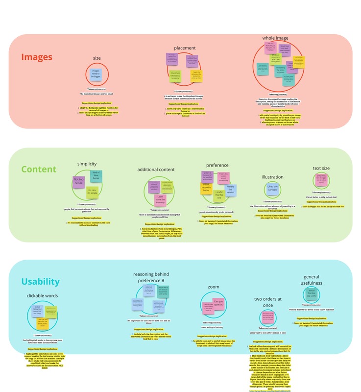
by Dominique Aruede, CMU Cognitive Psychology and Human-Computer Interaction Although I've had other roles this semester, I've been focused on the development of the Quiz section of the app. I had a separate assignment through my independent study to iterate on the quiz prototype. The following details my process: Design Challenge The app contains an interactive subsection which we named "Quiz." Quiz contains helpful tools for reviewing insect information (taxonomy, fun facts, etc.) like flashcard decks and short, image-based multiple choice question sets. The flashcard decks are the first component of the prototype to reach its user testable version in development. We wanted to figure out what categories of information presented on the backside of each flashcard would best facilitate learning. To clarify, I did not test for level of learning and transfer itself, but rather, I tested for level of understanding and comfort with two different degrees of content specifications. How scaffolded and robust does the flashcard information have to be for users to feel comfortable to rely on this tool (Quiz) as support for practice with macroinvertabrate ID activities? I ideated on two possible flashcard designs and conducted a series of AB tests plus online surveys with six users. Version A implemented solely a text-based copy from the desktop site describing order-level features on the macroinvertebrate of interest; the feature names were clickable and revealed scrollable zoomed-in images of the feature on many different families within the order to show variety. Version B implemented both this interactive copy and an additional annotated illustration which highlighted the same features backed by the context of the entire animal (the annotations are also clickable, leading to the same formatting of visual examples)—images below. I asked the question, what flashcard elements do users prefer when learning to ID? I also adapted the AB test with thinkaloud procedures some to make the data a bit more robust. I incorporated prompts and exit interviews into the study to answer the questions, how do users imagine using this in their lives; what other features might they want? what could make the user experience more seamless for a user? Mockup Versions and Final Prototype Iterations Developed Below are moving examples of both flows users were taken through during testing. They were not shown the full scope of the quiz, only the front and back of the flashcards in Version A and Version B. Version A is on the left and Version B is on the right. 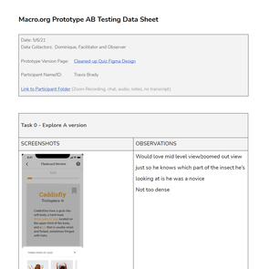 first page of one of the data collection sheets used in this study first page of one of the data collection sheets used in this study User Testing I recruited for this test through email and also reached out over social media, depending on what was appropiate for the type of user. We sampled with a range of users: novice types (that is a student in middle school or high school), amateur types, educator/trainer types, and volunteer/designer types. Not everyone I reached out to responded back, and so my final sample consisted of two amateur types, one educator/trainer type, one novice, and two designer types (n=6). I began each AB test by presenting two flows to the particpant. First they would start on the front side of a flashcard in Version A, and then they would be able to view the backside and direct me on where to click next, if they wanted to see the next card, and so on. Then we repeat this for version B. During this process, we embedded think aloud prompts to guide participants to comment on any possible confusion or areas of opportunity. Finally, participants were asked to complete a survey. Findings with Design Implications Both of the amateur type participants and the educator/trainer type called in to the interview over Zoom. The novice type called in over FaceTime, and the two designer types participated in person. I had taken notes and during each interview in a pre-made data collection sheet on the comments and reactions of individual participants. There were no transcripts generated for these interviews, but the interviews conducted over Zoom were all visually and auditorily recorded. I then went back and consulted the videos again to fill in information I missed while I was conducting the intwerview. The next step was to transfer every individual data point to a synthesis workspace in Miro and organize first by participant, labeling each data point with design cues that are good identifiers for sorting later (i.e. "suggestion," "preference," "Version A," "Version B," etc.). Finally, I built an affinity diagram, grouping by concern, summarizing the painpoint/comment, and developing suggestions or design implications for future designers on this project to refer to. I identified three main concern areas. Below are the findings:
Additional Content
3. Usability Clickable Words
Flashcard MVP for the 'Review Orders' Learning Goal Taking all of this into account, I developed an interactive prototype in Figma, incorporating the bare minimum edits that were suggested through the synthesis (aka, fleshing out Version B with the proper annotations for the illustrations, and fixing some some small UI thing slike the help button). I also prototyped an alternative way to display the images, using a bigger aspect ratio and drawing from the design of the lightbox feature in the Field Guide, a suggestion first proposed by my colleage, Estelle Jiang. I also prototyped the possible flow that's created when the bookmark button is pressed on a card: a new deck with only the bookmarked cards will be presented upon completion of the whole deck for the user to review once more or as many times as they like. Once the user indicates that they've mastered them, they will see an end screen with options. One note is that this version of flashcards contains a 'back' button near the bottom of each flashcard, but that is strictly for prototyping purposes because Figma doesn't recognize the difference between left and right swipes, it just registers a general swipe. In the real beta, left swipe means 'Card Mastered' and right swipe means 'Undo Last Swipe' or 'Go Back,' and of course, bookmark button means 'Study Again.' So there will be no need for a physical back button. Below is the exemplary demo of all that I've described. While creating this MVP, I realized that certain important content is missing in order to create a usable beta. I detailed out what's missing and what assets will need to be generated in a preadsheet available to all project team members. I recommend that new designers on the team take a look because I left comments in it about already curated content and plans that might be useful for designing the rest of the Quiz section, including other learning goals. You can find supporting links to everything covered in this process blog below.
Helpful Links
Comments are closed.
|
Project TeamAn interdisciplinary team Categories
All
Archives
June 2023
|
 RSS Feed
